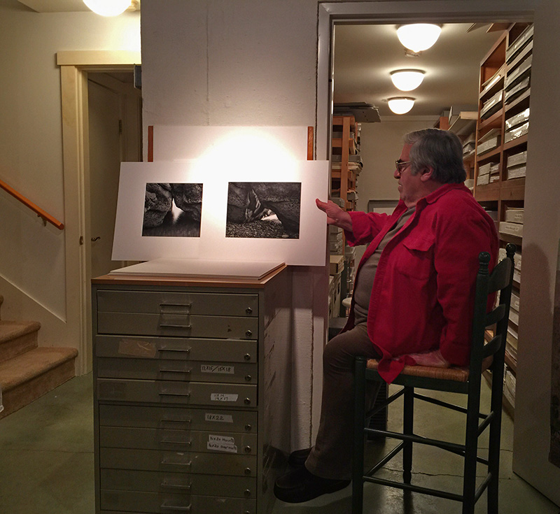
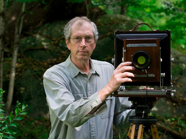
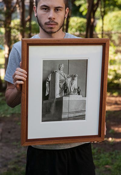
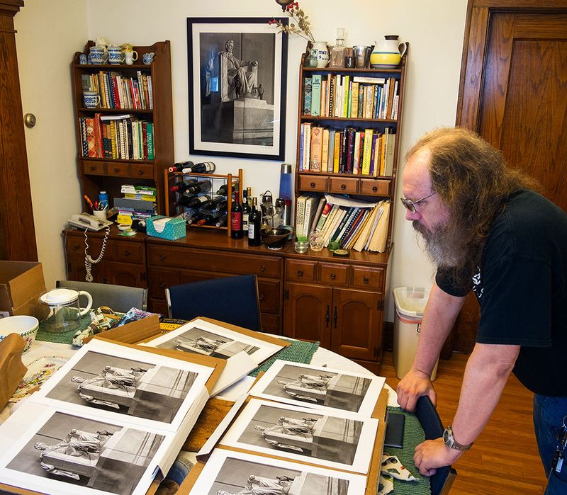
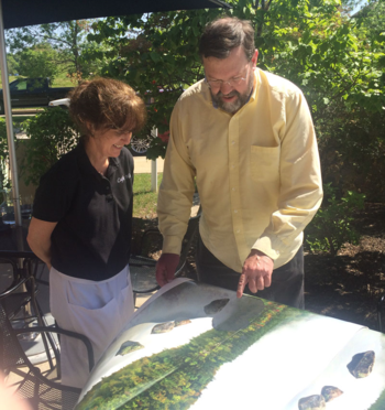
 DD-B looking over some of the many proofs for the sale print.
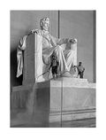
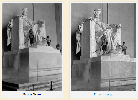
 [Note: DD-B's Lincoln Memorial picture, left, is our July Print Offer, currently in progress. (Part of our experiment this year of having a print sale every month.) —Ed.]
By David Dyer-Bennet [a.k.a. DD-B]
The TOP Print Sale image was shot on June 25, 1975, at the Lincoln Memorial in Washington D.C. The Lincoln memorial is, as you know if you've been there, a fantastic place. I see it as being ideally designed for B&W photographers—it's entirely white (with shadows creating grays and blacks), full of interesting natural light coming in from the outside.
When I walked in as a college student in 1975, it was just a decade after the Civil Rights Act was passed—America was beginning to finally deal with the aftermath of slavery and the despicable attitudes many Americans held, and this issue was very much in my mind at the time. And what did I find? Two black National Park workers, up on the pedestal cleaning Lincoln. (I didn't view it as "at his feet," since that had connotations that didn't fit my views; I thought of it as "in his lap," though that's inaccurate.) How could I resist? Hence, this picture.
On the contact sheet the Lincoln image (actually three similar frames) and one other image are marked in red grease pencil, and I remember being very excited about them at the time. I don't have any bad prints in boxes, though. They must have all been so bad I didn't keep any at all. Given the markings and my excitement I can't imagine I never tried to print this image.
As to what it was shot with, I would have thought that I took my Leica M3 kit on that trip, and probably only that. However, the frame spacing on the contact sheet suggests it was shot with the other body I owned then, an Asahi Pentax Spotmatic. I have no record of the lens used, or the exposure, but it would have been hand-held. The film was bulk-loaded Plus-X, developed in D76 diluted 1:1.
Given that I’d never made a good print of this in my own darkrooms, I was very excited when, in 2007, Ctein tried printing it digitally. He had just gotten his large-format inkjet printer. I'd been admiring Ctein's photos since the 1970s (and buying them since the 1980s). I loved the space program and technology images, and of course the amazingly deep shadow detail in his dye-transfer prints. I saw them in art shows at science fiction conventions. Eventually we met, talked, and gradually became friends. My first photo of him seems to be on roll 313, not long at all before the Lincoln Memorial photo on roll 344.
What I got from Ctein in 2007 was, from my point of view, even better than what I think is the normal custom-printer experience. Ctein and I sat down at his computer, edited for a while, made proof prints and compared and discussed them, edited some more, and so forth. So I could suggest things and watch how he did them, and he could suggest things interactively and show me fairly quickly what he meant. Seems to me we spent about a day and a half doing this. I came away with four prints.
The one thing we did that wasn't common in darkroom printing was some perspective correction. You could do this in the darkroom—I've done it a time or two, to correct mildly converging verticals—but most people who needed that back then shot with view cameras.

I've had the big print up on the wall at home since shortly after we made it (see the illustration at the top) and I still like it a lot. When this sale came up, Ctein found he still had the file from before. Starting from there, we've emailed back and forth a lot, and I've received three packages of proofs (six versions of the image). Ctein lightened the image some, and brought out the workers' faces more, and sent me proofs in different sizes. I asked him to fix a weird bright area on the boot toe and some mist around Lincoln's shoes, I remember, and darken up the left base a little (Ctein found a way to do it that enhanced rather than hid the spray, which had been a concern of mine). After several rounds of corrections and changes I picked what I thought was the strongest version, and we had our final image.
I started photography early, with my trusty Pixie 127 in second grade. Documenting what I see, mostly things involving people, is what drew me into it, and it’s what keeps me going at it more than 50 years later. This image has come a long way from the original exposure in 1975, but the TOP print is certainly the finest rendering of the image I've ever seen!
David
[NOTE: David has posted a more detailed account of the process on his website, DD-B.net. That posting includes more illustrations. —Ed.]
©2014 by David Dyer-Bennet, all rights reserved
Links in this post may be to our affiliates; sales through affiliate links may benefit this site.
(To see all the comments, click on the "Comments" link below.)
Featured Comments from:
Stan B.: "Great shot—and the perspective correction certainly seems to have helped in this case.
"You were smart to wait—I know I ruined a couple of thin but treasured negs with chromium intensifier back in the caveman days; my wails of grief having just departed the heliosphere."
Elisabeth Spector: "Very interesting and informative post; I always like to understand the process involved in other people's work. I greatly admire this image and have been very tempted to purchase a print. I just wish now that I had not seen the original drum scan! I find that I prefer the non-perspective-corrected version, in terms of composition, content and for technical reasons.
"One issue for me is that the correction creates a subtle but slightly unsettling 'distortion' of the geometry of the base of the statue—not terribly noticeable, just subconsciously perturbing in an Escheresque sort of way (mainly on the left hand portion of the base). Now that I’ve seen the original version, those 'corrected' lines and shapes jump out at me. The perspective distortion in the original does not seem at all distracting to me or in need of obvious straightening (maybe just a degree or so on the right hand side, primarily to get rid of that tiny sliver of space between the statue's base and the image frame). Sure, things aren’t perfectly squared off throughout the image, but I think the eye expects that to some degree. The image feels meticulously composed yet natural, and the vertical lines of the statue, at least those on the left hand side, look perfect. (I’m guessing that the photographer composed the image in the viewfinder using those verticals?)
"The much bigger issue for me is that I greatly prefer the inclusion of three particular elements in the original version that are lost as a result of the perspective correction: the ropes at the bottom, the ladder on the right, and the darkened steps in the lower left corner. To me, they each add something important to the composition and/or to the content. Without them, the image is made up predominantly of the mid-to-light tones of the statue, with the darkest tones concentrated in the two workers, who are relatively small elements in the composition. In the original, the dark tones of those three elements along the edges really help give the composition balance and provide my eye welcome resting points to explore the image further. The corrected version, in contrast, feels much more static and my eye feels lost in a sea of rather featureless marble once I’ve finished studying the main subjects (Lincoln and the workers). The ropes and the ladder also add nice context to the scene and suggest narratives or ideas that extend those of the main subjects. At the very least, the ladder works great as part of my favorite kind of environmental portrait where we see a worker among his tools, and it also has potential symbolic meaning (ascendancy, climbing within the social structure, etc.). The ropes seem important to me, too. They give a better sense of this particular place and its purpose, and suggest ideas relating to dividing lines within society and of people allowed in vs. being kept out.
"The re-worked version certainly has its strong points, particularly the way it brings out various visual details, especially in the workers. The tones are lovely, with a greater separation that enhances the various materials and textures. If I hadn’t seen the original, I might have no quibbles at all with the final image, but that drum scan is now seared into my brain and now I can’t seem to unsee it! The original feels unforced and welcoming, leading me into and around this space to enjoy the literal elements, the abstract compositional elements, and the figurative elements. The original just has a richer photographic vocabulary, more depth, more subtleties to hold my interest. The corrected version is still an amazing image, but in comparison seems two-dimensional, static, without as many areas to explore either visually or in terms of metaphor. I also have to believe that, at the moment this photograph was made, Mr. Dyer-Bennet framed the image purposely to include those elements along the edges. Consciously or subconsciously, they must have been important. I’m hardly a purist when it comes to cropping (or forced cropping that results from perspective correction), and the revised version may very well fit the photographer's intended vision better than the original. I hope I'm not way off base even bringing up these issues. Consider my thoughts not as a criticism of the revised version, but simply as even deeper admiration for the earlier version!
"I’d be curious how a print sale offering both versions would turn out. Perhaps I am only a voice of one saying that I prefer the original (not at all unlikely, as my tastes are often idiosyncratic). In any case, this has been a fascinating exercise in comparison, and I thank the photographer for showing us the behind-the-scenes story of this print. Best of luck in the sale; I have no doubt the print is gorgeous and will sell very well!"
[Note: See Ctein's comment, partly a reply to Elisabeth, with the header "Print Sale printer and admin Ctein adds" beneath the "Intention and Integrity" post, above. —Ed.]
Kennethy Tanaka (partial comment): "Moral of the story for DD-B: Never, never show your contact sheets or, today, the other versions of a print unless you're absolutely, positively certain that you made unassailable choices! (Which = Never!) All chiding and back-seat printing aside this is still an outstanding image, David."
DD-B responds to Ken: It's certainly "safer" not to show process or intermediate states. I come from an academic family, and my inclination is to teach, and one way to teach is to show what I did and why (which lets people think about it and form opinions; I didn't imagine you'd all agree with me). That's more important than being safe to me, though I'd be sorry if my openness costs Mike and Ctein significantly in their share of the sale proceeds.
Edward Taylor: "One teaching point here—as much as possible, post-produce an uncropped image and crop or alter (remove items, etc.)as the last steps. That way if you decide later that more is more, then you can change your final image without having to go back to square one.
"On an image with tons of editing, it may be a good idea to use smart objects and then save a version of the file without flattening it, therefore preserving much of the history.
"I have a hard time deciding which version I like best. Between the final version and the original, the final version has better contrast, tones, etc., but I may prefer the cropping and the ladder in the latter. (See what I did there? I modified that last sentence just so I could write 'the ladder in the latter.' I kill me.)"
