By Geoff Wittig
How do you convey the beauty of the natural world, both subtle and grand, using nothing more than microscopic dots of colored pigment or grains of silver on a sheet of paper? This is the fundamental problem of landscape photography. With more than 15 years of study and a bunch of workshops under my belt, I thought I had a pretty good grasp of the essentials. But I've recently tried my hand at painting landscapes, and it's been a revelation. Landscape painting has many of the same technical and aesthetic challenges as photography, and it's been around a lot longer—since at least the 1600s in its present form. The vocabulary used by painters, and the often elegant solutions they have come up with, have something to offer the interested landscape photographer.
Compressing the virtually limitless range of luminance seen in nature down to the comparatively miniscule dynamic range of the photographic negative, and then to the even smaller range of printing paper, all without fatal damage to the image, is the fundamental problem of classical black and white landscape photography. With the Zone System, Ansel Adams developed a vocabulary (zones, values, placement) that clarified and defined the specific problem of contrast distribution, thereby making it amenable to technical and æsthetic solution. But painters had been dealing with this problem for centuries before Niépce and Daguerre. There is a strictly limited range of values between the darkest available black and the brightest lead- or titanium-white paint, analogous to the total range between Dmax and paper white. How have painters dealt with this challenge? By deliberately allocating the available contrast "budget" in a manner that serves the painting's æsthetic goals.
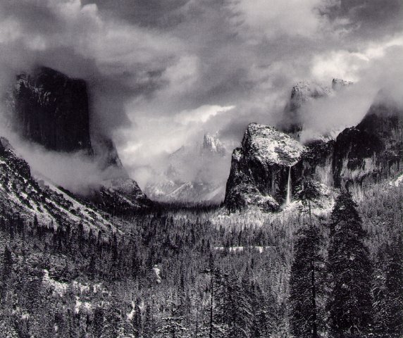
 Ansel Adams, Clearing Winter Storm
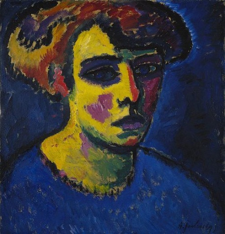
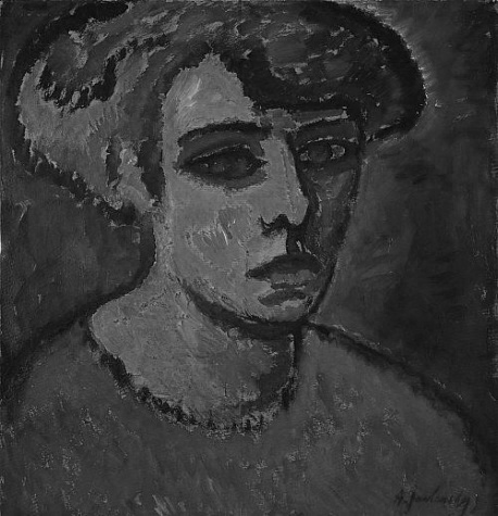
One widely used technique involves starting with a "grisaille," or monotone under-painting. The range from shadow to highlight is carefully apportioned until the painting's value foundation is perfect, orchestrating the path taken by the viewer’s eye to the intended center of interest. Only then are color and detail added to the painting. Ansel Adams explicitly used darkroom techniques to achieve precisely the same goal. In Examples: The Making of 40 Photographs , Adams spelled out precisely how he did this for "Clearing Winter Storm." Overall contrast was altered, edge burning applied, and elements darkened or lightened to conduct the viewer's eye to the glowing tendril of Bridal Veil Falls. I find it more than a little ironic that Adams endlessly ridiculed the painterly ambitions of the pictorialist photographers, while employing classic painters' tricks in his own darkroom.
Painters also discovered a few tools to effectively stretch the value scale a bit. When a light element is placed against a dark one, or vice versa, the apparent value of each is exaggerated. (Think sunlit face in a dark doorway.) This chiaroscuro technique is central to much of the drama in paintings from Rembrandt onward. Another technique is to substitute color for value. Painters are limited to the same 5 to 7 stop range from shadow to highlight that photographic printers have, but the range of available colors is much greater. Some of the limited available contrast range may be consumed depicting (say) the highlight-to-shadow transition of a cylindrical tree trunk, curving away from the viewer. But part of that transition can be illustrated with a warm to cool color shift, which conveys an impression of "roundness" or volume, while saving a bit of contrast that can be used elsewhere for more differentiated shadows. Next time you see one of Mary Cassatt's pastel paintings, check out the chubby arms of her toddler subjects. She used this trick all the time.

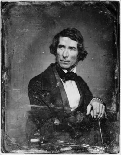
Asher Durand
Another problem for both painting and photography is attempting to depict brilliant transmitted light with the limited reflective gamut of paint, silver, or inkjet pigment. Hudson River School painter Asher Durand addressed this dilemma in his "Letters on Landscape Painting", a fascinating set of nine essays serialized in The Crayon, an art periodical, in 1855. Durand noted that one could never directly reproduce the glow of a shaft of sunlight bursting through the clouds using paint on canvas. But by intentionally using a warmer color for the sunbeam against a darker and cooler backdrop, the impression of its brilliance could be emphasized. We're doing some of this when we apply an S-curve in Photoshop: increasing the relative tonal distance between values on the part of the curve that is now steeper. But painters are free to apply a subtle color shift as well, to accentuate the impression of light. They've known for centuries that juxtaposing complementary colors against each other—blue against orange, red against green—will markedly increase the apparent saturation and impact of each. That's why those salmon-pink clouds in front of a deep blue sky at sunrise are so intense: the colors almost vibrate against each other. Knowing how this works, you can consciously use it to increase the color impact of your photographs—without thoughtlessly resorting to the saturation or vibrance slider in Photoshop.
Color balance is a technical challenge that was known and effectively addressed hundreds of years before auto white-balance or Adobe Camera Raw. Painters have long recognized the importance of color temperature to a convincing rendition of a natural scene. In fact the sophistication of painters' understanding of color temperature tends to be several notches higher than that of photographers. Recognizing that the light illuminating a subject is (for example) fairly warm is necessary, but not sufficient. The resulting color temperature of shadows will be cool, and accurately portraying the color temperature of each increment from shadow to highlight, relative to each other, is central to making a painted scene look right. The converse also tends to be true: subjects illuminated by a cool light source will tend to have proportionately warm shadows. I had always wondered why I so disliked landscape photographs subjected to gratuitous overuse of a warming filter. Now I know: the shadows are warmed as much as the highlights, and it just looks...wrong to my eyes. The best discussion of this issue I have found is in Richard Schmid’s wonderful book Alla Prima . Schmid suggests training yourself to accurately see the color temperature of the light on your subject with this exercise: place a sheet of white paper in the same light, then place a neutrally colored opaque object on the paper. Now look carefully at the color of the lit side of the object, and of its shadow. The difference in the color temperature can be striking, once you know to look for it.
A decade ago, we were pretty much stuck with the color balance of the film we used, modified by any physical filters we applied over the lens. Color correction tools in the darkroom were clumsy and limited, unless you were masochistic enough to attempt dye transfer printing. With digital image editing tools, color is today infinitely malleable.
This all too often means the neon "digital Velvia" look so prevalent on Flickr, but it can also mean carefully adjusting highlight and shadow color temperature to better emulate what we really see. I find myself using the Photoshop eyedropper to check the RGB numbers of neutrals in my shadows and highlights, and gently adjusting them if they don’t make sense with the prevailing light. It's a subtle effect, but the results look better, more realistic, to my eye. Painters spend a lot of time thinking about color harmony and the "palette" of a painting. When you can choose from dozens of tubes of paint and mix any combination you want, it’s easy to concoct an unrealistic or even absurd set of colors, so it's essential to think through what you're doing. Careful study of natural light and plein air painting—quickly executed paintings done outdoors to accurately capture the true colors of nature—are the traditional approaches. Having to deliberately choose the colors you're using to paint a landscape encourages you to consciously consider their emotional and æsthetic impact. As photographers we tend to take what nature throws our way; but once you start thinking about the impact of the color balance or the "palette" of your image, you can start to play with it for creative or artistic effect.
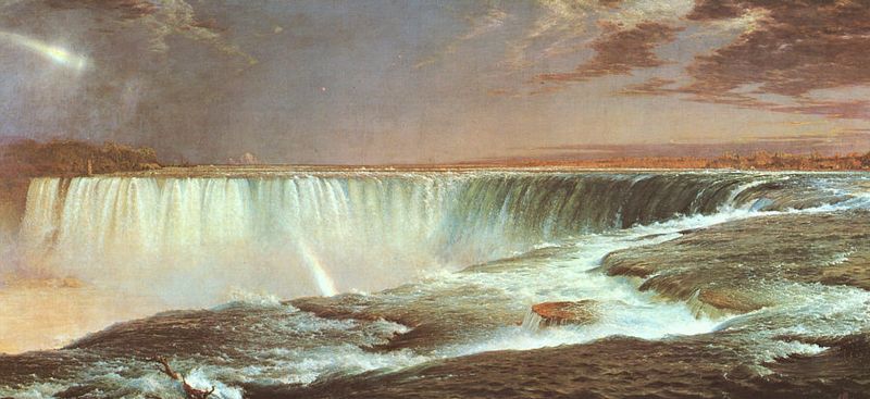
Conveying the illusion of vast depth and distance on a flat two-dimensional surface is another challenge shared by landscape painters and photographers, and again painters surely have something to teach us. The Hudson River school artists of mid-19th century America produced exquisitely detailed, giant scale landscape paintings that created an astonishing illusion of depth. Reproductions are indispensible, but this effect really has to be seen in person. If any museum within your reach has a large painting by Thomas Cole, Asher Durand, Albert Bierstadt, Frederick Church et al, by all means go see it. Near my home, the Rockwell Museum in Corning, New York, has Bierstadt's "Mount Whitney." It’s mind-blowing; you can almost walk into the painting. (It’s hard to imagine in our jaded age, but the unveiling of these paintings were major events in the 1850s and '60s. Crowds would line up for hours and pay for tickets to get a few seconds in front of Church’s "Niagara" [below] or "Heart of the Andes.") The Hudson River painters used every perceptual trick available: highly detailed foreground elements, diminishing texture from near to far, overlapping elements, linear perspective, S-curves, atmospheric perspective, color temperature shifts, dramatic lighting, strategically placed shadows, animals or people for scale...anything that could accentuate the impression of depth and space. Careful study of such paintings is time well spent. Most if not all of these techniques are applicable to photographs. A few moments of thought when composing and capturing an image can add greatly to the sense of depth, as can carefully judged printing to accentuate these elements.
 Frederic Church, Niagara
I won't go into detail on the subject of composition, except to say that for painters it's a very explicit proposition, because you're starting from a blank canvas. Photographers are instead editing the entire world down to the contents of a frame. The viewer's eye is immediately drawn to the brightest light tone, the most saturated color, the sharpest edge, and the most immediately identifiable subject on the canvas. The arrangement of shapes, values, colors and lines on the canvas can lead the viewer's eye to the painting's intended center of attention...or they can lead it out of the frame to the next painting further along the wall. Painters deliberately design their work to guide the viewer’s eye. As photographers we can do the same.
Finally, anyone involved in digital inkjet printing over the last decade is probably aware of the issue of metamerism, or, more correctly, metameric failure. The first affordable pigment inket printer to offer good print longevity was Epson’s 2000p, ten years ago. If, like me, you owned one of these, you know just how God-awful the resulting prints were when it came to metameric failure. Prints that were very nice under tungsten lights turned a ghastly vivid green under daylight. Those that looked decent under halogen lights turned markedly red-orange under tungsten lights. No amount of profiling or adjusting would solve the problem. Each subsequent generation of pigment inkjet has been less prone to metameric failure than the one before, and the current models are pretty good. But painters have this problem too! Paintings executed in both oil and acrylic can have significant issues with metameric failure, particularly with more translucent/transparent paints. But you won’t read anguished diatribes on the subject in art magazines. Instead, it’s understood that paintings should be displayed under controlled conditions: carefully lit from above with appropriate daylight balanced halogens. Problem solved—no wailing or gnashing of teeth. A related problem unique to painting involves the quality of the light falling on the painter's palette and canvas. If a painter has direct sunlight illuminating her palette while mixing and applying paint, the resulting painting is guaranteed to look much too dark and too saturated when displayed under typical indoor lighting conditions. That’s why painters use those goofy-looking umbrellas outdoors, to keep direct sun off their palette.
Geoff -
Suggested Resources
Alla Prima: Everything I Know About Painting by Richard Schmid, Stove Prairie Press, 2004
 There are countless "how to" books out there for amateur painters, but this one is honestly miles above the rest. A revered teacher and widely admired realist painter, Schmid is also articulate and thoughtful. The book features a shrewd analysis of how we see, from an artist's perspective. It provides a remarkably clear-eyed approach to rendering the subject in paint precisely as you intend it to look. It also presents a sophisticated, yet straightforward approach to recognizing color temperature, accurately mixing color, and putting it down on the canvas. Schmid looks upon photographs with a jaundiced eye, accepting them as memory aids regarding subject detail, but rejecting them as sources of color information due to their limitations compared to the trained eye. He also reserves withering contempt for anyone tracing a photograph rather than drawing a subject freehand.
Carlson's Guide to Landscape Painting by John F. Carlson, Dover Publications, 1973
First published in 1958, it's still a terrific resource, and available dirt cheap from Dover. Carlson was a widely admired teacher and painter, and this book presents an incisive analysis of how light really works in the natural world. He effortlessly explains the distribution of shadow/highlight values on both cloudy and clear days, and his discussion of why trees look the way they do against the sky is worth the price of admission all by itself. Carlson taught that the entire range of contrast in nature could be described in visual "shorthand" using only four values: bright sky, lit ground, darker distant hills, and darkest nearby trees. This sounds stupid when described, yet for painting it perversely works very well indeed.
Kindred Spirits: Asher B. Durand and the American Landscape by Linda S. Ferber, D. Giles Ltd., 2007
 This book was widely available just last year, but its price is already escalating wildly on Amazon. It’s well worth seeking out if you can get it for a reasonable price. The reproductions are very nice, with some enlarged details. Durand was the acknowledged master of detailed forest interiors and trees. The appendix includes the complete text of "Letters on Landscape Painting." These nine articles, originally published in 1855, provide perceptive lessons in painting from nature. Durand stressed the importance of spending a lot of time outdoors carefully studying nature to understand how light works. Though largely self-taught, he had a surprisingly sophisticated understanding of the optical and perceptual tricks required to create depth and light on canvas. He explains how amplifying the warm temperature of a painted shaft of sunlight will make it "glow," and how exaggerating the height of a mountain can overcome the limitations of paint on canvas, becoming the "lie that tells the truth."
The Hudson River School: Nature and the American Vision by Linda S. Ferber, The New York Historical Society, 2009
Simply a beautiful book, with lovely reproductions and incisive discussion of the history of this group of American landscape painters and their place in the broader world of art. Still available new.
Frederic Church by John K. Howat, Yale University Press, 2005
 Church was the most successful and widely known of the mainstream Hudson River painters, and this book includes excellent reproductions and details together with an incisive biography and artistic assessment. Grab it if you can find it; I saw one at my local Borders last month, but its price on Amazon is already escalating into the stratosphere.
-
The Hudson River School by Louise Minks, Barnes & Noble/Brompton, 1999
An older book, this contains a very nice selection of reproductions representing the entire range of this group of painters, including the "Rocky Mountain" painters like Bierstadt and Moran and their Luminist descendents. Available used for reasonable prices. Books on the Hudson River school and their Western/Rocky Mountain and Luminist descendants go in and out of print quickly. Any books on these painters with good reproductions are worth having, just to study their remarkable work. They've taught me more about the convincing rendition of space and depth than any photography book I've ever seen.
Send this post to a friend
Please help support TOP by patronizing our sponsors B&H Photo and Amazon
Note: Links in this post may be to our affiliates; sales through affiliate links may benefit this site. More...
Original contents copyright 2010 by Michael C. Johnston and/or the bylined author. All Rights Reserved.
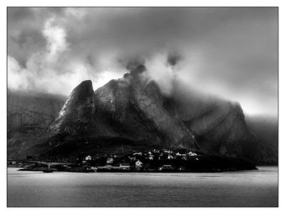
Featured Comment by Jan Kusters: "I do landscape, both in painting and in photography. Both have their own strong points, and from both I learn things I use in the other discipline. After two years of 'mucking about' with photographs I took in Norway, things only started to work when I decided to use the same 'drama' in my prints as I did in my paintings.
"I have always loved Adams way of choosing his values in a print like a painter would do. What he teaches basically boils down to 'do not accept what a camera, film and paper do on their own, make your own decisions and make them do what you envision.' As for his view on photographers trying to make their pictures like paintings, I think he meant something different; do not try to make a painting using a camera. If you want a painting, get a brush and paint. But both are flat objects on a wall, the decisions one makes, are the same....
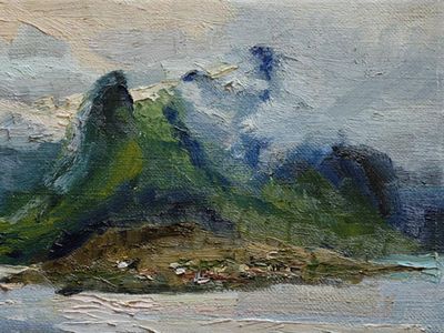
"As for the freedom to edit reality as a painter; as a plein-air painter I can only say that this freedom comes at the expense of very cold fingers and regularly soaked clothes when painting a Norwegian fjord in dramatic weather. Taking a picture takes me 10 minutes, a painting takes me over an hour...."

Both: Hamnoy, Lofoten, Norway, by Jan Kusters
