This week's column by Ctein
A week back, David Dyer-Bennet had an interesting comment on Mike's column, "Do You Really Need Full Frame?" It's worth looking up; in part it read:
We really need to find some way to demonstrate in controlled conditions ... using "pictorial" subjects (not test charts) ... The "tonality differences" that some people see in medium-format vs. 35mm, or today in full-frame vs. Micro 4/3 or whatever.
This relates to a problem I've been wrestling with for several years. How can we describe image quality more fully? I'm pretty well convinced that there are different "looks" to different formats and lenses. The problem figuring out how to analyze them is that we're lacking in a proper vocabulary (I mean that both colloquially and technically). Without such, it's very hard to create the comparisons. Whether it's with test charts or pictorial subjects you can only test for what you can describe. Without the right descriptor, you don't even know what to be looking at.
Example 1: Back in the (mostly) predigital age, British photo magazine writer Roger Hicks and I discussed the "looks" of different film formats quite a bit. We came to the tentative conclusion that what visually distinguished larger format from 35mm (and sometimes medium format) was not resolution and sharpness, as most people opined. We thought it was the disappearance of grain, so that you got clear, transparent tonality with no distracting noise. It took us a while to come to that understanding, because resolution and grain were intimately coupled in film.
Once we had digital photography of some quality, where noise and resolution became substantially independent parameters, comparison images made it clear that our instincts were right. But one couldn't design such comparisons without the right descriptor of the differences.
Example 2: My intuition says there's a lot more to bokeh, analytically, than most folks think. Bokeh isn't directly important to my photographs; I minimize distinctly out-of-focus areas as much as possible, plus I'm pretty insensitive to the nuances of bokeh even when they are present. But I think that indirectly it might have a great deal to do with how a lens "looks."
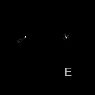
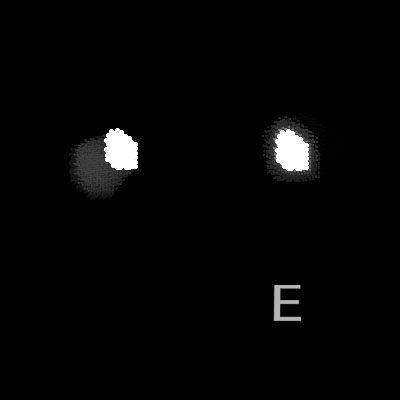
It's like this: I strongly suspect I can grossly quantify bokeh in terms of a spatial frequency power spectrum as a function of the distance-from-correct-focus. I'm pretty sure I could tell, crudely, good from bad bokeh just by looking at those curves. Harsh bokeh, for example, has a lot more high-frequency power than smooth bokeh.
Why should this connect to the overall "look" of a lens? Because, except for photographs of landscapes at effective infinity, just about no photographs are entirely in focus. The amount of defocus is held down to some tolerable blur circle (your acceptable depth of field), but that is distinctly larger and more diffuse than a pinpoint. The power distribution of spatial frequencies in that little bitty circle, kind of a mini-bokeh, affects the visual rendering—how edges are delineated from broad tonal areas, how microcontrast is enhanced or suppressed, etc.
It even affects depth of field, that range of distances over which subjects appear acceptably sharp. How much edge frequencies are enhanced or suppressed in out-of-focus areas alters our perception of sharpness. Harsh bokeh looks sharper. Even more subtly, the transition from acceptably-sharp to not-acceptable will be affected by that power spectrum.
I have a suspicion that this is all very well understood by the best lens designers (who are either nodding in agreement or laughing their heads off at my speculations), but it's not stuff they discuss with us mere mortals. Lacking a proper vocabulary for understanding this, it's next to impossible for us to devise (let alone analyze) meaningful comparison photographs. And that's only one aspect of lens quality that we find ourselves fumbling over.
Example 3: How about them cameras? Oren Grad and I have been noodling, on and off for years, with the problem of describing how digital cameras render spatial detail. Oren is preternaturally sensitive to the way spatial frequencies get portrayed, as sensitive to those as I am to color. (I can perceive 1/2 CC color differences; on occasion, 1/4 CC.) I can just barely see image characteristics that jump out at him (and grate on his sensibilities like fingernails on a chalkboard). I think he may be picking up on nonlinearities in how spatial frequencies get transformed.
In film photography, we often looked to the "modulation transfer function" (MTF)—how strongly different spatial frequencies are rendered. For example, suppose some MTF curve indicates that at 30 line pair per millimeter, the contrast is 50%. What that means is that spatial frequencies of 30 lp/mm will be reproduced with only 50% as much contrast as they had originally.
Now, there's an assumption there, which is linearity. It doesn't matter what the original contrast was; whatever it is, it's cut in half. The real world doesn't behave quite so nicely, but for film it was a good enough approximation.
It's not so good for digital cameras. There's a huge amount of internal signal processing that goes on before we get our grubby mitts on the photograph (even with RAW). Overall, it makes the photographs look better; we'd be a lot less satisfied with our cameras without it. But it doesn't make any pretense of linearity.
For instance, the canonical way of dealing with noise is to selectively suppress high spatial frequencies of low contrast. In any kind of noise suppression system, the MTF for low contrast subject material will be less than it is for high and the difference between the two will be greater for higher spatial frequencies. That's just one example of what can go on in a digital camera. A real digital camera doesn't just have one MTF curve, it has a whole family of them that are highly subject dependent.
Therein lies our problem. How do we concisely describe these kinds of complicated and nonintuitive behaviors. What kind of vocabulary will let us usefully and precisely describe what we're looking at?
Without such a vocabulary we're just fumbling about, flailing at conceptual will-o'-the-wisps while we try to wrap our heads and aesthetics around aspects of image quality we barely understand.
Ctein
Ctein's weekly column appears on Wednesdays.
©2013 by Ctein, all rights reserved
Links in this post may be to our affiliates; sales through affiliate links may benefit this site.
TOP's links!
(To see all the comments, click on the "Comments" link below.)
Featured Comments from:
Manuel (partial comment): "One possible answer is to sidestep technical considerations and confine the concept of image quality to the realm of subjectivity. A picture is a good one if it pleases you to behold it. This has the virtue of overriding any conceptual hurdles just by exploding them."
NigelRobinson: "This might not be what you are asking but there are established procedures and methods used in winemaking for sensory analysis. You may have come across them during your tea tasting. In particular, it is possible to determine sensitivity thresholds (i.e., how sensitive an individual is to a certain parameter, as you mention for your colour perception). Likewise, when using methods such as t tests, triangle tests, etc., it is possible to assess whether there are real differences between presented samples. This might not help with the vocab you need but might help you step forward."
Terry Letton: "If there is to be any worthwhile outcome to your quest, I think that the first thing to do is to eliminate the notion of better or worse from your categories. The different descriptions of image quality will be just that, different. Then it makes sense to inquire as to the appropriateness of said quality to an individual image. In this sense, image quality is much more than MTF tests and the like; it includes the input of the photographer. Capa then becomes a positive example of image quality rather than the go-to negative example."
Jocky scot: "I rate my camera lens combos by 'loveliness.' The D700 has got it while the OM-D E-M5 does not. I can tell by how the clouds and sky look."
Roberto: "It is fun to see how people with different attitudes (scientific vs. liberal arts) approach the issue. The same word 'quality' seems to be understood differently. I, having a background similar to Ctein's, fully support his quest. It would be useful to have a coherent way to describe the visual features of a picture (don't call it quality that for someone imply 'how good it is'), without reverting to numbers and charts. Which I love, but are hard to map to our visual perception."
Dave Polaschek: "Be careful in chasing after 'quality.' As I recall, it was a quest for quality that drove Phaedrus mad, and turned him into Bob Pirsig who needed to ride around on a motorcycle for a while and figure out his own brain."
Gordon Lewis: "Not only is it difficult to find a vocabulary to describe the esoteric, it's difficult for the uninitiated to understand the vocabulary even when it exists. For example, experienced electric guitarists would know exactly what I meant if I referred to a guitar's tone as being spanky, woody, twangy, wiry, or snarky. Anyone unfamiliar with these terms would probably find them bewildering. I'm not dismissing the search, mind you. I'm just agreeing with Ctein's assertion that these distinctions will still difficult to recognize, even after they have been defined in words."
Thomas McInnis: "As a Gen-Y'er (for want of a better term) in the fashion industry, many of the IQ indicators which are being discussed here seem irrelevant. Most of my experience of photography is print-less. At best a good Steidl book might pass through the studio, but generally photography is consumed in the pages of glossy magazines and on screen. Perhaps bokeh and resolution etc. has some impact on how that imagery is perceived, but largely it seems the race for adequate quality to match the best printing presses is over. I can shoot my work on full-frame, or APS-C, or on a pocket digicam with adequate megapixels and lens sharpness, and for the most part no-one (including my clients) would be the wiser.
"There is one thing for which (in my experience) we lack terminology. Colloquially me and my friends speak of 'space' in an image. For many years we would look at superb fashion editorials and be mystified as to how the photographer could show such a wide perspective, but yet feel so close to the model. Poses and framing were impossible to replicate when fooling around in the studio.
"Then a friend bought a Phase One kit.
"Reflecting back I realised this was the distinction I couldn't identify when I upgraded from APS-C to full frame. There is a difference in 'space,' and although it is common to talk about equivalent focal lengths on different formats with reference to field of view, there is obviously more going on. A 35mm equivalent FOV never feels quite like 35mm—and matching the FOV of 55mm on the Phase One to a full-frame does not result in the same image when photographing a model pulling a distorted and dramatic pose.
"So perhaps someone here can point me in the right direction for terminology to deal with this feeling of closeness and space?"
