[Ed. note: This is the last post expanding on the techniques used for the prints in the current Carl Weese print offer. This one is especially for those who really might consider trying the process.
Hope you've enjoyed these support posts as much as I have. September's Print Sale closes at 7:00 p.m. tonight, U.S. Central Time. —Mike]
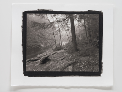 Carl Weese, Steep Rock, one of the two platinum prints we have
for sale until this evening.
-
By Carl Weese
I’ve been watching the progress of digital negatives for contact printing, mostly from the sidelines, since the mid-'90s. For me, the premier distinguishing characteristic of, “The Platinum Print” comes from my use of large- and ultra-large-format (ULF) camera negatives to make contact prints with a rich, smooth, subtle tonality. For years I’ve told students that if you want the eye-popping, crunchy-toned brilliance of West-Coast-style silver prints—make silver prints. Or now, monochrome inkjets on baryta-coated papers. Don’t make platinum prints for the presumed status, but for the inherent physical/visual character of the medium.
Early digital negatives had hardware, software, and media difficulties achieving this goal. As earlier mentioned, to get the platinum print’s full measure of tonal smoothness, the negative has to be muscular enough—in the UV light-blocking way—to produce a full-range print with no contrast agent added to the print sensitizer formula. You can get a full-range print (Dmax to paper white) from a weak negative, by adding lots of chemical contrast agent to the print formula, but it will end up with all the tonal allure of an '80s photocopy (that’s me: everyone is entitled to their own taste in tone so your mileage may vary).
In recent years, overhead transparency materials have improved in the amount of ink load they can support, while current generation printers and their pigment inksets can block lots of UV, and do it with smooth tonal transitions. So, game on.
Without doing a whole treatise, (and here is an excellent one generously provided on the web by Ron Reeder and Christina Andersen—my final approach is indebted to their method while drawing on half a dozen others along with notions, usually looking for something simpler, of my own) here is the problem and the solution.
Even the latest printers, inks, and substrates need to be tricked into making output for this purpose. You have to test the digital output in the platinum lab, back and forth, in a feedback loop until you get the results you want. You need to be able to make a good Pt/Pd print, or take a workshop with someone who can, to begin the process.
First step is to find out how much exposure with your UV source you need to get a good black through the transparency material, with your chosen Pt/Pd printing formula—this is the same as finding “minimum time to Dmax through filmbase plus fog” in silver printing.
My next step is to combine a step tablet file with a small file of a picture (see the first illustration below) that has been adjusted so that it makes a first rate monochrome digital print. If you flip and invert this file in Photoshop, then output on transparency material as is and print it in Pt/Pd, at the minimum time for a good black, you’ll get a dark gray mash of squashed tone. To trick the printer, you need to play games in the print driver to make it use as much as possible of the inks, along with black, that best block UV light. For Epson, that’s yellow. For HP, it’s vivid green. I’m using Epson, and the next step is to find another control fairly deep in the print driver called Color Density. Run up the slider, and you’re telling the print driver, “more ink! MORE!” Other printers and drivers will have similar but different controls.
The goal is to find settings that render the whitest patches of the step tablet and the brightest highlights of the picture file as convincing white at the basic print exposure. But at this point, all the middle tones will still be dark and muddy. The sensitometric curve of the Pt/Pd paper doesn’t at all match the linear ink laydown of the printer. You have to go back to the positive file and raise the brightness of the middle values using some form of curve. There seem to be as many ways to produce this curve as there are people trying to make these negatives. When everything comes together, you wind up with a negative that has enough range to make a full scale Pt/Pd print with no contrast agent, with a tonal distribution that moves smoothly from dark to light without breaks, jumps, or roughness. The step tablet is very helpful for quantifying these transitions in terms of % density, but I think the picture section is an invaluable reality check.
Some want to have a single Holy Grail perfect curve. This theoretically allows you to feed any well-adjusted picture file into the “black box” of a Batch Action and take the resulting negative through the platinum darkroom on autopilot. I prefer, and have ended up with, several different curves that I choose, or experiment with, for different pictures. The Church works with my standard Action, and prints in four minutes (on Arches Platine using an 85:15 Pd/Pt ratio), which is a bit of a safety factor over minimum time to black for the paper/formula used. "Steep Rock" needed a different Action that helps bring out subtle separations in all the delicate low values at the right side of the picture. It also prints at four minutes. If that special shadow-enhancing curve had been a bit strong, I might have found that an extra thirty seconds of printing exposure was needed to nail everything down. As long as the print ends up as I want, that’s fine with me. No reason to give up the subtle controls of the platinum darkroom to utilize along with the precision controls of digital imaging.
Different papers and different chemical formulas can make all sorts of changes in print color and tone, but the feedback loop of print driver controls and platinum darkroom printing times needs to be worked out for each chemical or paper variation.
That’s all there is to it.
Combination step tablet and picture-file test prints, with small (4x5) files of the print offer pictures.
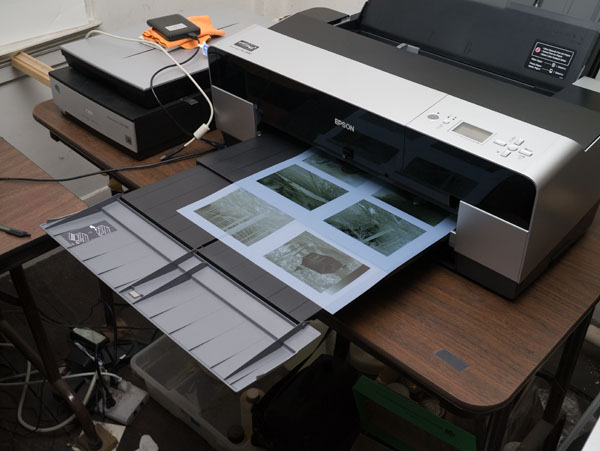
Ganged output of test negatives emerging from the printer.
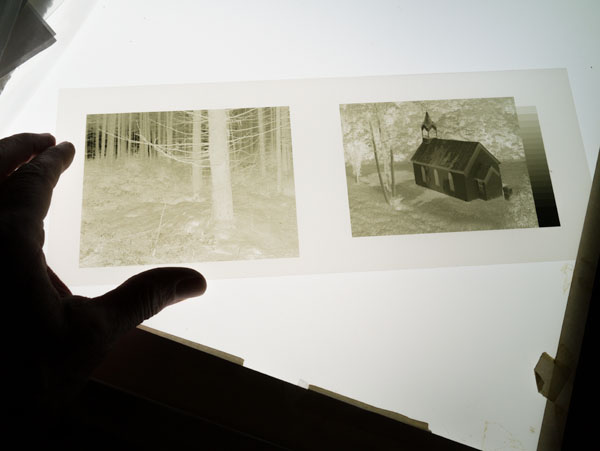
A pair of test negatives on OHP material, viewed on a lightbox.
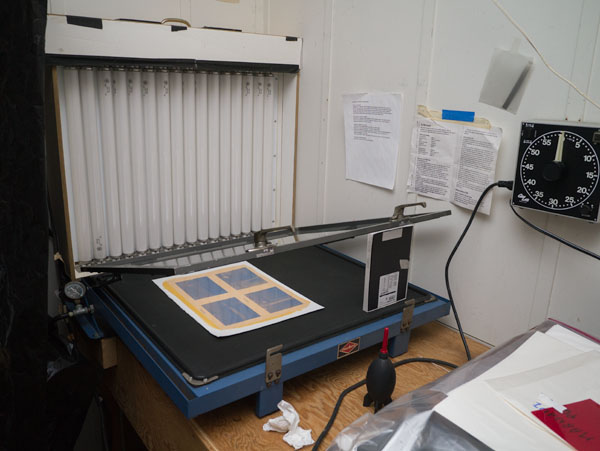
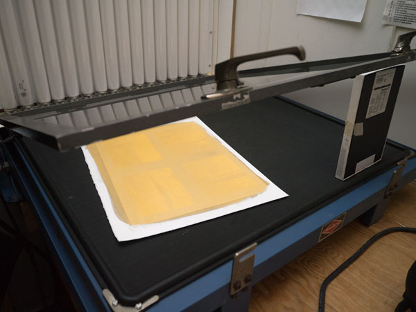
A set of ganged test files on OHP material, placed on a prepared sheet of paper, in the vacuum frame, ready for exposure.
During exposure the darkest parts of the picture “print out”—begin to form image density without development.
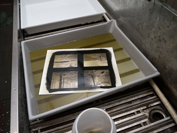
The print appears almost immediately in the developer.
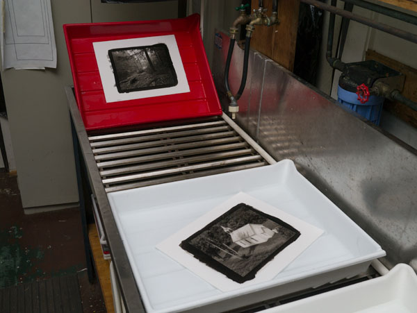
Wet processing consists of developer, water wash, two chemical clearing baths, and a final wash. Actually a simpler procedure than processing silver-gelatin prints.
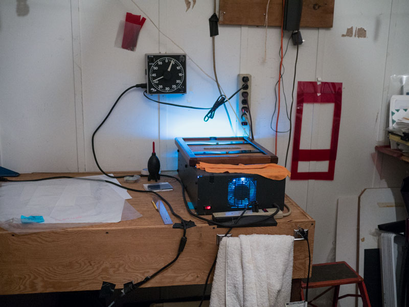
Final print during exposure on my smaller (12x15) UV exposure unit.
Carl
Carl Weese has been making platinum/palladium prints for 20 years, teaching the process for 15 years, and is the co-author of the book The New Platinum Print. He lives with his wife Bettina in Woodbury, Connecticut.
©2014 by Carl Weese, all rights reserved
Links in this post may be to our affiliates; sales through affiliate links may benefit this site.
(To see all the comments, click on the "Comments" link below.)
Featured Comments from:
Jim Hamstra: "For years I also used camera negatives from 4x5 to 11x14 to make platinum prints. When I started using digital cameras I tried several ways to make digital negatives; the best results then were with Burkholder's two negative process. It took exposure through two different negatives in a pin-registered system to get enough density. I had given up on digital negatives until a couple years ago when I saw a carbon print which was made from one of Jon Cone's Piezo negatives. Jon Cone has six or seven tone black and grey pigments that will print a continuous tone negative on an Epson printer and he has made profiles for different DR negatives. I had asked him about negatives for platinum and last fall I went to Santa Fe where he was doing a workshop as he assured me it was a simple process. I took a file that looked fine on the screen and applied a hand drawn curve to the image to adjust for how platinum shadows and highlights print. He then made a negative and a few minutes later I printed it making the best platinum print I had ever made from a digital negative. Since then I bought a new 3880 Epson and a set of Piezo inks that will print both negatives on Pictorico film and paper prints without having to change out any inks. As the process uses six shades of pigments the negatives are continuous tone not relying on dots for the shade.
"If you have never seen a Piezo negative, Carl, let me know, I will send you one of my outtakes. I have shown them to Dick Arentz and he seemed impressed with the density."


Thank you for sharing. Very informative.
Posted by: rfotofolio | Monday, 15 September 2014 at 06:40 PM
I have no experience with it myself, but I do know that the large format HP printers have special settings to print negatives, and the curves are made by measuring the positive contact print with the build in iOne device.
There are settings for printing on Platinum and for printing on silver halide.
Posted by: Eduard de Kam | Tuesday, 16 September 2014 at 01:52 AM
Having tortured myself with both Mike Ware's and the more traditional Pt/Pd chemistry for some time, I am in awe of Carl's work. I'll keep on trying... For goo prints in this medium, it isn't just the mechanics. The subject matter is very important too!
Posted by: Ger Lawlor | Tuesday, 16 September 2014 at 06:04 AM
Jim, I'm familiar with the Piezo system, in fact I did a couple days of cooperative consult with Jon back in, um...so long ago it was still Iris printing, but have followed the advances. But I wanted to find a system that would work with stock equipment. As an aside, while I love the digital prints from my HP Z3200 (and its incredible economical ink consumption) I decided to go with Epson because one reason to learn this was to teach, and if I worked out a system on the production-grade HP, who would I teach it to? The installed base is essentially all Epson, and not 24". So I really wanted a procedure that could use an Epson 3880 in stock configuration and produce results I liked. It took a while, but I got what I wanted.
Posted by: Carl Weese | Tuesday, 16 September 2014 at 03:41 PM