I'd like to solicit your advice and opinions.
My goal was to winnow the semi-finalists from this first round of submissions down to 12 or 15 photographs. This proved to be very difficult: virtually every photograph I received was excellent in some way. There were no duds. So, ever the consummate professional editor, I rose to the challenge...
...and, um, cheated. There are twenty candidates here.
I've identified the pictures only by number, to keep the photographers anonymous for now. (Naturally, semifinalists from the second and third round will be identified with 2xx and 3xx numbering.) [UPDATE: I added the photographers' names when the finalists were announced on Monday, Nov. 21.]
Remember, we're looking for pictures for a future print offer. So—anything here you would have to have if a print were offered at an accessible price?
Take your time. No need to make snap judgements. Look through them several times. Let them sink in for a while.
Don't feel you need to comment on every picture; please make an effort to make your comments succinct. Maybe just confine yourself to commenting about what you really like (or perhaps the opposite).
In a couple of cases I included titles because I felt they were needed. In one case I made the JPEG smaller because I felt it looked better than way.
Remember also that there's a person out there who took each picture, so be considerate even if you dislike something. (But that doesn't mean you have to say "nice capture" to everything.)
If we "vote" on these, it will be in a day or two—I don't want to introduce an objective measurement of popularity too soon.
So here for your delectation and discussion are the semi-finalists from the first round. Looking forward to hearing what you think....
Mike
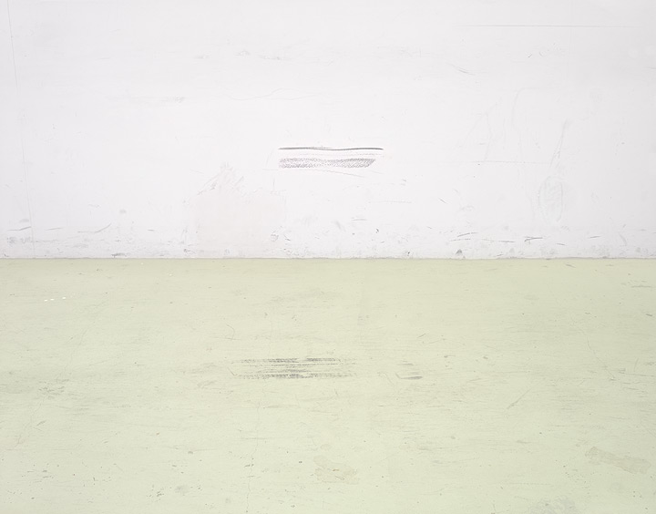 102 (title: Carpark Wall and Floor) by Leigh Perry (finalist)
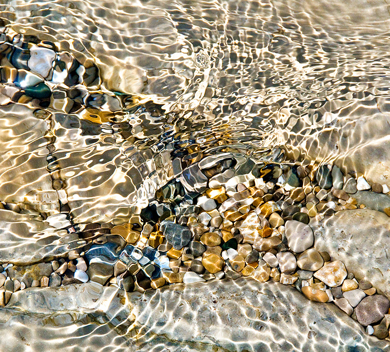 105 by Kathleen Pickard (finalist)
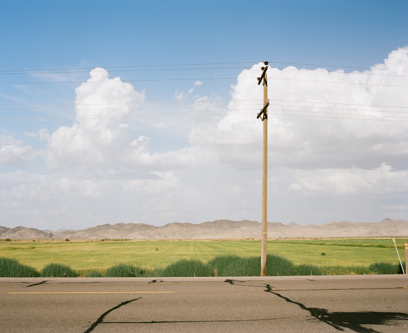 111 by Bernd Reinhardt (finalist)
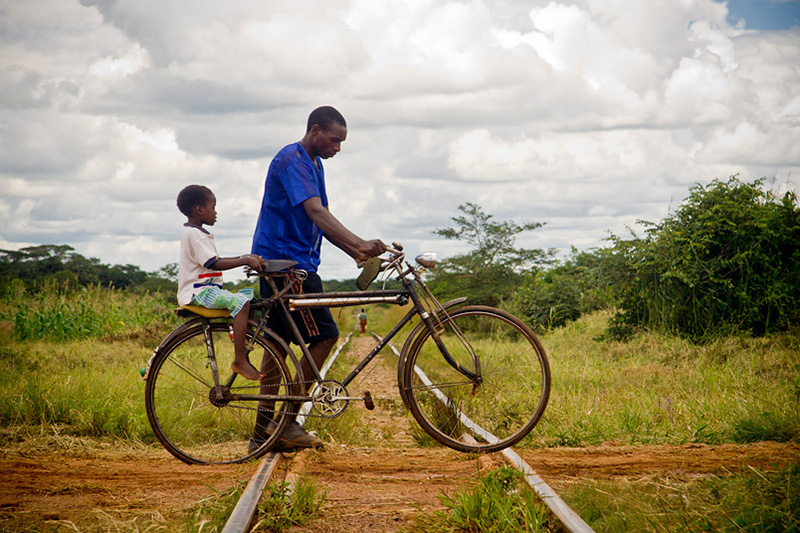
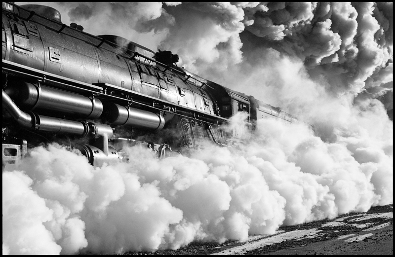 112 by James C. Tiemann (finalist)
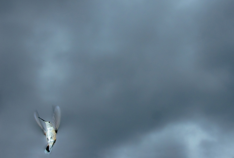
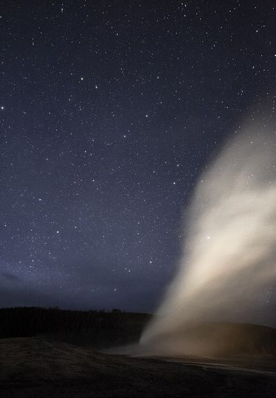 114 (Title: Old Faithful Nighttime Eruption) by Alberto Bengoa
Send this post to a friend
Please help support TOP by patronizing our sponsors B&H Photo and Amazon
Note: Links in this post may be to our affiliates; sales through affiliate links may benefit this site. More...
Original contents copyright 2011 by Michael C. Johnston and/or the bylined author. All Rights Reserved.


The comments have proved the old adage; "There's no accounting for taste." Please keep 'em coming. It's been a good read.
Posted by: Dave | Friday, 18 November 2011 at 10:01 PM
111 by far, and 118 after that.
Posted by: justin | Friday, 18 November 2011 at 10:03 PM
oh my god! What problems you have, Mr Johnston.
These images would make one awesome and fantastic show... and how could you buy just one?
Posted by: Richard Skoonberg | Friday, 18 November 2011 at 10:17 PM
My favorites:
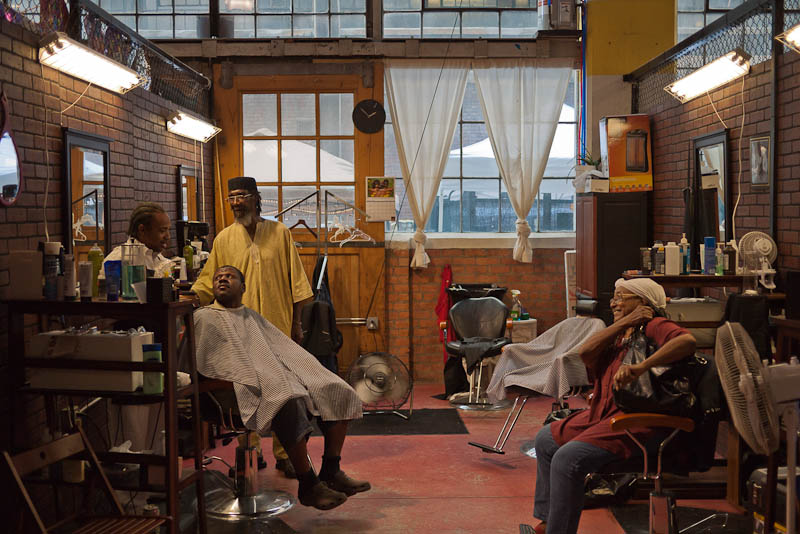
101, Barber shop, slice O' life.
105, the best, like to see this one really big, say,5x7 feet.
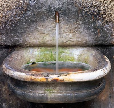
107, sink, pure simplicity.
112, Train, powerful. The sky looks a little 'shopped.
Posted by: David Owensby | Friday, 18 November 2011 at 10:26 PM
WOW! Really. Good. Work. All of them. I'm also enjoying the fact that the selection is somehow 'so TOP' --yes, even the (by now) famous/infamous 'Carpark Wall and Floor', which I'm growing to like more and more each time I go back to it--. Congratulations, and best of luck to everyone involved.
Posted by: Juan Rizzo | Friday, 18 November 2011 at 10:33 PM
#120. I would hang this on my wall in the 2x3' or 3x4' size. What attracted me was the composition and tonal qualities.
All the others are interesting but don't appeal to me (or my wall).
Thanks.
Posted by: Mel | Friday, 18 November 2011 at 10:35 PM
In the end, I always come down to two things--composition and tonal range. Most of the images here are strong on one, but not the other of these criteria. For example, 105 has excellent tonal/color range which would challenge most printers. But compositionally, it lacks impact. I feel like I've seen it before, even if it is a good example of this type of image.
The image that best exemplifies both composition and tonal range is 112. Every detail is distinct, and the composition really conveys power. It will print beautifully, particularly on a matte surface like Hahnemuhle Photo Rag.
I also like 102, but I worry that the tonal range is so compressed that it wouldn't be possible to put the detail we see on screen down on paper. You could use a pearl or glossy surface, but then the pastel color palette would be compromised. Printing on a matte surface might leave the image looking smeared.
Some of the other images are very interesting, but might not generate much interest because the subject isn't very "hangable," at least not in a home. For me, #101 is that kind of image.
Good luck narrowing these. I'm glad I'm not making the final decision.
Posted by: Greg Boiarsky | Friday, 18 November 2011 at 10:40 PM
Wow, all great pictures, and I can appreciate the skill necessary to take a lot of these. There are some very difficult shots here. And yet, when I think about what I would want to buy, there a very limited number that really rise above the others. These are, first and foremost, numbers 104 and 105. Specifically, 104 and 105 as a combo. They just scream to me as a wonderful juxtaposition.
104 is gritty, yet curvy. A colorful subject, yet reduced to lovely B&W tonality. Whether it is an analog or digital capture, it captures the B&W aesthetic wonderfully (as do 106 and 112, but they don't work as well in the combination I am proposing).
105 is smooth, glittering, sparkling, delightful color. It's the kind of picture that screams digital (whether or not it actually is) in a way that makes you feel it's energetic exuberance. If you were in the field and saw this on the LCD of your camera, you'd be smiling for the rest of the day, just waiting to get home and see it on your big screen...
I really think they would make an outstanding combo.
The other two standouts are 115 and 118.
People are objecting to the composition in 115 because it feels too perfect, but you know what? It kind of is perfect. I love the play between boundaries and also the wonderful clouds, that you don't notice until a beat later.
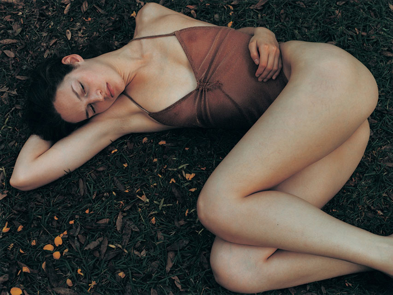
118: there are a lot of pictures out there that strive for this aesthetic, and very few come anywhere close. This picture nails it. Why? Because it isn't about sex, or trying to fake some chance encounter. Instead, it self-consciously (see choice of color palette) and effectively evokes emotions - a strong sense of nostalgia and longing, with enough reality (the faint color of her veins) to trick you into thinking this might be one of your own (false) memories...
Runner-ups: 102, 109, 111 and 119. 102 is in some ways the best of the bunch, but I don't see it winning.
Please, please, PLEASE offer 104 and 105 as a combo!
Best,
Adam
Posted by: Adam | Friday, 18 November 2011 at 10:41 PM
Congratulations to all those chosen. Fine images all.
Posted by: Eric Rose | Friday, 18 November 2011 at 10:42 PM
Mike,
Thank you for putting this on. This comment section is the best (most productive?
) discussion/critique of photography I've ever found on the web.
Scott
Posted by: Scotto | Friday, 18 November 2011 at 10:45 PM
My personal likes
#s 105,112,119
Posted by: David Herman | Friday, 18 November 2011 at 10:50 PM
Sorry. None of these do anything for me.
Posted by: Will Whitaker | Friday, 18 November 2011 at 11:00 PM
Here is my minimalist reply; 101, 107, 108, 111, 112, 114, 117. Yeah 7 isn't too minimal but these are the ones that I keep coming back too though all have their appeal.
This past year I've worked as a paid 2D art judge for two major art festivals in my local metro area. Judging is tough when work is good like your final choices demonstrate. So I know what it's like having to work through hundreds if not thousands of images in a limited period of time. In the end my choices revolve around my visceral response to an artist's/photographer's work; I didn't have time to scratch very deep or to live with the images.
My print preference would be to have the image no larger than 7 inches as the largest dimension printed on an 8x10 or 8.5x11 in. sheet of paper. I'm into smaller prints these days, particularly for my personal collection. I can mount and mat the prints and then rotate them in and out of frames in my home.
Posted by: Don Bryant | Friday, 18 November 2011 at 11:15 PM
I still think the dog one below is best!
Posted by: Rob Smith | Friday, 18 November 2011 at 11:24 PM
101, 107 & 112 are my favorites, in any order.
Posted by: joe | Friday, 18 November 2011 at 11:30 PM
The question is what I could and perhaps would live with on my wall.
# 118 but only if changed to black and white with a strong positive slide of the yellow channel. I think doing that might change at least a few who are enthusiastic yet troubled by the cut-off feet. The further enhancement that would seriously help the smoothness of the abstract flow would be to pshop out the nipples.
On the other "hand," I think the absence of one hand and both feet with the sole presence of the left hand nicely placed to
1) continue the flow
2) but also break it up naturally at a central point in the image
3) and finally to remind us this is a person
is not merely fine but is what is the center of the pix. The presence of the nipples, especially so close to the hand, distracts from this for a number of reasons.
Posted by: Dovydas | Friday, 18 November 2011 at 11:35 PM
My favourites are 101 and 111.
I rather like 102 as well.
S
Posted by: expiring_frog | Friday, 18 November 2011 at 11:50 PM
I have a rule when it comes to my own photos :
-I cull as many photos as I can - i'm my own harshest critique on my own work but then again I want to show my best in the end.
-Then I walk away for a few days - I do something else unrelated to photography.
-Then I whittle away at the fat again and again until I feel the saw is just about to cut into my emotions - that's when I stop and I know i've got the best photos.
Based on my own methodology, the only photo of this first group really worthy of a commercial print sale is 112 but with an important reservation : Only very large print would be appropriate in order to present a big sense of scale so the megapixels must be there to maintain print quality even at a base 300 dpi.
The reason why it has to be a big print in my opinion is that the viewers can have a visceral feeling that must jump back or get scalded by the steam coming from that huge long horizontal cloud of steam coming from that iron horse.
That and the fact that the tonal spread on the photo is superb - a worthy challenge for a master printer. What say you sir Ctein ?
Keep'em coming Mike - this is fun.
Posted by: Pascal Sauvé | Friday, 18 November 2011 at 11:55 PM
101 If Norman Rockwell had been black, he would have painted this. It's a terrific picture bursting with life.
102 is TO-O-O-O minimal.
105 Mosiac feel is wonderful; maybe too busy for my own wall.
107 is my personal winner; colors, texture, and symmetry make an image I can look at for years
110 is what a B&W should be; the textures and tones are compelling
112 is technically compelling (and it's a locomotive) but not sure I'd look at it for years
120 works for me, despite the slightly awkward stance of the figure. If 107 and 110 sold out, this is the one I'd buy.
These are all superior photographs!
Posted by: Bob F | Saturday, 19 November 2011 at 12:07 AM
I'd say all these are fine images in a book. Part of a select collection or on the wall maybe no. That said, my picks are:
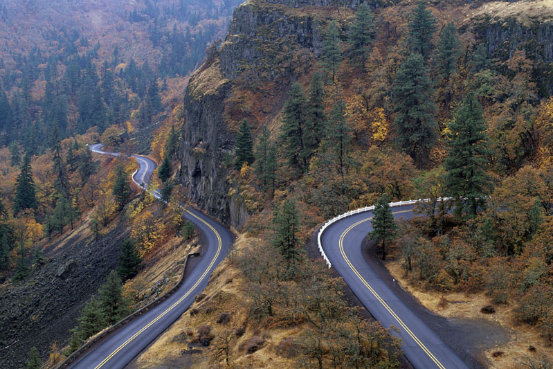
111 - the cloud forms, distant hills, forground bushes are seen well, what spoils it is the tar smear (just tar lines would have been good).
118 - beautiful tones and colour, not a unique viewpoint though and I wish her feet were included with space around the whole form.
Posted by: Farhiz Karanjawala | Saturday, 19 November 2011 at 12:52 AM
112 really does transcend its genre; I'd buy it.
I feel as if 102 is part of a complex joke than everyone but myself is in on. Maybe that is the point.
Posted by: Paul De Zan | Saturday, 19 November 2011 at 02:53 AM
My first impression was that this is a joke. After a day to think about it, my second impression is that it's an astonishingly good one.
Posted by: Timprov | Saturday, 19 November 2011 at 04:31 AM
The only one I would consider having on my wall is 102 (the car park) because it's so absurdly minimalistic. The others are all great photographs, just not the kind I would hang on my wall...
Posted by: G. | Saturday, 19 November 2011 at 05:24 AM
Now I can see them, I, unlike just about everyone else, am not terribly impessed. They're all rather too conventional for my tastes. Not something I'd want to have hanging on my wall.
Posted by: Alice | Saturday, 19 November 2011 at 06:32 AM
111 poses questions which may still be relevant in the future, so it will endure as an art print.
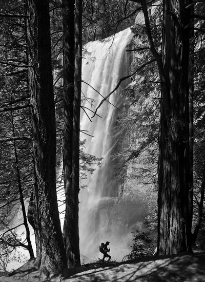
120 classic chinese landscape style. Will still be a powerful image in the future.
Posted by: IanM | Saturday, 19 November 2011 at 06:48 AM
There's not a bad image amongst them, but not many really excite enough for a print. 102 is a standout for me, with 109, 101 and 105 having something.
It will be fascinating to see what sort if photos the TOP audience respond to. Perhaps in due course if this proves to be successful, you will develop an understanding of what prints will 'fly' and be able to select accordingly.
Posted by: Simon C | Saturday, 19 November 2011 at 08:56 AM
I would rule out immediately 106, 107, 109 and 110. To me, of very little appeal.
All other make great prints, to me.
I'd buy myself:
111
114
118
Posted by: Marino | Saturday, 19 November 2011 at 09:11 AM
i forgot, i would also buy 102, but definitely NOT as a small print.
Posted by: Marino | Saturday, 19 November 2011 at 09:12 AM
Mike, pardon me for the 3rd comemnt in a row:
I especially loved yesterday's BW black cat- Abolutely wonderful small print, that would make.
Posted by: Marino | Saturday, 19 November 2011 at 09:14 AM
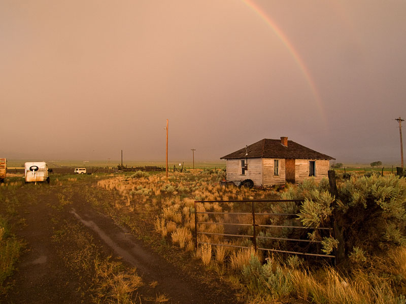
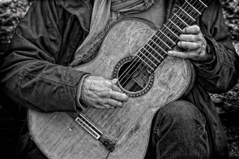
Very good mix of pictures. The choices really speak to your experience. I'm a sucker for the texture in the guitar and the large format, color negative look of the telephone pole landscape (love to see the series by this photographer).
One question - would any of these pictures have been included in your periodic "Random Excellence" posts? Maybe that's a source for a future print offering.
Posted by: Tom Duffy | Saturday, 19 November 2011 at 09:22 AM
I keep coming back to 111. It has such a wonderful mood. It also has the kind of composition which really attracts me - simple looking at first and after spending some time with it, a more complex composition appears with the black lines on the road working with the black parts of the pole. I would buy this print!
david
Posted by: david drake | Saturday, 19 November 2011 at 09:37 AM
All impressive, some more than others, I think I will only venture a top four, as suggesting any more might make me go overboard.
in no particular order: 101, 112, 114, 120. If I had to include any more it would be an additional five, so I'll stick to just these four :-)
Posted by: MichaelLam | Saturday, 19 November 2011 at 10:59 AM
>Now I can see them, I, unlike just about everyone else, am not terribly impessed.
You're not unlike everyone else, Alice.
Posted by: Paul De Zan | Saturday, 19 November 2011 at 11:33 AM
I want to vote for the pics I like the best, but feel the obligation to TOP is to vote for those I think will be good candidates for sale.
The marketplace is unfair!
Posted by: Jimmy Reina | Saturday, 19 November 2011 at 11:54 AM
I immediately chose 112 when I first looked at these photos. As much as I liked 112 when I first saw it, I have become apathetic toward it in the last 24 hours. I keep going back to many of these photos over and over again - but not back to 112. It just doesn't interest me anymore. Maybe it is too obvious - nothing to think about - maybe just too much smoke around an inanimate object. If I had made a snap purchase, I would be really regretting it right now.
It is still a great shot, but many of the others now seem more interesting.
Posted by: Edward Taylor | Saturday, 19 November 2011 at 01:23 PM
Number 102 would be my pick.
I'd also give a shout out to 111 just because expansion cracks on highways are so under appreciated as compositional elements!
A friend on Facebook asked me why I like 102. Here's what I said.
First of all, in addition to enjoying photography I also like paintings - especially abstract paintings. Have a look at someone like Mark Rothko for example. Now, of course, many people don't enjoy abstract paintings either! But for me, my appreciation of this photograph is rooted in an appreciation of abstract art - that is art that is about form and colour without necessarily representing anything concrete (no pun intended).
So, when I look at this photograph I see it in part as a pure abstract. There are two large colour fields with various markings. In this reading, the image becomes completely flat - rather than a representation of a three dimensional space. The colours are pleasing, gentle pastels.
Now, another interesting way I can look at this photograph is that the bottom is almost like a reflection of the wall - as if the floor was light green water reflecting the markings on the white wall. This is because the biggest black marks on the two surfaces are almost like mirror images of each other.
Then, in a final reading, I see this as a literal representation of a rather mundane scene in a parking garage. But one that rewards contemplation. That is, each of those 'markings' was caused by some vehicle driving through this space - so the markings leave me with a sense of the passage of time.
So, in the end, I love it because it can simultaneously exist as an attractive abstract and a literal scene. I also like that the sense of space is ambiguous - you can just as easily see this as a flat 2 dimensional object or a 3 dimensional one.
Posted by: Eric Fredine | Saturday, 19 November 2011 at 01:52 PM
The closest among these to being wall-quality is the fountain (107) but it needs the colors softened so as to not raise the thought of "Photoshop" in the mind of the viewer
best wishes
Posted by: Greg Smith | Saturday, 19 November 2011 at 03:03 PM
Every time I look at 112, the steam engine, it looks like a photoshop paste job. Heck of a shot if it was real.
105 or 119 if I was going to have it on my wall for a while.
Posted by: Jon | Saturday, 19 November 2011 at 05:23 PM
The barbershop photo is interesting. At first appearance a snapshot, it allows for protracted viewing. It's the only one that has held up over the last few days. There is a lot of interplay condensed into the frame, but the viewer has to reach across to the middle ground to figure out what is going on. At first glance it seemed a near miss, but that may be precisely the art of making the viewer do some work to resolve the scene. I hope the print is large enough to see the interplay. I would like to see more from this artist.
The bicycle crossing the tracks also is worth meditating on. It feels like momentum has been lost momentarily as both wheels jam on the rails. Nice tension in what at first seems to be a static scene.
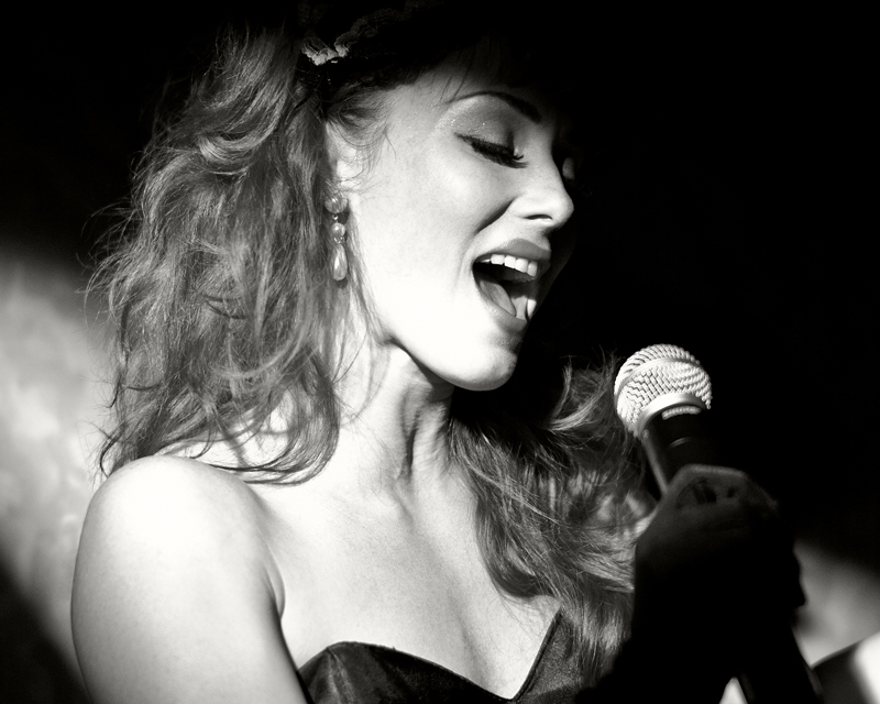
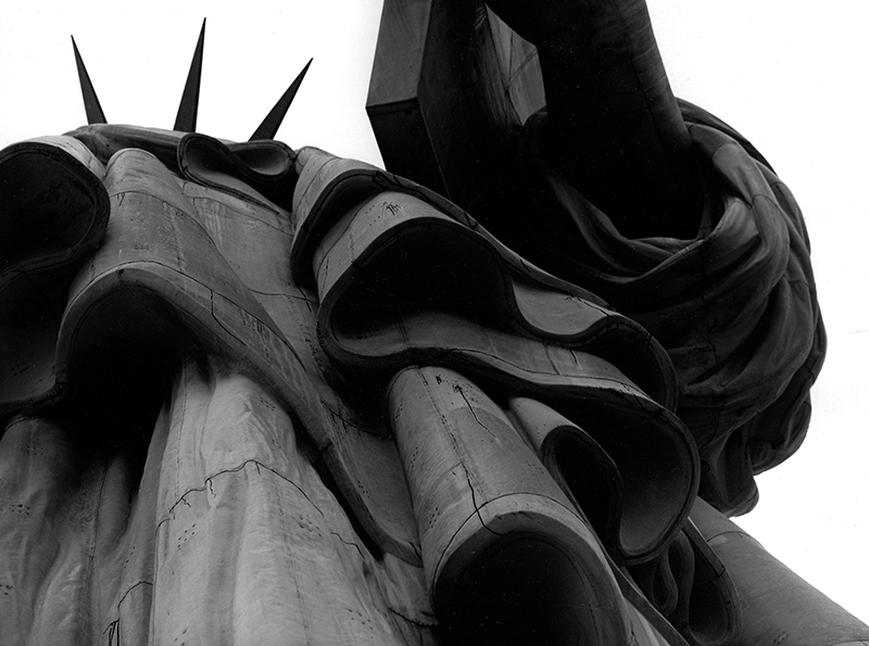
When a photo is identified as a "Gursky" by everyone or clearly snaps into a genre (b&w jazz singer, the age of steam, graphic of the Stat of Lib, tasteful/arty girlfriend snap, A.A. country) you've lost me.
I notice that nearly all of these pictures are, compositionally, quite resolved. They are centered and often calm. They don't challenge the frame or the surface--they give up their meaning at a glance. That's not what I would look for in a picture that I would live with every day.
Posted by: Ciaran | Saturday, 19 November 2011 at 06:59 PM
So if #102 wins is the price going to be 4.3 million?
Seriously I like most of these. I'd say my favorite is 119, followed by 105.
Posted by: Jack Nelson | Saturday, 19 November 2011 at 07:33 PM
Wow, wow, wow, those are good. Cograts to you for attracting such a group of readers.
Posted by: G | Saturday, 19 November 2011 at 08:26 PM
I missed your poll, but let me voice that I find 105, 109, 113 and 118 particularly extraordinary, and 119 very nice.
Posted by: G | Saturday, 19 November 2011 at 08:29 PM
112, definitely, love the power in the photo, the texture in the steam, would love to see this one as an 11x14
111 has a strange draw for me, I don't know what it is but I love the sparseness of the photo.
Posted by: John Doty | Saturday, 19 November 2011 at 09:18 PM
I especially like 103, 106, 112, 114, 120.
If I had money and had to choose just one print right now? 120. Love the "vertical energy" in this composition, love how the hiker is framed in the trees and how much of a sense of human smallness is conveyed.
I find it interesting that out of those, all but one are black and white and the color one I liked is almost monochromatic.
102 & 113 are a bit too minimalist for my particular taste. 111 wouldn't find its way onto my wall either. This isn't saying they're bad, just that I can't see them living on my wall in print form. If it's any consolation the multi-million $ Gursky wouldn't be there either.
Posted by: Paul Glover | Saturday, 19 November 2011 at 09:25 PM
101: More important than the obvious stories is that this photo depicts a safe-haven. That's worth more and more these days.
102: Minimal, brazenly unapologetic. Brilliantly composed with the scuff mark symmetry. Pure aesthetic bliss.
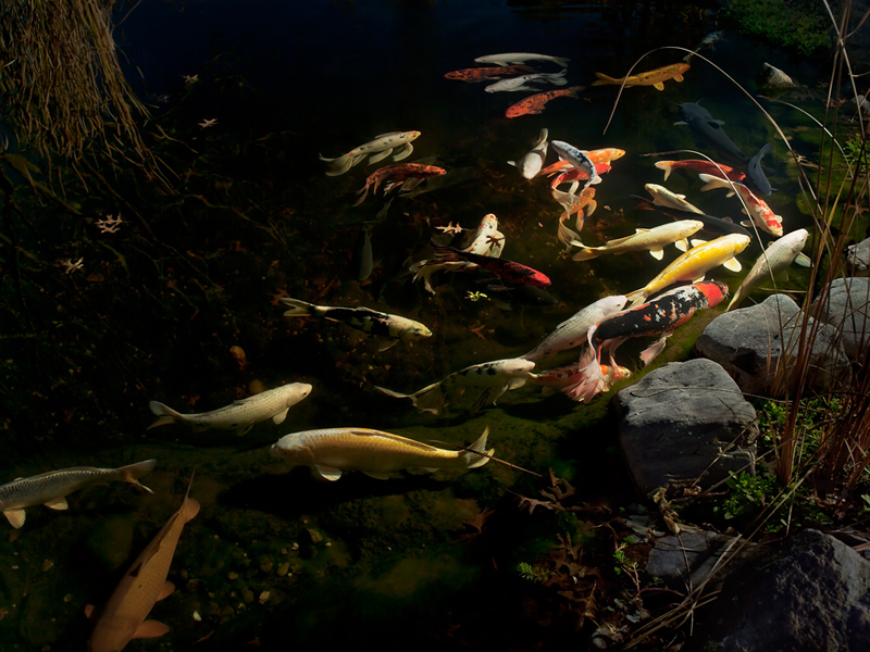
109: Unique scene and the still water gives it a strong surrealist tinge. The more I look at this one the more I appreciate it.
119: Excellent composition, great scene. Raw photography at it's finest. No bells, no whistles, no need.
I'd have a hard time whittling these down any further, they are all fine photographs. Good luck!
Posted by: Threeark | Saturday, 19 November 2011 at 11:10 PM
Guess I have unusual tastes based on the votes but there was only one that grabbed me, 109, the fish pond, wonderful depth and richness of color and tone, would need a talented printer and some good lighting I think too to be appreciated properly but even based on the jpeg I think it would be a knockout!
Posted by: Sam Murphy | Sunday, 20 November 2011 at 01:35 AM
102 and 112 for me.
The simplicity of 102, the drama of 112.
Posted by: Paul H | Sunday, 20 November 2011 at 01:45 AM
Woman Reclining would be AWESOME if her feet were not cut off, as if they were unimportant. *JUST me*, but I never understand why extremities are cropped when just a 1/2 inch more easel on the right side would complete an otherwise excellent photograph. I do love the overall tones of that photo, color, contrast, etc.
Posted by: Marty | Sunday, 20 November 2011 at 07:19 AM
101 - A frame from "Coming to America".
102 - Sugimoto cityscape series?
103 - Either part of a Virgin Atlantic ad campaign or the intended target ducked leaving the full "rabbit" exposed.
104 - So tonally manipulated that it looks man-made (highly polished woodcarving?).
109 - I think this was already done in "Finding Nemo" (the school of fish scene where they make all sorts of shapes).
110 - A guitar made from driftwood.
116 - An upskirt shot.
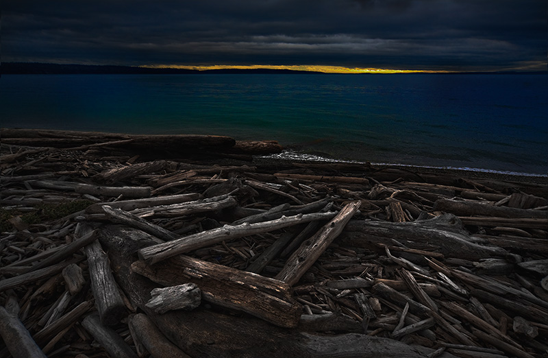
117 - The "unlit" foreground logs are brighter than the last rays of sunlight in the background.
118 - Poster image for anorexia nervosa.
Posted by: Jeff Hartge | Sunday, 20 November 2011 at 07:01 PM
Number 120.
Posted by: John B. | Monday, 21 November 2011 at 01:12 AM