I'd like to solicit your advice and opinions.
My goal was to winnow the semi-finalists from this first round of submissions down to 12 or 15 photographs. This proved to be very difficult: virtually every photograph I received was excellent in some way. There were no duds. So, ever the consummate professional editor, I rose to the challenge...
...and, um, cheated. There are twenty candidates here.
I've identified the pictures only by number, to keep the photographers anonymous for now. (Naturally, semifinalists from the second and third round will be identified with 2xx and 3xx numbering.) [UPDATE: I added the photographers' names when the finalists were announced on Monday, Nov. 21.]
Remember, we're looking for pictures for a future print offer. So—anything here you would have to have if a print were offered at an accessible price?
Take your time. No need to make snap judgements. Look through them several times. Let them sink in for a while.
Don't feel you need to comment on every picture; please make an effort to make your comments succinct. Maybe just confine yourself to commenting about what you really like (or perhaps the opposite).
In a couple of cases I included titles because I felt they were needed. In one case I made the JPEG smaller because I felt it looked better than way.
Remember also that there's a person out there who took each picture, so be considerate even if you dislike something. (But that doesn't mean you have to say "nice capture" to everything.)
If we "vote" on these, it will be in a day or two—I don't want to introduce an objective measurement of popularity too soon.
So here for your delectation and discussion are the semi-finalists from the first round. Looking forward to hearing what you think....
Mike
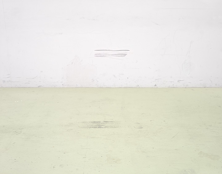 102 (title: Carpark Wall and Floor) by Leigh Perry (finalist)
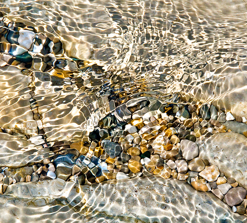 105 by Kathleen Pickard (finalist)
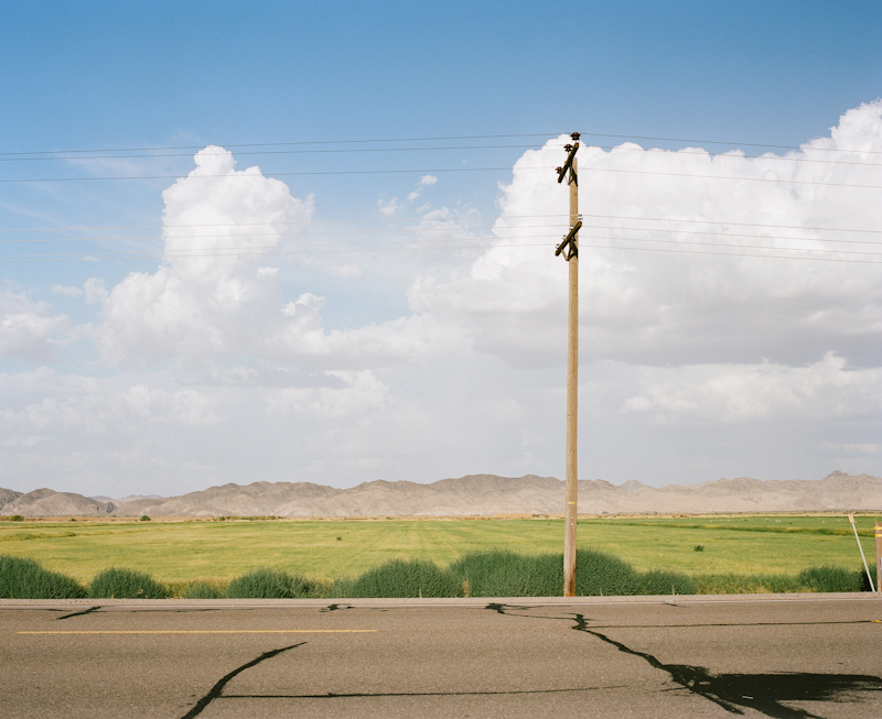 111 by Bernd Reinhardt (finalist)
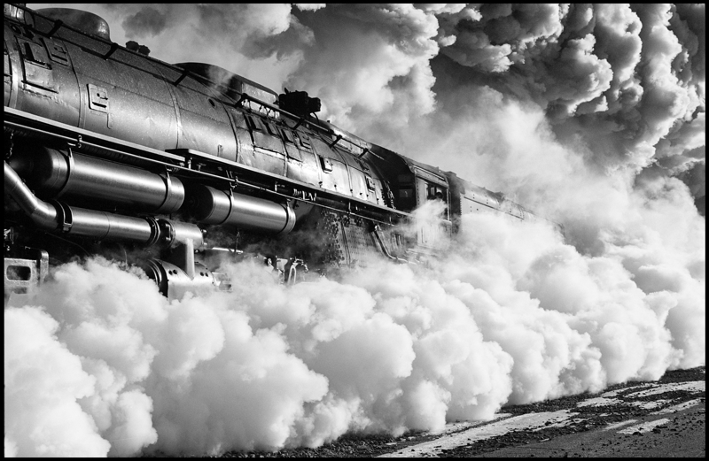 112 by James C. Tiemann (finalist)
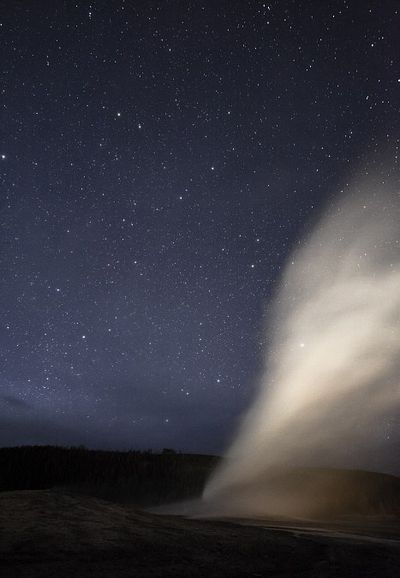 114 (Title: Old Faithful Nighttime Eruption) by Alberto Bengoa
Send this post to a friend
Please help support TOP by patronizing our sponsors B&H Photo and Amazon
Note: Links in this post may be to our affiliates; sales through affiliate links may benefit this site. More...
Original contents copyright 2011 by Michael C. Johnston and/or the bylined author. All Rights Reserved.
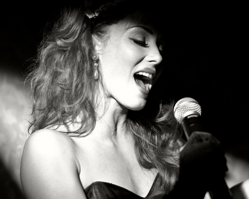
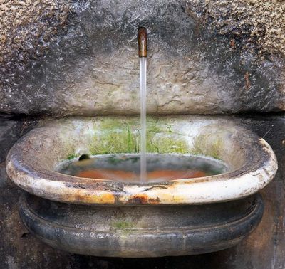
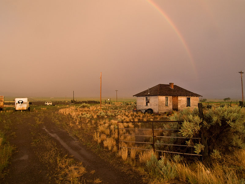
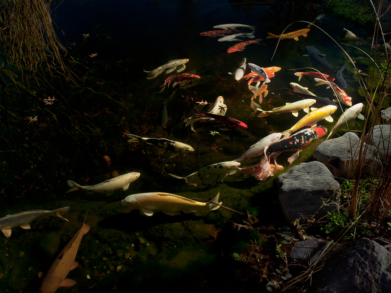
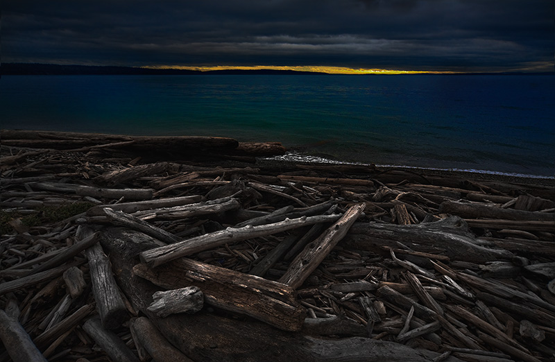
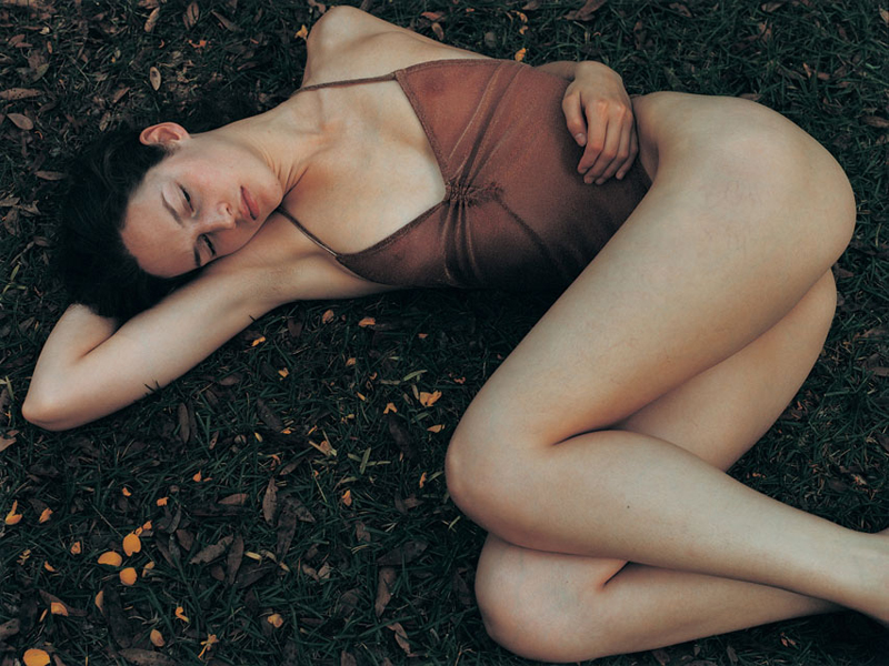
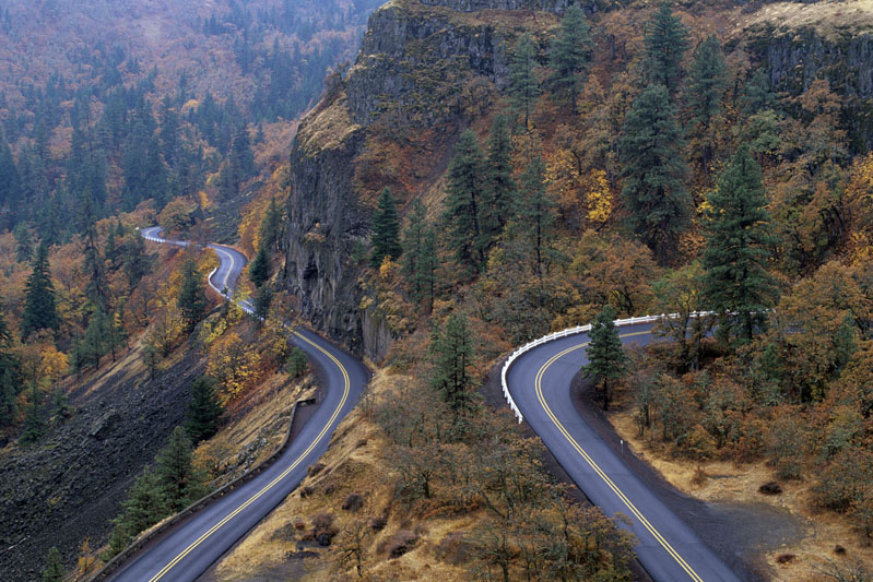
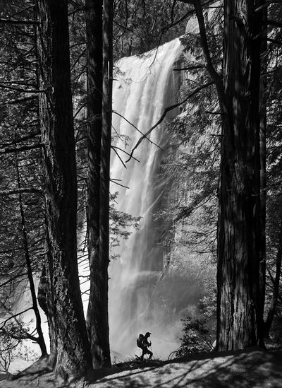


Oh, I forgot - my favorites are: 101, 112, and 118 (even though I think I wish the feet were there). 113, 117, and 119 are my second choices.
Other comments - I think 101 would probably be a better print if it weren't too large and I think 118 may have limited appeal because it is a photo of a person who is not famous and not the buyer's family member. I have learned that some people do not want to hang such photos on their walls.
Ed
Posted by: Edward Taylor | Friday, 18 November 2011 at 12:07 PM
Difficult choice. In the end it is all about personal taste.
I'd go for the first. It's a "slice of life" type but strangely perfect. Every element is right, falls into place: models, colour, movement, light,composition, props...
Second choice would be 111, an image I'm sure I would enjoy looking at today, tomorrow and in 10 years. Simple but deep and moving.
I don't enjoy overprocessed images. There is also a couple of too "cliched" b&w image for my taste (but they are the Ikea best seller type) and there is something that makes me feel uncomfortable in the picture of the girl. 113 and 114 are beautiful and awesome technically, I just don't dig them as much. 115 is great, awesome, beautiful but there is a sadness to it that makes me doubt I'll like to see it hanging from my wall. I am sure 102 and 109 would be better appreciated in print, in my monitor they are lost.
Anyway, these are all great images. Maybe next time you should envisage a "portfolio" sale... ;-)
Posted by: marc | Friday, 18 November 2011 at 12:08 PM
Wow... A great set of pictures.
101 has a Norman Rockwell look to it that I like (Naturalism maybe!!!).
112 is striking... Really ! Sort of an iconic picture of the XXth century.
117 is timeless, sort of "dawn of the world" (or end)...
I guess voting will be real hard... !
Posted by: Jacques Pochoy | Friday, 18 November 2011 at 12:11 PM
As a photographer, I like them all. I can see a compelling reason for inclusion -- whether color/composition, photographic technique/texture, subject/subtext -- for all of them. If it were a matter of clicking "like" or posting a note of encouragement to the photographer, they'd all get my vote. And most of them are more interesting to me than anything marketed on 20x200 in the last year.
As a collector though, I have to marshal my resources and wall space carefully. In this light, I don't see any "must haves." My favorite is 116 because it strikes the right balance for me between tradition, technique and a subtle and novel rendering of an otherwise familiar subject. I can see it being something I would enjoy, contemplate and discuss with friends. 119 and 120 have similar appeal but I have less desire to see them as prints.
I have to say that I participate in TOP print sales as much to to support TOP and its talented contributors as anything else. A print sale is by far preferable to a subscription fee or other means of support. That said, the usual enticements are still important to me: Is it by a known artist or renowned print maker? Is it offered at a lower price to TOP readers for a short time and is normally sold for much more in galleries? Some such investment thoughts always enter into my purchase decisions.
Posted by: ryan | Friday, 18 November 2011 at 12:17 PM
There are four that I could see myself owning: 105, 106, 112 and 114. 112 is incredibly powerful--just great work. I must say that there are a few of the others that don't do anything for me, but that is just a matter of personal taste.
Rob
Posted by: Rob | Friday, 18 November 2011 at 12:29 PM
102.
Posted by: david wen riccardi-zhu | Friday, 18 November 2011 at 12:30 PM
110 or 116
Posted by: Karen Mullarkey | Friday, 18 November 2011 at 12:31 PM
A few comments.
1. Truly disappointed my image didn't make it, but it was fun thinking that it might.
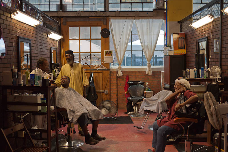
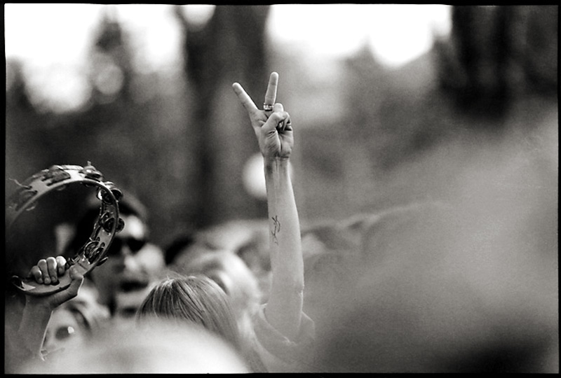
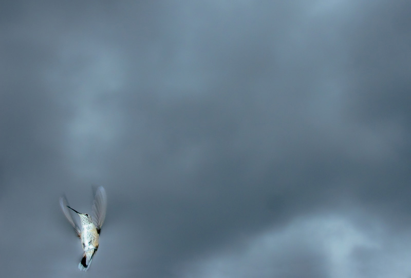
2. I would like more info on some of the images to make an informed decision (i.e. is this a print I would buy?) I am thinking of 113 - the hummingbird, was it photoshopped in to a different background, 101 where is this barbershop, 103 was this a peace rally, a protest, a country music concert? For some images context is important (to me anyway).
3. I think the review process would be easier if these images were organized in an online library (picasa or smugmug for example or organized in a web page where comments would appear immediately below each image).
Posted by: Michel | Friday, 18 November 2011 at 12:33 PM
I'm not much of a print buyer, but would love a TOP readership picture book :) 102 is intriguing; nothing I'd hang on the wall, but the type of thing I love in a book. 112 is the print I'd be most inclined to buy. 113 is amazing (though I doubt I'd hang it). 118 isn't my usual cup of tea, but I really, really like it. Most of the rest are photos I would also love to see in a book. Can't imagine the logistics of that ...
Posted by: Dennis | Friday, 18 November 2011 at 12:36 PM
My pick: 101, 113, 118, 119
If I had to choose one: 118
Posted by: Bernard | Friday, 18 November 2011 at 12:43 PM
101
I think Robert Frank was right when he said “Black and white are the colour of photography.” However, this is a pretty convincing argument for the use of colour. The interactions of the three men on the left and the reaction and placement of the arms of the women on the right are a delight, while the rhythms of the paired background shapes, both inside and outside the barber’s shop, beautifully connects both sides of the picture. Then within the overall composition are the telling details – the floating feet echoing the footrest of the chair opposite; the cross in the mirror on the right; the double portrait of the calendar, work wonderfully well. The shortcoming for me, confirming Stephen Shore’s statement that you should never have red in a photograph, is the towel on the back wall which adversely punches through the muted colours around it.
116
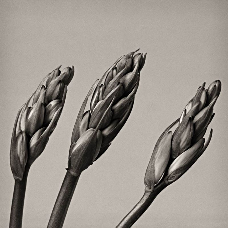
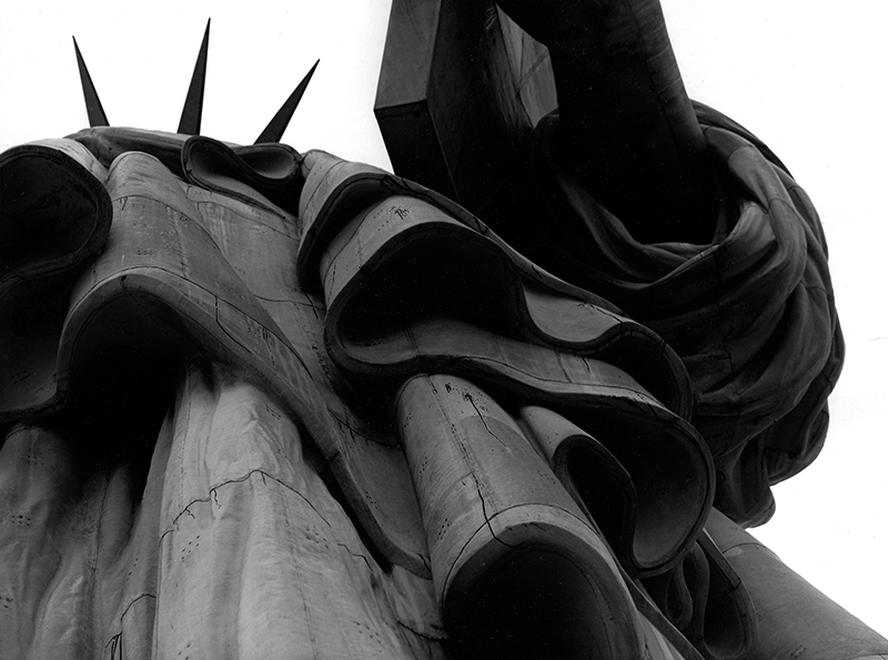
A highly effective picture of a subject that has been photographed to death. Will work well when framed and displayed, as the overall forms read at a distance, with the rhythms of the curves of the details will be revealed as the viewer gets closer.
Posted by: John Garrity | Friday, 18 November 2011 at 12:43 PM
Mike,
some of the pictures contain EXIF-data with the name of the photographer, so they're not anonymous.
Perhaps a new rule for the next turn: "Send only files without EXIF-data".
I like some of the photos, my favourite is 112.
I'd really like to get feedback on my photo. You haven't chosen it for showing here, but is there any chance I get feedback? (Probably not, because you can't do that for everybody, but I had to ask.)
Thanks for this motivating contest.
Leo
Posted by: Leo Graet | Friday, 18 November 2011 at 12:44 PM
Good choices Mike. As I think you can sense from the early comments there's something in here for nearly everyone who would genuinely want to buy.
I've no criticism of any of these images. They each appear (at least at this dinky size) well done and well conceived. But I can offer some categorical awards.
The Norman Rockwell Award: 101 (Über-classic)
The Irving Penn Award: 104 (classic, restrained and refined)
The William Claxton Award: 106 (I can smell the smoke)
The Joel Sternfeld Award: 111 (I can see the wild hair)
The David Plowden Award: 112 (remarkable)
The Richard Misrach Award: 114 (very cool)
The Carrie Mae Weems Award: 115 (an image rich with metaphor)
The Josef Koudelka Chaos Award: 116 (just proves that there's always a new view of even the oldest subjects)
And of course....
The Ansel Adams/Sierra Club Award: 120 (Über-Über-classic)
Please accept my "awards" as the salutations I intend them to be.
Congratulations to all of the preliminary winners and good luck in the next round!
Posted by: Kenneth Tanaka | Friday, 18 November 2011 at 12:44 PM
I'm not going to comment on any specific photos yet, but it is a fine selection with a good variety of photos. Congrats to all who made the cut. I didn't enter, but I hope to enter next time.
Posted by: Jason | Friday, 18 November 2011 at 12:47 PM
There are five or six photos here that I would very much like to have prints of but I will only comment on one. #112 could be stunning image if it was printed big. How big? I don't know: steam locomotive big: maybe $1000 big.
Posted by: Brian Small | Friday, 18 November 2011 at 12:54 PM
Good display of talent here! Congratulations to all the semifinalists! 105, 117, 118 are the best of the bunch in my opinion, and the only ones I'd consider for purchase. Some of the others are a bit too cliche for my taste.
Posted by: Mathias | Friday, 18 November 2011 at 12:57 PM
Clear winners in my opinion: 105 and 107. I don't care much for the other entries. P
Posted by: peter | Friday, 18 November 2011 at 12:57 PM
Tough choice; I'm glad I've only got 20 to choose from, not 600 :)
The one that stands out to me is 112; definitely my first choice for one to hang on my wall. It helps I have two young train crazy boys as well; they’d love this one even more than the Ctein “Soyuz – Apollo” that was the most recent addition to the photo collection.
After that it gets much more difficult to choose a second place. I'll cop out and give my next 3 favorites: 106, 112, 119.
Posted by: Chris Sheppard | Friday, 18 November 2011 at 12:57 PM
101 and 102 stand out to me as the most interesting and compelling and 112 and 119 as the most beautiful. 118 is a fantastic and moody portrait.
Does anyone else struggle between what you truly like and what you want to show off on your walls? It's especially tough when your wife has a say as well.
If I had a gallery room dedicated to showing fine art photography then I would choose 101 or 102 - probably 101. But, to put in a living area, perhaps 112 or 119.
Great work everyone!
Posted by: James Maher | Friday, 18 November 2011 at 12:59 PM
105 and 112 are the ones that I'd consider.
Posted by: Dave Kosiur | Friday, 18 November 2011 at 01:07 PM
Below are purely my impressions and opinions of the photos. Some I like, others I don't, and still others are neutral.
102 - Well seen and well done.
103 - too much of the blur in the lower right
105 - Nice arrangement of stones, excellent colors and patterns of light. This and 120 are my favorites
107 - reminds me of something I shot. Not that I don't like it, but I wouldn't buy something that I could have made myself
110 - too HDR-ish looking
112 - it's nice, but too much steam, IMHO
114 - wow
120 - my favorite, along with 105
The others don't really speak to me one way or the other.
121-130 - They collectively represent all the others that weren't chosen. There must be some in there that I also like :)
Posted by: toto | Friday, 18 November 2011 at 01:08 PM
I vote for 107 and 115
Posted by: Rob Spring | Friday, 18 November 2011 at 01:11 PM
Things I don't like:
113: The bird looks like it has been made brighter in Photoshop. It looks too artificial to me. And there's a dark spot in the lower right part of the image that looks like dust on the sensor or a cloned area.
117: This pictures looks somehow distorted to me, like a slighty wrong ratio. Stretched horizontally...? I also don't like the colours, they look like too much Photoshop to me.
For me, these things would be very critical in a selection for possible prints. Even if the pictures might work as a picture otherwise.
Leo
Posted by: Leo Graet | Friday, 18 November 2011 at 01:11 PM
#111 would be my pick.
Posted by: Stephen | Friday, 18 November 2011 at 01:14 PM
103.
If only the tambourine wasn't cut off... what a shame!
106.
Is it sensual? Beautiful? Painful? Funny? Oh my! It drives me crazy and I want it!
111.
I could just look at that for hours. I wish it was in my office.
Posted by: beuler | Friday, 18 November 2011 at 01:20 PM
102, 117 or 119. of those three, i like 102 the best. to me, that's seeing. nice symmetry. something so simple.
Posted by: Jake Schoellkopf | Friday, 18 November 2011 at 01:24 PM
Like many others have said... Wow!
My "three"...
#103... I love the mystery/timelessness... is this a contemporary photo (say of an "Occupy" demonstration) or a vintage photo (of a Vietnam era demonstration). If this was my photo, I'd crop in from the right to make a square image while loosing most of the large out of focus area which adds nothing to the story.
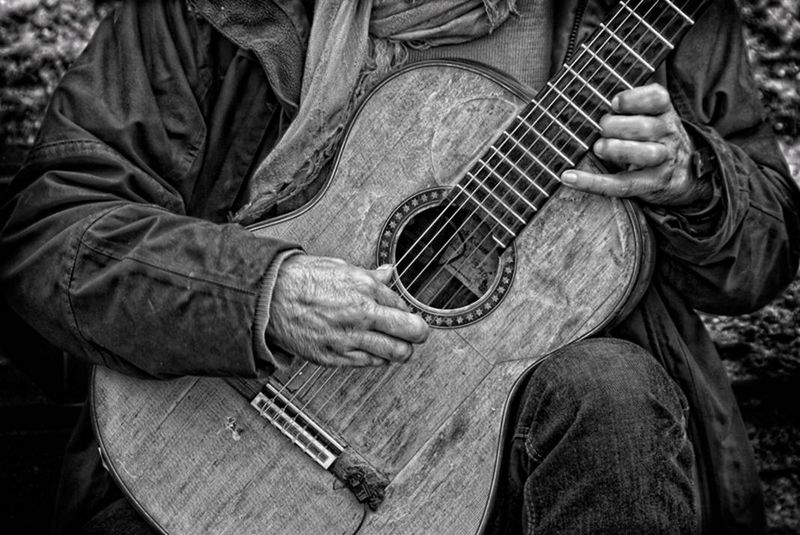
#110... love the lines and the texture... both the instrument and the player are "well worn"... one can almost hear the gritty blues.
#114... simply fantastic. A unique and rare view of an icon.
If I had a budget for such things all three would be on my walls.
If I may be permitted a fourth, it would be #112... I love the contrast... both tonally and between the hard, mechanical locomotive and soft, organic steam.
Posted by: Frank Gorga | Friday, 18 November 2011 at 01:27 PM
My problem is, we have no wallspace. My wife and I can't even display any of our own work, or most of the prints we already own. And I hate buying new prints and storing them for the hypothetical future where we might be able to hang them.
That said, I'd still consider buying 104, or 101. Maybe 109 or 113. I like most of the others, some quite a lot (105, 107, 110, 114, 115) but I probably wouldn't buy.
On the other hand, if you decided to do a TOP book and said this batch were the first quarter (say) of the images for it, I'd sign up for the Kickstarter project like a shot.
Posted by: ed g. | Friday, 18 November 2011 at 01:30 PM
#2 is Fantastic and #11 is my second choice. All have something worthwhile but I buy to hang not own and store in a flatfile. I think #1 is outstanding and could see buying it if it was part of a published series.
#2 just moves right past being "photography" and for my taste is the clear choice. I almost submitted something similarly minimalist but it was my Birthday and I just couldn't spend too much time on it.
#11 is one of those images that if printed large enough and hung in the right location would simply disappear and act as a window or portal, and I could get lost in it for sure.
First class stuff all round and I hope to have something to toss in next time.
Cheers
Charlie
Posted by: charlie | Friday, 18 November 2011 at 01:31 PM
I like 112 and 116 the most out of these, I think they would be the only photographs I'd purchase out of the lot.
112 is the only one out of them that I'd run to buy. It is incredibly striking and I would really love to have it on my wall.
The strength in 116, and the almost disorientating angle make it for me. I love the fact that it is a different way to look at a very typical photographic subject.
Posted by: Christopher | Friday, 18 November 2011 at 01:37 PM
112 and 120!
Posted by: ACH | Friday, 18 November 2011 at 01:37 PM
These are all excellent in different ways and I can understand why people thought them worth submitting and you thought them worth highlighting.
But with any photograph that hangs on the wall and is likely looked at every day, excellence is not enough. What is needed is also an element of mystery or uncertaintity - something not too plainly stated, that enables it to engage with the viewer and re-engage, again and again, and still leave you, when you are away from it, with the desire to look at it once more.
I've looked at these maybe six or eight times since they were put up and there are only two which I still feel have meanings not yet exhausted. One is #118, a composition as beautiful as its subject. How one might like to share her dreams... but, as someone has already remarked, it is a shame that her feet were not included in their entirety and, ultimately, this would irritate.
The other is #119. I couldn't put my finger on what its attraction was at first but then I realised that those two roads, setting off in the same direction and then diverging completely - one determinedly the other hesitantly - seemed such a good metaphor for so many human relations. I look at them and feel regret and also hope that maybe somewhere else, out of the frame, they might come together again. A bit whimsical perhaps but there you go.
So of this bunch, it is #119 for me.
Posted by: Len Salem | Friday, 18 November 2011 at 01:46 PM
Ha! I know who 113 is. Already have a print, though. :)
102 is my favorite of these.
Posted by: Rob | Friday, 18 November 2011 at 01:48 PM
Register my vote for 102! As an homage to Sugimoto's minimalist seascapes, it cleverly suggests the traces left by the automobile on the environment, without being heavy-handed. It's certainly the most beautiful environmentalist photo I've seen all year.
Posted by: Ben Syverson | Friday, 18 November 2011 at 01:53 PM
113 and 116 are the ones for me. Wonderful graphic statements that fit my sensibilities perfectly.
Posted by: Dan Jansenson | Friday, 18 November 2011 at 01:55 PM
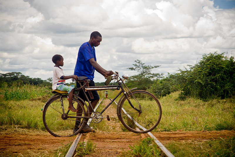
If I were considering images I'd hang on my wall, I'm partial to 110, 115, 119, 120. Of those, 110 or 115 are my faves. I play guitar and have a natural affinity for guitar images and I've been to Ethiopia a couple times and resonate with the bike + father(?) + son(?) connection there. Not sure how I feel about the figure in the distance framed by the bicycle frame. I didn't notice it at first--only saw him/her on a second look. While visually interesting and a bit of serendipity, I'm not sure it adds to the strength of the image. For me at least.
Good candidates overall.
Posted by: Michael Gowin | Friday, 18 November 2011 at 01:57 PM
111/105 - Both of these images took me somewhere, but aren't necessarily what I'm looking for in a print.
112 - Exact opposite, this would make a powerful print, but doesn't take me anywhere.
105 - Only image that both takes me somewhere and appears it would make a really impactful print.
Posted by: John Rodriguez | Friday, 18 November 2011 at 02:00 PM
I vote for #102, because it is puzzling, and for #118, because it is pleasant.
Posted by: Marcelo Versiani | Friday, 18 November 2011 at 02:01 PM
All excellent stuff. #102 might be the kind of photo I'd hang on my wall, but I'd have to see a print to be sure of it.
Posted by: Steve G, Mendocino | Friday, 18 November 2011 at 02:06 PM
Ok, after going to bed and looking again:
101: too "idealized" for my tastes, but nicely seen moment if not posed. Norman Rockwell indeed. Personally, feels strangely out-of-place given the prevailing social trends/economic climate of my country, the USA.
102: Very clever. This one I might buy a print of just to remind me to be more aware of my surroundings.
103: From an event photographer's perspective, this feels too familiar to appreciate.
104: Nice lighting and composition. An attractive photograph, but has no mystery or discovery for me.
105: Attracted to this one last night, but the novelty has worn off this morning. Not sure why.
106: On my calibrated monitor, the tones to the left of the chin on her jawbone appear too bright for my tastes, and it consequently distracts me.
107: personally don't like HDR or the subject too much. It's subjective.
108: I guess this may be one of the reasons I'd be a lousy photo editor. The "story" seems vague to me, but this doesn't add mystery in this case.
109: Like the lighting on the fish, very nice. I yearn for more abstraction in this one. The bright rocks are too dominant and the tree in the background give it a sense of reality I just don't care for. I want koi and blackness. Feels like it was taken in the lagoon of a hotel in Hawaii.
110: Nice timing with the hand placement. I like the composition. The face of the guitar, it contrasts nicely with the dark clothing and the man is a false subject here for me--the guitar is the subject. I can appreciate that trick. Ultimately, I wouldn't order it because while it is technicaly excellent, it doesn't inspire me.
111: I get the themes. My wife does not. I see a similar scene a lot in California's Salinas valley, the southern Central Valley and other places. Pass.
112: Drama. The geometry of the composition is wonderful. I like it a lot. I might buy a print of this. Although the clouds in the upper right seem a bit HDR and too dark. Did I mention I strongly dislike HDR?
113: Feels like an "achievement" photograph. Not enough detail or abstraction
to sustain my interest.
114: Great idea. The terrain's skewed horizon (not saying it is tilted) is distracting. Also, I want to see more spray, feel frustrated that I can't see more of the plume. In other words, I really wanted to like it but don't. Would love to see this subject in b&W ala Michael Kenna.
115: Clearly more to me than just a travel grab shot. There is great internal tension here and a story. Might buy a print.
116: My favorite. Iconic. The tonality is excellent. If I can afford it, I'll buy a print. I am also an American, so this photo probably has more appeal to me than others.
117: Can't appreciate this. Seen this before, taken photos like this before. Seems a little too photo illustration for me.
118: Interesting photograph. Not to my tastes for a print, but I appreciate the artistic choices here.
119: Great composition, very atrractive photo. Attracted to this at first, then lost interest, to no fault of the photographer. I just feel that I this reminds me of car advertisements, of which I already see to many of, and that takes the joy out of this photo for me. But I guess that is a complement as well--it could be used in an advert.
120: this is Yosemite right? A little of Ansel in there. I hiked the JMT, so this has some appeal for me. Like someone mentioned above the pose seems to0 idealized--but I'm not sure the image would work otherwise. Wish the hiker was a complete silhouetted. Really interesting to me as it mixes genres-- B&W landscape and editorial. Ultimately, I want more drama in a scene like this to retain my interest. I want the natural landscape to be more beautiful.
Ok, 102, 112, 116 are the photos I would consider a print of.
Posted by: Mike | Friday, 18 November 2011 at 02:10 PM
As 114(Old Faithful) brings me back to a very treasured moment at the most beautiful place on earth, um, yes. Please please please please! 108 and 101 are also strong. A lot of great images - for the images not selected, would the artists be made public afterwards, so we could at least have a second chance to acquire our favorite?
Posted by: Rob L | Friday, 18 November 2011 at 02:22 PM
They are all lovely but my favorite is the dog by Paul Lalonde Stern. I don't think the dog is either happy or sad. I suspect he is just topping off the pool.
Posted by: Mike Plews | Friday, 18 November 2011 at 02:28 PM
Having though about it 105+112.
Not sure if I'm in a position buy though as I'm looking for a house at the moment.
Posted by: Bill Hughes | Friday, 18 November 2011 at 02:28 PM
Oops, my bad! In my post above, I transposed the numbers---it's #102, not 101, that gets my second vote, after 109.
Posted by: tex andrews | Friday, 18 November 2011 at 02:29 PM
My favorites were: 101; 107 and 117.
If I had to pick just one, it would be 101. I enjoy the feeling of a place and time that I can 'put myself into.' Aside from the barber, I can place myself into the other positions - getting a haircut, being a friend who's just hanging out or waiting for someone in the barbershop. At least that's how the relationships seem to me.
Having lost two family members this summer, I may be biased toward this slice of life.
Posted by: Paul Van | Friday, 18 November 2011 at 02:32 PM
105 is a beautiful abstract and would make a wonderful decorating piece for anyone. 110 is wonderful, even if I can't see hanging it in my own home, I think it would be popular. 112 simply takes my breath away. I would hang it tomorrow! 116 is similarly impactful and graphic. Abstract yet instantly recognizable. A sure seller!
Posted by: Frank | Friday, 18 November 2011 at 02:32 PM
Interesting to see the spread of opinions. It seems like every image was equally loved and panned by various people. There are a couple I would like to see in print, There are a few I would not have selected.
You do have a tough job ahead...
PS I too would like to see some of the also-rans, or maybe a link to the various photographers website.
Disclaimer, I submitted an image, but I agree that there a few here with broader appeal, and potentially better sales potential.
Posted by: Alan | Friday, 18 November 2011 at 02:38 PM
#102 jumps out as the one that I would buy, must have something to do with my love of Rothko. #111 speaks to me as well.
I'm still planning to take Mike's advice to let them all soak in for a while.
Posted by: Kusandha Hertrich | Friday, 18 November 2011 at 02:40 PM
I still cannot decide between 101 and 112. I like mostly pictures of people in action, and mostly color, but with 112 I sort of feel the noise and the smell of the machine. With 110 I'm sure I'll keep on wondering about the secret face of the guitar player.
Posted by: Roberto C. | Friday, 18 November 2011 at 02:45 PM
They are really all quite good. I think the ones I find myself coming back to the most are 102 or 113. I'd have to spend longer looking at them to sort out whether that "keep coming back to" was likely to translate into a purchase.
I also really like 104, but in a "I have a weakness for that kind of photo", which, again, is something that I'm not sure would yield a purchase, but might.
Another way to say this is that I enjoy 104 more than 102 or 113, but that i admire 102 and 113 more, and find them more distinctive and memorable. (Of course, they're both representatives of large genres too, but, for me at least, they stand out within their genres a bit more.) I suspect that, for me, that sense of distinctiveness is more likely to translate into a purchase than a general level of liking, because it's more likely to lead to a sense of the purchase opportunity being a unique non-repeatable kind of opportunity.
Posted by: Benjamin R. George | Friday, 18 November 2011 at 02:46 PM
I'm SO glad that I don't have to make the decision!
Prints that I would buy:
101 Barbershop. Would have to be largish.
102 Carpark Wall
111 Road with telephone pole
112 Locomotive
116 Statue of Liberty
If I had to pick three: 101, 102, 112.
I think I've seen the series that 109 (Goldfish Pond) belongs to, and there are others that are better; closer up, more fish color, more movement, less black.
105, Stones under ripples, is a perfect execution of an idea I've seen before. Wish I'd taken it, but wouldn't buy it.
120, Waterfall Hiker, really looks like it was taken in the 1940's. That's a GOOD thing, I quite like the picture, but probably wouldn't put it on my wall.
Don't think there are any here that I wouldn't be proud to have taken.
Posted by: Paris | Friday, 18 November 2011 at 02:48 PM
Jan writes of 102: &lsuo;If you need a title to explain what it is, it works less for me.’
My position is generally that the viewer being unable to correctly identify the subject is, ceteris paribus, a sign that the photographer is doing something right.
Posted by: Benjamin R. George | Friday, 18 November 2011 at 02:48 PM
I hate to say it, but the dog from the last post is still my favorite. But of this group I like 111 the most.
Posted by: Robert S. | Friday, 18 November 2011 at 02:58 PM
#118 stopped me in my tracks. Just beautiful.
Posted by: Daniel | Friday, 18 November 2011 at 03:07 PM
Wow! What amazing submissions! No wonder why you had to 'cheat' and show us twenty... :)
The interesting thing for me is to visualize what they would look like hanging on a wall. Not all photos lend themselves to it, and though all the images here are wonderful in their own right, it still comes down to 'hanging on the wall'
In my opinion the images best suited to this are - (listed in the order they appear...)
102 104 109 112 116 119
Posted by: Jim in Denver | Friday, 18 November 2011 at 03:09 PM
Well, I already have #102 on my wall... oh wait, that rubbed right off!
;)
But seriously, 105, 107, and the "painfully epic" 112 would be well worth the print offer if they looked as nice on paper as on screen...
Posted by: MarkB | Friday, 18 November 2011 at 03:15 PM
I am drawn to 111.
112 is a photoshop masterpiece, but I don't like it
-Hudson
Posted by: Hudson | Friday, 18 November 2011 at 03:33 PM
102 breaks all the rules- without all that much to break them with! Hypnotized by its eloquent, well aligned, ultra sparse minimalism. Also like the more reassuring 111- puts me right in the driver's seat (better yet, the passenger's seat where I wanna be)..
And transitioning from ultra cool to resonating warmth, 118 is quite the sight to behold. Mesmerating in its classic lines and curves that are somehow slightly off kilter- enough to breathe life into it and make it fresh and vital.
Posted by: Stan B. | Friday, 18 November 2011 at 03:37 PM
My top two choices are 110 (classical guitar) and 112 (locomotive). I would purchase either one in a heartbeat. I would also seriously consider 113 (hummingbird).
Posted by: Brian | Friday, 18 November 2011 at 03:39 PM
105 is really really nice -- I would buy a print!
Posted by: Vivec | Friday, 18 November 2011 at 03:42 PM
Thanks, Mike. This was an instructive exercise.
These are all excellent images, in a mass-appeal kind of way, which I guess is what one wants for a print sale. Most of these would make nice postcards or greeting cards, and I say that without prejudice one way or the other. I hope stock photo agencies are taking note.
Having said that, and while I understand that this particular purpose favors certain kinds of images, I couldn't help being a little disappointed at the general lack of strong emotional content and/or strangeness. But that's just me. So I look forward to the "best of the rest" editor's picks!
103, 104, 105, 109, 111, 112 look like prints I could enjoy having, though at varying sizes from postcard to huge.
In several I sense the potential for some level of emotional relationship (punctum? -- purely a personal response, of course): 101, 111, 112, 115, 118.
Hey, it just struck me that this exercise could make for interesting psych profiling!
Posted by: robert e | Friday, 18 November 2011 at 03:47 PM
I zipped down them at speed. It didn't take more than a moment to know whether they grabbed me.
I like
101
105
106
111
112
and 101 is my favorite, by far.
Posted by: David Bennett | Friday, 18 November 2011 at 04:04 PM
101
Posted by: Bob Rosinsky | Friday, 18 November 2011 at 04:04 PM
Wow.
#1 - 112
#2 - 101
Great work!
Will
Posted by: Will | Friday, 18 November 2011 at 04:07 PM
If I had the space on the wall - 101 and 119.
I love the atmosphere and narrative of 101 - it's like an entire novel expressed with a single shot. Colors and light are absolutely beautiful. Also, high ceiling brings to memory old Renaissance paintings strangely enough, capturing ones attention in a similar way.
119 - I find the drama, mystery and allegory of two roads irresistible. The beauty of surrounding mountains and color palette are really appealing as well.
Posted by: Sasha Vasko | Friday, 18 November 2011 at 04:14 PM
I would hesitate between 105 and 109. I would like to hang both on my walls because I know I will be able to live with them more than a few weeks.
But my favorite is the cat from yesterday.
Posted by: Marc Gibeault | Friday, 18 November 2011 at 04:22 PM
I could see 101 on a wall in a gallery or museum, but I don't think I'd put it on my wall.
104 is very nice. I can see this in a large print.
112, very cool. Also a wall picture.
Maybe 120 as well.
The others are good, but not really my style that I'd want to see all the time.
Posted by: David | Friday, 18 November 2011 at 04:24 PM
To me #111 looks the most like "art".... something beyond craft. Somehow that's a portfolio I'd like to see more of. Not saying it's my favorite genre, but it seems to have that I-don't-know-what. I have the same respect for 101, in a nice big size.... A lot of the rest are the kind of thing you can see on flikr or photo.net.... very acomplished but not really reaching out of cliche and into something new.
Posted by: Chris Y. | Friday, 18 November 2011 at 04:29 PM
Hi there.
I really want to look at and comment on these (to be honest, as much for myself as anything), but as a work overloaded person for the next few days, I wonder if I should start, since I can't do anything constructive until Monday. How long do we have exactly to comment?
Thanks.
Dean (rushing off to work on a Saturday- groan)
Posted by: Dean Johnston | Friday, 18 November 2011 at 04:35 PM
108 or 118 are my favourites.
Posted by: Patrick Dodds | Friday, 18 November 2011 at 04:39 PM
Nos. 111 and 112. Both are very fine; I'd buy 'em and hang 'em.
Posted by: Bruce Mayer | Friday, 18 November 2011 at 04:52 PM
Dear Mike (and authors),
#109 and #112: if the prints go that well as the jpgs do, then you've got my money.
#119: if there is a story that goes with that shot, then I'd love to order it as well.
Thanks,
Zig
Posted by: Siegfried | Friday, 18 November 2011 at 05:14 PM
I'd say you've covered a lot of the familiar photographic strategies very nicely here Mike. Great selection.
As for me, I'll go for the Edward Hopper (111).
Posted by: Stuart Hamilton | Friday, 18 November 2011 at 05:14 PM
102 please.
Posted by: Julian Simonis | Friday, 18 November 2011 at 05:27 PM
Well.
I'm not sure you need any more comments but here's my favourites -
105 - It reminds me of a Bridget Riley painting. It conveys movement and reflection and I love the mix of soft and crisp portions in the picture
112 Power, Steam - the zig zag make it look likes it moving but it was probably stationary when the photo was taken, the billowing steam makes you want to step back.
113 The bird's position is ambiguous - I'm a glass half empty person so it looks like Icarus falling to me.
Other Likes 115, 116
Very Jealous of you Mike - you get to look through 600 odd photos like these - Not Jealous of you having to make a choice though
Gavin
Posted by: Gavin McLelland | Friday, 18 November 2011 at 05:27 PM
Mike – no doubt that all these images are competent in one way or another, and with a few exceptions, they have mass eye candy appeal.
However – before I opened my wallet to purchase any of them, I’m going to ask myself:
- Do they bring any unique artistic achievement to the table? If you’re just looking for something pleasant to hang on your wall - are these better than stock images that you can buy preframed at Target for $20? Are they better than your typical Flickr Explore collection?
- Will they appreciate in value with time? Do they show promise of a budding photographic genius or some sort of vision seeping through that will convince me to take a gamble now in hope for financial returns (whether or not I like the artwork to hang on my walls)?
For me, all these images fail on either the first criteria, or the second, or both. I’m eagerly awaiting the results of the vote though, as it will provide good insight in what people are willing to buy these days.
Posted by: Nick | Friday, 18 November 2011 at 05:27 PM
I am partial to photos that show some aspect of life where friends are meeting, so 101 is a no brainier for me. The colors and multitude of details on the photo are very attractive too.
109 and 114 are interesting, especially the night photo of old faithful. Probably not a small print of that but 13x19 for example would be my choice (I do not have more space in my home).
The rest are good, but those are the ones I would like to have.
Posted by: Alberto Castro | Friday, 18 November 2011 at 05:29 PM
#102 struck my eyes like a lightning. Better than any by that digi-faker Gursky.
Posted by: Max Pasion | Friday, 18 November 2011 at 05:37 PM
I'm amazed how #s 118 and 119 are so similar in line. You could practically superimpose one on top of the other for some digital artsy thing, perhaps with a pickup truck moving along a leg.
#102 - This is exquisitely seen. Beautiful. And it even needs to say in color, as bare it is.
#112 - This is exquisitely done. I can hear it as much as I can see it.
Posted by: Tony Rowlett | Friday, 18 November 2011 at 05:52 PM
My take:
#101 is a pretty cool scene, but not sure I'd want it hanging in my house.
#102, #111 I don't get at all, Gurskys?
Of the rest, were I to have a bunch of disposable income, I would buy:
#105
#107
#113
#120
Posted by: Ciuciu | Friday, 18 November 2011 at 05:55 PM
I prefer 108, the house and rainbow; 109, the koi (fish); and 115, the bicycle over the railway tracks. I'm aware that these represent a certain aesthetic, the 'National Geographic look' perhaps. My favorite is the fish, simply because I like the colours and think it has nice abstract qualities when viewed from a distance.
Posted by: James | Friday, 18 November 2011 at 06:09 PM
As others have said, there are many fine images here.
For me, the challenge is separating what I simply like (without context) from what I would actually hang on my wall. Some of these beg for companion images to provide support and flow, but are not images that are singular enough (for me) to stand alone displayed as individual prints.
My faves are #102, 104, 105 & 112.
I missed the submission notice by a couple of hours. When the next call for entries comes around, I'll jump in myself. After all these years, my skin is quite thick...
Tom
Posted by: Tom Hassler | Friday, 18 November 2011 at 06:18 PM
102 is the only one that has a slight edge, the rest is just the average well executed decoration. (Ok - i have to admit 101 has a sympathetic positive human vibe I kind of like.)
I realize volume is an not insignificant part of the print sale, but I hope we will see print sales in the future with some photographers who are willing to take some chances.
Posted by: Niels | Friday, 18 November 2011 at 06:24 PM
108 and 111 I'd buy tomorrow
Posted by: Richard Quirk | Friday, 18 November 2011 at 06:28 PM
Each is impressive in its way, but I especially like the subtlety of 102, the passion of 106, and the power in 112.
Posted by: James Gaston | Friday, 18 November 2011 at 06:41 PM
Man, I love 111 and 112 for totally different reasons. 112 is really upfront and BIG, but I also has get a sense of ambiguity of scale from it. 111 feels so intensely comic-sad to me... and just saying that, yeah, I feel I need 111 more in my life. 111.
Posted by: Sklathill | Friday, 18 November 2011 at 06:51 PM
I really like 112 and 114.
Posted by: James Hengst | Friday, 18 November 2011 at 07:03 PM
Now it's clear why you punted. All of these are worthy of a wide audience. There's not a bad one among them; there's not even a good one among them; they're all excellent, and they make me want to pick up my camera and go outside and make pictures (pity it's dark out now...).
I want all of them. This is a problem.
If I had to choose one, I'd go with #107. As I mentioned in an earlier comment, I love those Velvia colors! Even the somewhat blown out section of the rim doesn't bother me.
The others that jump out at me are #102 ("Carpark Wall and Floor") and #117.
The ones that call least loudly to me are #108, #109 (but I can envision a beautiful print of the latter if the blacks are deep and the highlights are under control - this looks like a prime candidate for a Ctein dye-transfer print), and #118. I can't explain why these don't attract me as much as the others.
Someone has already suggested this, but I think it deserves serious consideration: a book of all the semifinalists from all three rounds (assuming the second and third rounds produce work of this caliber). Something printed large enough to let the pictures speak. Perhaps with a little blurb from the photographer for each? I have no idea whether this is feasible, but it's definitely something that, if I have any money at all, I'd buy.
Thank you for not limiting yourself to 12 or 15 photographs.
Posted by: Q | Friday, 18 November 2011 at 07:09 PM
#111
If one would photoshop-out the pole,
the grass--definitely the grass, much too organic--,
the mountains--too much commotion in the back there, it has to be straight or nothin'--,
and probably the large black patch
and cut off a centimetre from the right hand side to do away with the leftover sticks there,
hey,
it'd be a Gursky.
Although ... on second thoughts ... it ain't really level. That kinda ruins it.
Posted by: Hendrik | Friday, 18 November 2011 at 07:21 PM
Just kidding ...
#117 please, Gursky-sized, on a wall of it's own, I'd love that.
Posted by: Hendrik | Friday, 18 November 2011 at 07:23 PM
I like the Weston-like 104 and the abstract appeal of 114. Not sure if 102 has enough "punch" for a wall-hanging print.
Posted by: Mark S. | Friday, 18 November 2011 at 07:42 PM
101 - Delectable! Please tell me this was not staged! But then again what if it was, it's still lovely. But the clock! 10 to 2 - really? But great use of triangle & square geometry
102 - well ok... but I had to look at the title to get that it was a good photo
103 - nostalgia
104 - not my veg
105 - beautifully seen and shot
106 - nice teeth & eyelashes…
107 - makes me want to go…
108 - not sure there's any pot-of-gold there
109 - now if you'd have had my fish wrangler, the geometry would have been better
110 - compelling and very well processed
111 - beautifully seen and for me the best image. Why is it that sometimes the best shots are seen in the 'worst' light? So much for that rule!
112 - OTT
113 - superb
114 - beautifully executed - a technique tour-de-force
115 - nicely seen
116 - a new view! Hooray. Well done!
117 - Beautifully shot and processed. One for the wall
118 - beautifully disturbing
119 - wish I was there
120 - Nat Geo 1951 - well done
Posted by: Chris Sanderson | Friday, 18 November 2011 at 07:44 PM
No. 102 is the one that really grabbed me on first look through, but I think I'd prefer it without a title, or at least with a less specific title. And I don't think it necessarily has to be big. It immediately reminded me of Sugimoto's seascapes, which work beautifully as (relatively) small prints.
Posted by: Ian Provan | Friday, 18 November 2011 at 08:27 PM
101 - I wouldn't want a big print of it though, there is too much empty space in the middle. How big though? I'm still looking around my house to find the perfect size. This picture, though, freezes time perfectly.
116 - I have seen her in a million different ways, but I have never thought of her as so rugged or so structural. It gives her a beauty that I hadn't thought of before.
Posted by: Kosch | Friday, 18 November 2011 at 08:46 PM
101, the other seem so...how shall I say this? Commercial?
Posted by: JR | Friday, 18 November 2011 at 08:48 PM
Dear Mike,
All are superb. I might buy fine-art prints of 102, 105 and 111, which have a strong sense of "the thing itself", that I like in photography. This might be construed as boorish, but some of the chosen photos, excellent as they are, remind me too much of the type of images associated with the motivational posters one sees often in a certain type of US office or waiting room. Maybe that's precisely the point, since these are meant for a print sale.
Seeing these twenty images makes me want to see some more of each photographer's portfolio. Would it be reasonable as part of a contest/sale like this for the entrants (or some subset of entrants, such as these twenty chosen ones) to submit a set of (say, three) images?
Thanks for this educational opportunity.
Posted by: Adrian | Friday, 18 November 2011 at 09:22 PM
Dear Mike,
They are all very good photos in one way or another and I would be proud to have taken any of them. Not sure I could even.
But I get the feeling I have seen them all before somewhere. Probably in a very high quality photography handbook.
However 101 is quite engaging and 102 cutely observed. If I saw them in a gallery I would certainly look twice.
Posted by: Steve Jacob | Friday, 18 November 2011 at 09:32 PM
Actually and honestly, I prefered the dog. A tighter crop and it would be poster material!
Posted by: Steve Jacob | Friday, 18 November 2011 at 09:34 PM
101, 109, 112. Each for different reasons.
All these submissions are a definite cut above the ordinary.
Thanks for letting us look at them!
Dave
Posted by: Dave Fultz | Friday, 18 November 2011 at 09:44 PM
Most of these are interesting, although as a matter of personal taste I can't honestly say I would hang any of them on my wall. I think 113 comes the closest. I gather from the comments that 102 has some popularity, but I just don't get it; my wall already looks pretty much like that. To be honest, the one I keep thinking about is the dog you posted yesterday: as in most photographs with living things, the eyes are everything. I'd hang that one on the wall in a heartbeat.
Posted by: Arch Noble | Friday, 18 November 2011 at 09:50 PM