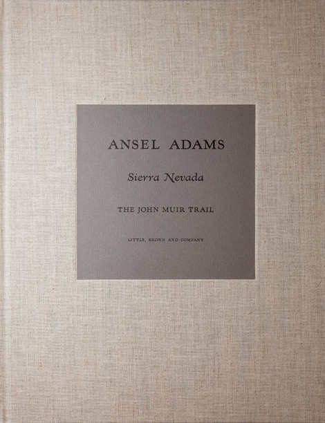
Ansel Adams, Sierra Nevada: The John Muir Trail (deluxe edition)
Little, Brown & Company, 2006
Printed at The Arion Press
$1,200
Reviewed by Geoff Wittig
Reviewing this very high end photo book is akin to an auto magazine looking at the Bugatti Veyron; most folks will never encounter one, but it's interesting to know what's achievable. As an example of fine letterpress printing and state-of-the-art photographic reproduction, this volume is exceptional. As a genuine work of art with a heritage, its qualities go much deeper; it is a lineal descendant of Adams ' best work.
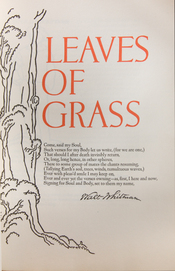
 Permit me to explain. Fine book printing is a genuine art form with its own conventions and acknowledged masterpieces. In modern form it descends from William Morris's attempt in the 1890s to rescue book printing from a debased "industrial" level. A relative handful of artisan-printers in Europe and America produced small editions of gorgeously printed books from roughly 1900 to the 1960s, though the movement was mostly moribund after World War II. A tiny number of fine art printers soldier on to this day. Among the very best were Edwin and Robert Grabhorn in San Francisco; their masterpiece was Walt Whitman's Leaves of Grass (1930). This beautiful book was letterpress printed on hand-made paper with meticulous care. The text was set by hand in Goudy Newstyle, a typeface with a distinctive personality matching Whitman's exuberant verse. It is consistently included on lists of the finest books ever printed in America.
Early in his career Ansel Adams developed a familiarity with the art and craft of book printing. From the start he worked diligently to have photographic reproductions, in his words, “as good as you can possibly get them.” In 1937, at the peak of his artistic powers, he was invited to produce a fine art limited edition book. Walter Starr, a wealthy businessman, underwrote the cost of a book on the Sierra Nevada mountain range as a memorial to his son, who had died in a climbing accident. Adams threw himself into the project, struggling for the better part of a year to get adequate photo reproductions to match the fine letterpress text printing. The final result was an exquisite work. Sierra Nevada: the John Muir Trail was released in 1938 as an edition of 500 copies, and it was immediately recognized as an artistic triumph. Good copies currently go for more than $12,000. (Yes, that’s three zero’s).
Adams also deliberately sought out the finest printers for his own portfolios. The Grabhorn brothers printed the text for his first three print portfolios. His last three portfolios were printed by Adrian Wilson, a revered craftsman/printer of the 1960s and '70s. Adams worked strenuously to achieve adequate reproduction in mass market editions. In Little, Brown & Co. he found a commercial publisher willing to meet his standards; consequently the Ansel Adams titles currently in print display nearly uniform quality photo reproduction.
Little, Brown & Co. released a new edition of Sierra Nevada: The John Muir Trail in 2006. This new version contains the original foreword written by Adams in 1938, together with a history of the genesis and creation of the original book. It displays modern, high quality reproductions of the 50 photographs found in the original, many of which have never been published in book form since. In the modestly priced ($50 list, $31.50 at Amazon) trade edition, these are printed on fine matte paper via tritone stochastic screening, which is state of the art reproduction quality. At 11.7 x 9.8" it is a pleasant size for study, and provides access to some new images for those who just can't get enough Ansel.
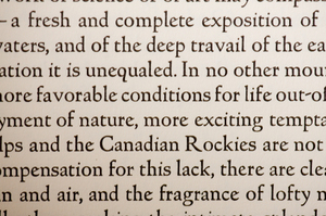
Higher altitudes The companion limited edition is on another level entirely. This edition of 500 copies is actually produced by the Arion Press, the renowned San Francisco printing house established in the 1960s by Andrew Hoyem. At 12.5 x 16.5" it is constructed of linen over board with a matching slipcase. The title is inlaid into the spine and cover. The paper is Somerset cotton rag. The individual photographs are printed on a silk-finish paper by stochastic tritone printing, then "tipped in," or glued along their top edge to the cotton rag page. The text is something really special. It's printed letterpress, using hand-set metal type which is inked and then pressed into the page. Running your fingers down a line of text, you can feel the sculptural impression. This is the method used by fine printers from the time of Gutenberg down to approximately 1970, when cheap and fast (but flat and soulless) offset printing replaced it. The typeface used is Goudy Newstyle, which was used to print the Grabhorn Leaves of Grass in 1930. And it’s not just the same design; it’s the very same metal type! Andrew Hoyem partnered with Robert Grabhorn in the 1960s, and took over the Grabhorn brothers’ historic type collection. Like other Arion Press books it displays an elegant design; margins are generous, the title page classical and restrained, the typesetting immaculate. A traditional colophon at the end elaborates on the paper, type and printing method used. You will never see a more beautifully printed book.
There are many genuinely excellent photo books for sale at fairly reasonable prices these days. Somewhere around $40 seems to be the going rate for a decent sized book with good reproductions, though recently I see that Taschen is publishing a new series of perfectly nice photo books for the bargain price of $14.99, God bless 'em. For personal study and to build a "working library" of inspirational photography, seeking out worthwhile titles is a pleasant challenge. Cruise the remainder tables and you can find really nice books for $10–$20 or less. But if you love books and have a bunch of discretionary cash, consider this: for about the price of the average name-brand ƒ/2.8 zoom lens, you can own a letterpress photography book by America's greatest living printer. It's a genuine work of art.
As of last week, the Ansel Adams Gallery was offering a deal on this grand book: for $1,250 you get the book and an actual 8x10" gelatin silver print ("Bridalveil Fall, Yosemite Valley"). This is one of the "Yosemite special edition" photographs, printed in the darkroom by Alan Ross from the Ansel Adams negative. And, yes, I bought one.
________________________
Geoff


How do these compare with the Duostone(?) process of Sid Rappaport, who printed the Paul Strand book for Aperture?
Posted by: Bill Mitchell | Tuesday, 23 September 2008 at 07:00 PM
"How do these compare with the Duostone(?) process of Sid Rappaport, who printed the Paul Strand book for Aperture?"
Bill,
Can you provide a little more information please? What book, and where did you find the name of the printer? Is there a more complete company name for the printer? Are you referring to "Tir a'Mhurain: The Outer Hebrides of Scotland"?
"Duotone" is just a name for multipass printing with different inks. Technically it implies two inks, as the name implies, but it's also sometimes used generally for three- and four-pass printing. The quality of a two-ink duotone is much better than single ink, and if done very skilfully can come close in quality to more involved printing methods. Sometimes black and white repro is made with a black and a gray plate, but more often duotones are done with black and a color, to give the picture what one might call a tone or a tint--a color cast.
Mike J.
Posted by: Mike J. | Tuesday, 23 September 2008 at 07:40 PM
I think Mr. Mitchell is referring to "Stonetone", a proprietary process devised by Mr. Rappaport (or his firm) as a means to provide the best-possible reproduction of photographs. This was in the '70s, when repro quality was mostly horrible, and IIRC that's how Ansel himself had his books printed then. I'm relying on my memory here; perhaps someone can chime in with the full story. Should prove interesting..
Posted by: Mark S+ | Wednesday, 24 September 2008 at 12:27 PM
The "Stonetone" process set was developed at Superior Printing Ink, New York City for Sid Rappaport of Rappaport Press. This special process series was only sold to Sid. He also had special black inks made containing various pigments not normally used in process or black ink production. Sid was quite a character and use to drop by our color lab on Bethune Street to work with the development or fine tuning of the ink shades for his company.
Posted by: Stephen Hicks | Friday, 12 December 2008 at 02:26 PM