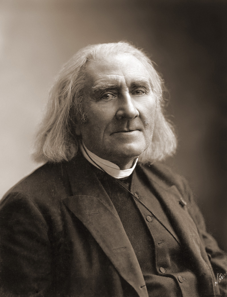
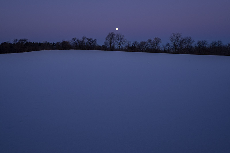
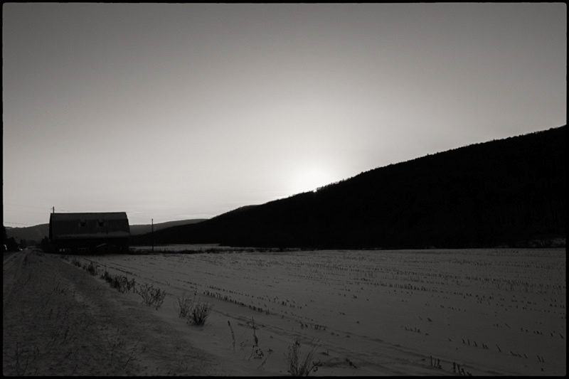
Not everyone knows how to color-correct a picture. Here are some basics.
First, you need to memorize the opposing colors. Cyan is the opposite of red, yellow is the opposite of blue, and green is the opposite of magenta. Getting that very straight in your head is the first step.
If you're not very familiar with what those colors look like, go look at them until you recongize them. You need to memorize the three pairs of opposites and what each of the six colors looks like.
Subtracting one of those color has the effect of adding its opposite.
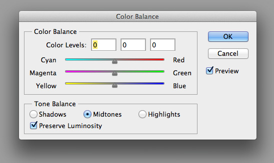
Most modern photo editing programs for digital files make all the above nicely obvious and clear by providing a set of sliders for color correction or color balance. Here's what that looks like in the editor I use:

This is nice, but remember, you need to have these pairs of colors in your head. If they're not in your head, you won't learn to know what a picture needs by looking at the picture.
So here's how you color balance a picture:
- Look at it.
- Decide what color it has too much of.
- Add the opposite.
As with most things relating to photography, you use your visual intelligence to solve problems. That is, you do things by looking. So although the three steps above are "all there is to it," there's more to it, because you need to learn to recognize what it looks like when there's too much of one color in a picture.
The way to calibrate your visual intelligence in this way is to add the wrong colors to your own pictures on purpose.
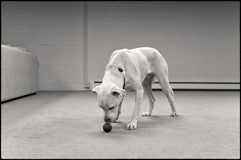
An example:

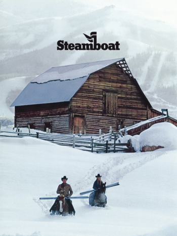
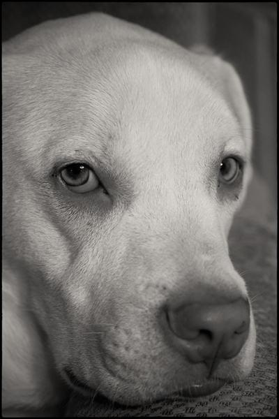
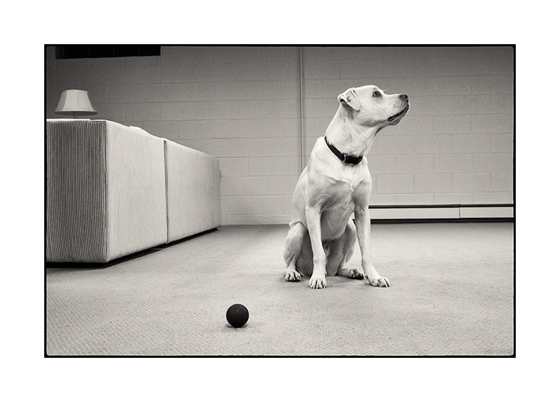
Too much blue. Solution: add yellow.

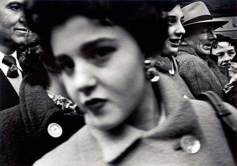
Too much yellow = needs more blue.

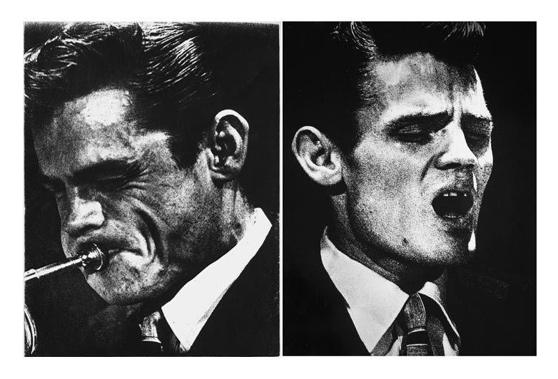
Your mind should be telling you "needs magenta" when you see too much green.

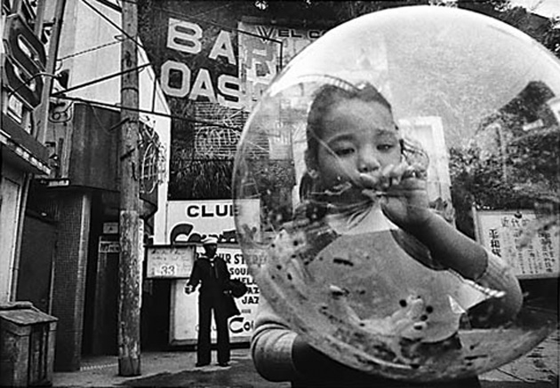
A magenta cast is usually easy to see. Add green to correct.
Now here's an interesting aspect of this particular file...

This is 20 points of added red. But there's no overt red in the picture, which brings up why it's important to try this exercise on many different pictures. When there's less of a particular color in the file, it becomes relatively more difficult to see that there's too much of that color when you look at it. It takes a little practice.
Open files, add too much of a color, and then study it, really letting yourself look at the result.
The other reason it's valuable to practice seeing in this way is that it's a good way to learn to see smaller and smaller amounts of color cast. If it's a bit difficult to recognize that the above file is too red when it has 20 points added, imagine how difficult the red cast would be to see when it's only had 5 points added. As you do these exercises, try to start with files that you think are neutral or "perfect" and then add smaller and smaller amounts of color cast, to see if you can detect what that looks like. At what point does it simply become a judgement call? At which point does it cease to really matter? Pay attention.
A tip: as is probably obvious, just as pictures without a certain color make it hard to see a cast, pictures with areas that are supposed to be white can make it easy to see color casts.
When there's no clear neutral to work from, don't forget that looking at small areas can give you good clues as to how overall color can be "off." This is also a good way of evaluating some pictures that might have a lot of light of a particular color.

This picture, for instance, has a lot of blue in it naturally—even the rider's pants are blue and the shadowed building facade is bluish—which make it easy to assume a blue color cast. By looking at the rider's face, the green grass, and the streetlight post, you can get a feel for whether there's really a cast or if that was just the light. Or, add too much yellow and then back off on it until the blues start looking right.
Here's the last picture to round out this set:

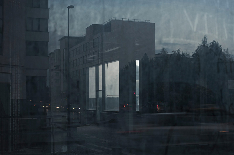
Too much cyan. Cyan is fairly close to blue visually (compare this picture to the top one), so it can take a bit of practice to learn to see the difference between cyan and blue casts.
When you've seen the "right" cast, adding the opposite color can seem sort of "magic," a falling-into-place quality, transforming the file into looking "right" effortlessly. Pay attention when that happens, so that you can recognize when it's not happening—if you're struggling with a file, trying different things haphazardly yet still not quite getting it to come 'round, it's a good sign that maybe you haven't seen it properly.
Psychological color
Our eye-brains aren't color agnostic. We're quite sensitive to green, for instance—probably the result of having evolved on a green planet—but to most people, on the other hand, more yellow just reads as richer (sun)light! Cyan and magenta are unnatural colors and look "wrong" to most people, so a little too much can be disturbing, whereas excessive yellow tends to make pictures more pleasing to most viewers. Or at least they're quite tolerant of it. Look at the iPhone picture of Xander from yesterday's "Re Cellphone Cameras" post. It's quite yellow, but still quite tolerable. You can err a lot on the side of too much yellow and not suffer for it. Some automated printers just heap on the yellow like sugar in food. Well, maybe not that bad. But it can be annoying to people who are used to evaluating color.
Here's a nice exercise that I do purely for fun sometimes: when you run across a picture on the web that has obviously, blatantly wrong color, download it and correct it. Yes, small JPEG files downloaded from wherever will not stand as much correction a full RAW files you own, but you might be surprised both by how well it works and by how well you can do. And it's good practice.
Another tip: sometimes when you think you're seeing all kinds of different casts, and it's confusing you, it can simply mean there's "too much" color. Try backing down on the overall saturation, then color correcting, then (if need be) adding saturation back in until you reach the point of sufficiency. The fashion these days is toward oversaturation, which, ironically, can make color correction more difficult.
Interpretation
I recommend that starting to practice color balancing by aiming for a neutral result—it's easiest. And work on pictures that have natural color.
Then, once you've practiced seeing deliberate color casts on your own pictures and have gotten a pretty good eye for it, you can start introducing artistic interpretation into your efforts. I'm sure you've noticed that many files have a fairly narrow range of acceptable interpretations, while others have a wide range of possible colors and hence possible effects. I have a few pictures that I think look best with color that departs from normal or neutral—or from the reality as I remember it. I also have a few files—one sunset picture comes to mind—that have so many valid interpretations it's almost confusing. these can take quite a bit of work before you feel you've really arrived at the optimal result.
When you get a difficult file (and note that a difficult file can be good as a learning opportunity), try working on it for a while and then coming back to it later when you're fresh again. Sometimes, your mind will figure it out in the interim, and the solution will seem relatively easier to find. Starting over with old files of your own work once in a while can be fruitful practice too.
There's obviously much more you can read about color theory, but remember what I said about visual intelligence—the best practice involves looking and evaluating on your own, and doing it again and again, honing your eye's ability to see and your brain's ability to understand rather than merely amassing theoretical knowledge.
Mike
Original contents copyright 2014 by Michael C. Johnston and/or the bylined author. All Rights Reserved. Links in this post may be to our affiliates; sales through affiliate links may benefit this site.
Yo. TOP's links.
(To see all the comments, click on the "Comments" link below.)
Featured Comments from:
Bryan Pollock: "When it comes to colour relationships and you want to have some eyebending fun pick up one of these babies. A great rainy afternoons entertainment. The individual colour cubes come in two pieces and are all jumbled up in the box. You have to sort and assemble each little cube and then arrange them in their proper order in the larger cube. If you think they are easy to assemble think again. The hours I spent staring at two halves of what I thought was the same colour was an eye-opener I can tell you. It really can teach one about subtle colour variations over the whole spectrum. I think there also might be something in the assembly part of the process since one is using ones eye, brain and hands to build the colour relationships."
Mike replies: They used similar tests at the NIMH labs in D.C. when my brother was an intern there—subjects were asked to arrange painted metal disks in color order (very similar to the Pantone Online Color Challenge mentioned in the comments by Paul and John). I did very well on those tests then, and I attributed it to the fact that I was doing a lot of color printing at the time (I do less well on the Pantone test now). And, no joke, I do think your ColorCube would be an excellent exercise for color photographers!
Paddy C: "Nice overview and I would do well to follow your advice and practice more even after all these years. One additional thing I find quite useful is correcting/adjusting an image until you have it 'right' then stepping away. Come back to it in a few hours or the next day and you may find your 'right' was a bit wrong."
Stephen Scharf: "Mike, thanks for the informative post. Always good to refresh how color balance is achieved by understanding the colors and their opposites. Color cast correction is very easily dealt with in Lightroom. The white balance dropper tool makes this incredibly easy to do. The dropper tool zooms in to a pixel by pixel level view and lets you see the balance of red/green/blue so you can get very close to picking an individual pixel that is very close to a target neutral, click, and you're done. I haven't used the color balance sliders in Photoshop since 2006 because of this functionality. Fuji X-cam shooters have an even easier time of this because the auto while balance on Fujis is so good that trying to find a white balance that is more neutral than what the camera finds is pretty difficult."
Mike replies: I would recommend against using the dropper tool method unless you're already very experienced. It's much better for people to learn how to understand color, which will improve color seeing with and without a camera. And the excellent out-of-camera WB of today's cameras—which many photographers simply default to, thus more or less throwing in the towel on interpretive possibilities—is why I said "a difficult file can be good as a learning opportunity." I actually enjoy finding pictures that I can't immediately figure out because I appreciate the challenge.
Hugh Crawford (partial comment): "Yikes! That's very C-print way of working. I can almost smell the blix. I certainly wouldn't use the color balance tool for color balancing. I've sort of forgotten that the color balance tool was there. I always do color balancing with the curves tool if I'm in photoshop, taking advantage of the nice black, gray, and white point tools. You can also grab the red green and blue curves individually to do the same thing as the color balancing tool does with more finesse..." [large snip; see Hugh's full comment in the Comments Section. —Ed.].
 Hugh's interpretation of the biker picture
Mike replies: You missed the bit at the very top that said, "Here are some basics." (Smiley face.)
I like your interpretation of the biker shot much better...except that now it no longer works as an illustration of what I was talking about. (Smiley face redux.)
John Sparks: "Reading your post was like looking at a web page in a foreign language. I totally understand the concept that red and cyan are opposites, but that doesn't help when I look at your examples and the one that is supposed to look too red and the one that is supposed to look too cyan are almost indistinguishable. In fact, I can only easily see two sets of your images, the warm ones (too yellow, green, red and cyan) and the cool ones (too blue and magenta and the motorcycle one). I can see subtle differences between the ones in each group but have no vocabulary for what the differences are. I have still have one of those Kodak viewing filter sets and still wonder why the cyan ones are clear.
"I worked for a year in a photo studio where a large part of my job was making color prints. No amount of trying larger changes made my eyes able to see most of the large differences much less smaller changes (except in the blue and yellow directions where I don't have problems). I could only make final color prints when there was someone else around to tell me what changes I still needed to make. At the end of that year, I could see color better than I ever had before or since, but mostly that just pointed out just how bad my color vision really is.
"I find color balance on the computer much more satisfying than when flailing around in the dark (no pun intended) of a color darkroom. My method of color balances is to take the color temperature slider and move it back and forth until the cool/warm balance looks right to me. Maybe keep it a bit on the warm side as that is generally more appealing. Some photographs never look right so I just go on to something else.
"My commercial artist wife who can look at a white wall and instantly tell what tint it has looks at my prints and she likes the color so it can't be too bad.
"Maybe I should have stuck with B&W, but, with digital, that brings up the whole toning thing which is even worse than color balancing. At least in the darkroom days, you just picked a paper and chemicals and lived with what you got.
"Your words make it sound like I just need to follow your steps, but it might as well have been written in Mandarin."
Mike replies: It sounds like you might be dealing with a deficit of some sort, in which case it would be desirable to use whatever automatic aids that technology can supply. We all have knacks for certain things and not others. And as far as B&W "toning" is concerned, bear in mind that most people can't even "see" the tone (i.e., color cast) of B&W prints when first faced with the task, unless it's made very obvious. Most non-photographers miss what we consider routine distinctions between "cool tone" and "warm tone" silver papers, for instance.
If others are dealing with similar incomprehension just because they're beginners, keep in mind that the examples here are only illustrations. What you should do is pick some of your own pictures, open them up, and play with the color controls, looking at the effect of adding and subtracting various colors. That's what will help you learn to begin recognizing the subtleties.
Dave in NM: "My first suggestion to anyone looking to have control over color balance in their natural light photos is to start out with a known quantity. Calibrate your monitor with a hardware device and create a profile for your camera (to be applied automatically at import to Lightroom or ACR) using an X-Rite ColorChecker Passport. Then turn off Auto White Balance and shoot with your camera's Daylight setting. Natural light varies greatly in both color and quality—using AWB or an eyedropper tool to achieve a 'neutral' color balance basically discards all those variations and ignores the character that different types of light can bring to a scene. A gray card in early morning is not going to be the same color as a gray card at high noon. The warm light of the 'golden hour' is going to impart an entirely different feeling than the cold green light that precedes a violent summer storm.
"By starting out with a reasonably accurate representation of the scene, rather than the camera or computer's software interpretation of what's correct (neutral grays), you're preserving the unique properties of the light that was present when you tripped the shutter. If you don't like it, you can always adjust it later. But if you don't have an objective example of what was there to begin with, recreating the essential quality of the light as it was will be much more difficult after the fact."
Jack Foley: "I was taught to remember which colors affect which with the phrase 'Red Corvettes BY GM'; that is: Red/Cyan, Blue/Yellow, Green/Magenta. Silly, but helpful."
