As I've looked through samples here and there, it seems clear that there are treatments of tone and effects in B&W that are so prevalent now that they amount to new styles or fashions. They've become a sort of new normal. For example, consider the sample from the Q2M I linked to in the previous post (see it best on flickr):
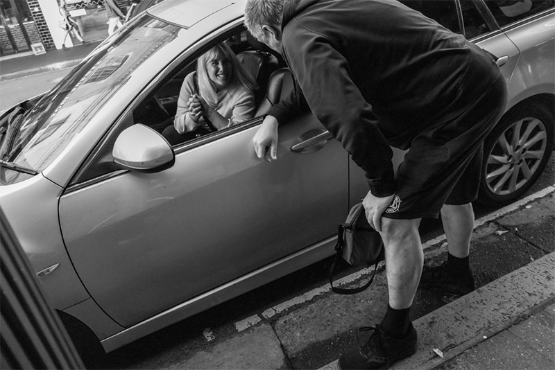
Guy Ross-Clift, Rendezvous, King Street, Newtown, 2022
There's no right or wrong way for B&W to look. I respect photographers, so I assume that photographers are presenting their work the way they want it to look. So this isn't a criticism, and I'm not saying there's anything wrong with this. It's not my picture so it's not for me to say what it should look like.
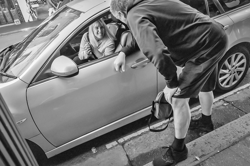
Still, I don't believe that if I were standing there I wouldn't be able to see any detail in the fellow's shoe. It looks like the light is off. I like more of a sense of airiness and a sense of light in a picture, that's all. If it were up to me, I'd print it something more like this:
I'm just modifying the small JPEG I screenshotted from flickr, and I don't have the whole file to work with, so naturally this is only approximate, meant to give you the idea. (I'm fiddling with this with Guy's permission, by the way.)
It's not helpful to think of either one of these as "more filmlike," which is a comment I often see—after all, this is filmlike, and this is filmlike, and this is filmlike. B&W film had a very wide range of expressive potential just like digital B&W does. These are just two different interpretations of this scene. I'm not even entirely sure I like mine better; either one can look "wrong" after you look at the other one for a long time! If it were my picture and I had the original file I'd probably experiment some more. I might try darkening the interior of the car somewhat and see how that works, and I might try reducing the contrast in the folds of the man's dark clothing, because that seems to be calling too much attention to itself in my version. I don't think the woman's face needs undue emphasis, however—spotlighting—because it's clearly the center of interest of the picture and the eye is going to get there soon enough without being led.
In any event, one of the things I'm going to be looking at with these monochrome sensor cameras is whether there's enough information for me to get the files to look the way I want them to look. I'm not interested in whatever the current fashion might be. I'll be wanting my pictures to be my style. Just like I did with film, and just like any monochrome photographer should.
UPDATE Friday:
Richard Parkin mentioned that I actually can upload a bigger file, so I found that. Starting there, I took another run at this. I actually made a GIF of it, but I didn't care for seeing it that way; when we look at one version of something, it has the effect of "normalizing" that rendition, and it can skew your judgement. So you have to be careful what you look at when you're applying modifications. For instance, in darkroom printing, you always start with low contrast and move up on the right contrast; if you start out with two much contrast and progressively apply less, it's much more difficult to know when you've reached the optimum amount.
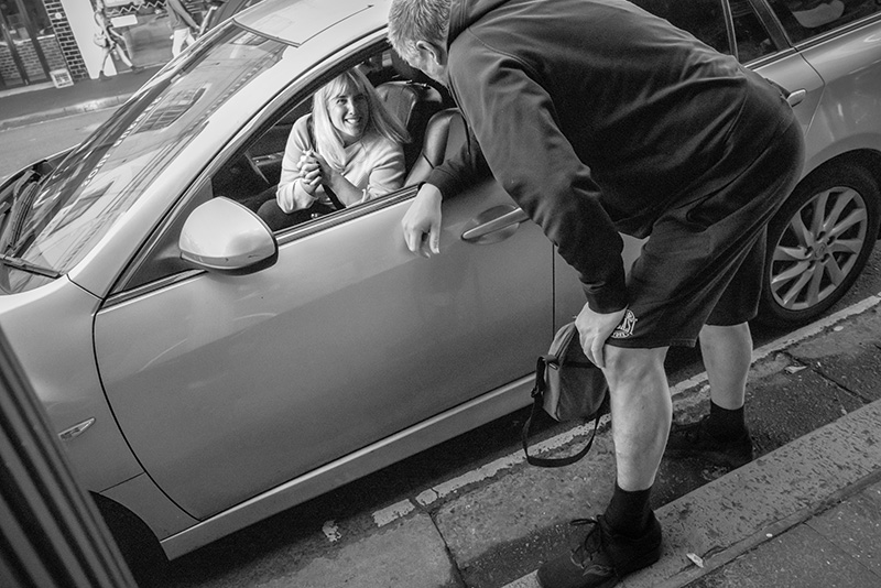
Here's my second, more serious take:
The biggest problem with the picture is that the woman is actually pretty far out of the depth of field, and there's not a lot of detail available in her face. That surprises me a bit; I would have thought ƒ/8 with a 28mm lens would be holding d-o-f better. And it would have, with grainy, less resolving film (the amount of "bokeh" depends on the resolution of the film/sensor; the greater the resolution, the more obvious it becomes what's in focus and what's not). The focus in the image is placed on the side mirror. It would have been preferable to place the focus right on the woman. But of course the scene was probably way too dynamic for that level of nicety—it was likely a fast, reactive shot. And that reactivity, don't forget, makes the picture—if Guy hadn't caught those clasped hands and that smile, he wouldn't have had this picture at all.
My Photoshop is a little maladroit, as well. I've been using Photoshop since 1994 but I still don't know much about it. What I was trying would probably be better accomplished with a layer mask, but I don't know how.
If this were my picture, this is the point at which I would make a guide print. A guide print is the first good attempt at a print; at that point you begin studying the print and letting that guide any future modifying of the file. There are times when, depending on your printing setup, you might have to make the file look a little worse in order to get what you want in the print; but the print takes over because that's the final, finished form of the work, and it's what matters.
One of my disadvantages in working on this image is that I don't actually know what the light was like, because I'm not the photographer. When I'm working on B&W, I'm often guided by the "feel" of the way the light actually was in the scene. I'm picturing sort of afternoon light on a city street where not a lot of sunlight is getting through. It's a defensible guess anyway. I think my lightening of the woman is fully believable because it's easy to assume there is light from the sky coming in through the raked windshield of the car.
Open this version and the original and place them side by side. There's actually way less contrast in my version, but it looks like the contrast is more vivid because the balance is better. The light on the man is much more realistic but his body is being de-emphasized like he is in the original (unlike my first try). And there's much more "directing," tonally, to the woman.
Mike
(Thanks to Guy)
P.S. Arnold was very proud of that picture of Bill Brandt, by the way, in the first "this is filmlike" example. He deliberately mimicked Brandt's own style, and successfully, too.
Book o' the Week
 Chromes is an edit of more than 5,000 Kodachromes and Ektachromes taken from 10 chronologically ordered binders found in a safe in the Eggleston Artistic Trust. This archive was once used by John Szarkowski, who selected the 48 images printed in Eggleston’s seminal book William Eggleston’s Guide, while the rest of the archive has remained almost entirely unpublished. Three volumes, slipcased.
These book links are your portal to Amazon. Please use our links; they help support the site.
Original contents copyright 2020 by Michael C. Johnston and/or the bylined author. All Rights Reserved. Links in this post may be to our affiliates; sales through affiliate links may benefit this site. As an Amazon Associate I earn from qualifying purchases.
(To see all the comments, click on the "Comments" link below.)
Featured Comments from:
[Thursday comments start here, before the Update —Ed.]
Albert Smith: "I'd bet that any 10 random readers are seeing 10 different things when looking at the images. No two computers are exactly matched, not to mention tablets and phone screens. The true thing would be a print, and then how the print is illuminated comes into play. For what it's worth, and I'm sure it's not worth anything, I prefer the first image. I like contrast. At least on my screen."
Mike replies: It's true. In B&W, more so than in color, exact rendition of values is of heightened importance. The only way to really "fix" the intended look of the final treatment is with a stable print. Not for nothing does the photographer sign the print—it's a stamp of approval, of saying, "this looks the way I want it to look." Anything online is just a hopeful approximation.
Rob Campbell (partial comment): "Perhaps the most pervasive trend in black/white snaps today is encapsulated in those street pix where everything dark is turned into jet black, with only the highlights having any detail. I didn’t like that much at first, then I had a go at it myself. Now, I see it as just another gimmick, an attempt to introduce interest where none really exists. There are scenes where it works, but mostly it just reminds me of poor exposure techniques."
Geoff Wittig: "Black and white photography self-evidently is all about tone, specifically the relative distribution of tones across the available range from paper white to D-max. Other concerns like grain/sharpness and subtle color casts (intentional or otherwise) are secondary.
"That's precisely why I find black and white so much fun! there are endless possible permutations in how you decide to pitch the tonality, from dark and moody to light and airy, high contrast to low, and so forth. You get to decide how to spend your tonal range 'budget.' And this is why I'm a contrarian on the subject of dedicated monochrome sensors. I could be wrong, but it looks like you're stuck with the relatively arbitrary decision the manufacturer (or conversion shop) makes regarding the sensitivity of the sensor to red, blue or green light striking it. With a standard Bayer sensor (or Fuji's X-trans sensor for that matter) you can change this to your heart's content after capture using software, such as Photoshop's black and white conversion layer.
"Back in digital's pre-history, I made black and white prints on an inkjet printer after scanning in Kodak Ektar film negatives. I had been very dissatisfied with prints from B&W negative film, though admittedly this was developed by a commercial lab, as I never tried my hand at traditional darkroom work. Starting with a color negative I could play all I wanted with the tonal balance using color filtration.
"I could be wrong, but starting with a color sensor seems analogous."
aaron c greenman: "For years now, making Leica Monochrom prints with the Piezography Pro (and previous offerings) ink system has given me immense amounts of photographic joy and satisfaction—a true end-to-end digital B&W workflow. Printed on Canson Baryta Photographique has never disappointed. Mike, I would encourage you to engage with Jon Cone for a discussion/interview, I’m sure you would find it fascinating, as would he. Jon is a real innovator in the field. What a fantastic printing system. My dream TOP post 😉."
MikeR: "Rather than a monochrome sensor, top of my photography wish list is a monochrome printer. I've seen work done with a printer converted to a carbon inkset that just blew me away. You know a print is special if in a gallery show with lots of contenders, you keep coming back to one again and again."
[Friday comments start here, after the Update —Ed.]
robert e (partial comment): "These examples and discussion so far illustrate how different BW photography is from color photography, and how malleable a monochrome image is, paradoxically as a result of a substantial limitation. And I contend that this plasticity extends even beyond post-processing and presentation, to the act of looking at the final product. It may have to do with the tension of seeing the familiar in an 'unnatural' way, and how that encourages us to question or play with the act of seeing. That tension, which sometimes shades into wonder, is inherent to all photography, but take away color and it's amplified by an order of magnitude."
Jeff in Colorado: "Highlight recovery is tricky with monochrome sensors, because all channels clip simultaneously."
Mike replies: It's the biggest weakness of digital, in color or B&W. There's a very narrow range between those glaring electronic-looking empty featureless whites and too much undifferentiated dull tone that rob the results of sparkle. (The human eye is very sensitive to tonal variation in highlights and very poor at tonal variation in shadows (dark areas). This parallels the way B&W responds, but digital is naturally the opposite. I'm not sure about this, but I suspect that one of the biggest advantages of very high-MP sensors (say 45+) is that this problem—the visual effects anyway—are easier to overcome. Some of the best high-MP-sensor pictures have very good highlights, or seem to.
Sal Santamaura: "Re 'The focus in the image is placed on the side mirror. It would have been preferable to place the focus right on the woman. But of course the scene was probably way too dynamic for that level of nicety—it was likely a fast, reactive shot.' If I were shooting this with my D810, it would have been (as always) using Live View. Face Detect AF would have had no problem finding and focusing on the woman."
Mike replies: Great point; this scene would have been perfect for face- or eye-detect AF, wouldn't it? A textbook example. However, then he wouldn't have been shooting with a Q2M then, right? Aren't "bare" sensors limited to contrast-detect AF, and therefore can't do face- and eye-detect focus? I don't know for sure, because I don't know enough about how AF works.
Stephen S.: "Face- and eye-detect work perfectly well with contrast-detect autofocus, which is why it is a feature on so many fixed-lens compact 'point and shoot' digital cameras, and in fact first appeared on them."
David Bostedo: "Re '...either one can look "wrong" after you look at the other one for a long time!' That's something I run into often in software. I'll move this or that slider one way or the other, sometimes going to extremes, trying to decide where to place some tone or brightness. And they can often look right in different ways...so I usually wind up somewhere in the middle. Which always makes me wonder if I'm just finding some average, rather than the way I'll want it to look long-term."
Mike replies: It's a problem. As a friend used to say, "careful with those sliders, Eugene"—the reference, for those of you who are not old fogeys, is to Pink Floyd's song "Careful with that Axe, Eugene."
Carl Siracusa: "While I agree with you in general that the look of most B&W photos you see these days is too contrasty, I'd argue that a more important consideration is how well the tonal balance that's been created reinforces the message the photographer is trying to convey. And how convincing that balance is as a reflection of how light behaves. In your sample photo, for instance, I would place the most emphasis on the guy leaning over the car precariously, one foot one the sidewalk and another in the street, almost straining. You should be able to see the strain in the folds of his clothes. And unless there is some particular reason to make the woman's face clearly visible, I would make it only as visible as it needs to be to convey her happiness at seeing him. Otherwise it detracts too much from him and looks unnatural. She is inside a car, after all, and the light falling on her shouldn't be brighter than the light falling on him. I personally would combine the woman in version #1 with the guy in version #3. But obviously, the photographer may have had something else in mind entirely....
Mike replies: That's interesting, and surprises me, because I think the guy is definitely a supporting actor, a secondary character, and the woman is the point of the picture. But this makes it clear how important authorship is for photographs. If you had taken Guy's photograph it would have had a different meaning, and, accordingly, you would have presented it differently.
