A week and a day ago now, we published Jim Hughes' article "Fugitive Color," a meditation around Kodachrome. In the article, Jim talked about Harald Mante's new book from Rocky Nook, Photography Unplugged , which was published last September.
Here's the U.K. link . And of course it's available from Amazon Germany—it was originally published by dpunkt Verlag in Germany.
I was in the bookstore a couple of months ago and had just picked up, flipped through, and put back down yet another of those agglutinations of purty scenics, thinking sarcastically to myself (I'm often sarcastic with myself), "Sorry, but I need photographs to have a little more substance than that." Just as I was thinking that, I picked up Harald's book and thought, "Whoops! Well, maybe I don't, after all."
I flipped through it, then sat down and looked through the whole thing carefully, then came back the next day and looked through it again.
And then bought it.
 The simple, straightforward layout serves the work.
It's true that Harald casts the book (in a brief note in the front matter) as a "Goodbye to Kodachrome," since most of the pictures were taken with Minolta cameras (as he told me in an email recently) and the famous Kodak film. But I really think that this book will appeal to anyone who works in color, whether film or digital.
Harald works in bold, elemental compositions, a strong and vivid sense of geometry and design, and, most of all, vivid and coordinated palettes of colors. This ain't Deep Stuff—the work really doesn't have a lot of "meaning" past the exaggerated sense it imparts of the joy of looking and seeing. There's a sense of playfulness, almost of fun. But I'm fascinated by the fact that the book doesn't seem to have any weak spots, and that, despite the photographer's relatively simple project, he doesn't repeat himself (much) or fall back on worn-out tricks and tropes. You won't come away thinking you've seen anything new, yet there's a lot of invention here and a surprising variety. It's consistent and strong.
The reproduction and book design are outstanding—I frankly wouldn't mind if every photographic book were laid out in a such a no-nonsense manner, one picture per page, no distractions; it simply serves the pictures. In fact, the only criticism I can muster of the book is its cover, which is somber and featureless. So many book covers are bright and inviting and promise more than the contents deliver. This cover is the opposite.

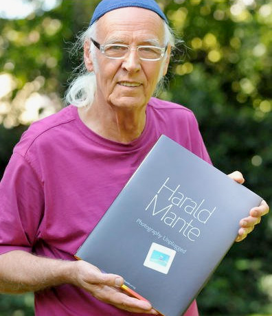
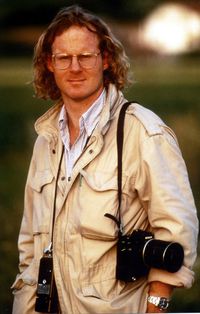
Harald Mante with his new book. Photo by Ralph Bodemer, derwesten.de
All in all, this is joyful and enjoyable. Harald Mante was unknown to me before I saw this—apparently he's well-known as a teacher and writer on photography in Germany. It's distinctive, individual, and just very, very well done (I'm avoiding the term "eye candy," but I can see how this would get to be a guilty pleasure for many). I suspect 90% of the people who read TOP would truly enjoy at least a single trip through this tour of Harald's work, and a strong majority would get a lot of enjoyment out of repeat visits. I have. Whatever kind of equipment you use, if you like strong design and clear, vibrant colors—and you don't mind optimism and an affirmative outlook—a sparkling surf without the undertow—you'll like this.
Mike
Send this post to a friend
Note: Links in this post may be to our affiliates; sales through affiliate links may benefit this site. More...
Featured Comment by
Chris Lucianu: "Harald Mante has arguably been one of the most influential public teachers on color, composition, and photography design in German-speaking countries for nearly forty years. His monthly contributions in popular photography magazines were a fixture: eagerly awaited, often dreaded. His terse style and luscious palette were often sensed as a silent rebuff: 'less is more.' A study of the width and depth of his influence would be rather revealing."
 Christoph Bangert, Sgt. Mohammed Bashir, 22, Afghan National Army, Karamguzar, Imam Sahib District, Kunduz Province