I've received another print that was damaged in transit.
Maybe I'm too conditioned by the ideas I was inculcated with in art school, followed by a fairly lucrative career marketing prints online, but, just so you understand, here's the way I've always thought about it: a print with a flaw is a ruined print. A print is either right or it's a loss.
So some readers might be thinking "so what, it's only one little crimp/crease/tear/bend/blemish, you can look past that no problem," whereas I'm thinking, reject.
Anyway that might account for the fact that I am disconcerted to receive a damaged print in the mail, whereas some senders are quite casual about packing them for shipment. A stern admonition: if a print is damaged in transit, don't blame the Post Office. It was not their fault. It was your fault. (See my post about packing prints for shipment here.) Pack every print like you worked on it. Or like you just sold it for $2,500.
Or, go right on doing whatever you want to—I'm not the boss of you.
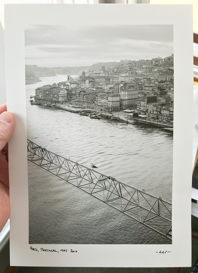
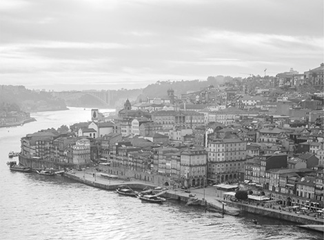
 Nicolas Vincent, Porto, Portugal, May 2010
With that out of the way, it's time for Nick Vincent's lovely print, which I've been looking at for ten days now and enjoying. Nick lives in Lisbon, Portugal, which means the print had a long journey in which to acquire the two horizontal bend marks you can't see in the above JPEG. They've relaxed a little since the print's been free of the packaging and might press out.
It's a small inkjet print (image area 6.5 x 9.75 inches), mainly midtones and higher with some dark accents—I don't think it contains a pure black, unless it's on the bird's wings, which are probably more like a very dark gray, only near-black. The color is neutral with just the slightest greenishness, but the image color matches the paper base color nicely. The paper has a semi-gloss surface and is luxuriously thick.
I'll be honest—B&W prints made by inkjet usually have a little something extra to prove to me. It's not a very natural medium for B&W. Everybody habitually extols the "control" they say they get with the technology, but baseline—what, shall I call it? The baseline integrity, maybe, across the board—is not the highest and not-quite-successful prints are common in my experience. There might be more control, but there are also more ways to screw up.
One of the major tools we have to work with in B&W is tonal values. Some people are immune to the charms of tones and therefore tend to not "get" B&W. The sensitive deployment of tone is a big part of what I call "judgment" in B&W printing. B&W photographers and printers are exquisitely sensitive to tone. I remember Peter Turnley telling me that when Voja Mitrovic, who was Henri Cartier-Bresson's printer (and Peter's, among many others), would look at prints, he would immediately critique the tones—a little more here, a little less here, his hands vaguely mimicking the motions of dodging and burning. B&W is much more flexible than color, and allows for greater interpretation—plenty of photographers have a tonality that is consistent throughout their work (one of the ways experts detected that Walter Rosenblum was making counterfeit "vintage" prints from Lewis Hine negatives was that the tone of the modern fakes had the unmistakable tonal signature of Walter Rosenblum prints).

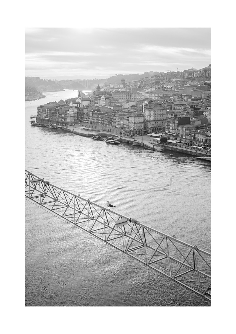
Nick's JPEG of his picture. Bear in mind you're looking at a JPEG, not the print.
Nick's judgment here is sure. The print is very sharp, limited it seems by the tooth of the paper (I inspected it with a high-power magnifier), yet nowhere is there any trace of evidence of oversharpening. Keeping a very light touch, he has nevertheless maintained tone in all the highlights—it would have been so easy to step over that line. The highlights in the sky are not as rich as they might have been in a film print, but that works here, because the haze is increasing with distance and that area of the picture should not be calling attention to itself—it conveys only receding distance, the faraway reaches of the river, as well as a certain winsome property of the light, and it's doing its job. (Before you goose up some area of another in a print, ask yourself, do I really want to draw attention to this?) In fact, nothing is overdone in this print.
Two lessons
There are two lessons we might talk about in regard to Nick's print, both of them important. The first is that it's often said that a B&W print must contain a pure white and a pure black. This is false. No argument possible—just false. That's not to say that a print cannot be successful with a maximum black and a paper white; of course it can. It's not to say that your prints cannot all, each and every one, have a pure white and a pure black. Maybe it's your style. But prints can and have succeeded with many, many different ranges of tones. This one has no pure paper white and no pure maximum black, and it would be worse if it did.
As to the notion that a pure black and a pure white are a good starting point, actually most expert printers in the film days believed the opposite—that you start with a deliberately soft (i.e. low contrast) guide print and add contrast until you get to the right value. The reason is that contrast is like volume when listening to recorded music—we tend to prefer louder sounds, and it's harder to turn it down than it is to turn it up (headphone listeners will vouch for this—sometimes to the detriment of their hearing in their later years, unfortunately). Similarly, it's more difficult to dial contrast back down than it is to dial it up, and "overshooting" (by a lot or a little) the just-right contrast level is a common flaw of amateur printmakers.
The other lesson is that this print isn't heavy-handed in any way. I've opined many times that I think that's the most common flaw of all prints from all sources that I see these days: heavy-handedness of some sort. We all tend to get insecure about not enough. Human nature. A guy who gets insecure about sharpening will fret about it and concentrate on it...and oversharpen. A guy who gets insecure about microcontrast will hit the structure or clarity sliders (or whatever it's called in your image editor) too hard. It's the old "if a little is good then a lot must be better" trope in human nature. It's very tiresome. In the little precinct of photo printmaking, it distorts or ruins an awful lot of prints.
Ease = confidence
The size here is unremarkable. Just guessing, size probably isn't critical for this image—I imagine this picture would work at several sizes, although I probably wouldn't want to see it any smaller (and I confess I might like to see it a bit larger). This is the kind of print you'd keep in a box and show along with a bunch of others, and for that purpose it's fine.
Altogether? A confident, sensitive printing job, that speaks well of inkjet. I've continued to enjoy this print, and nothing about it nags at me or reveals itself as a flaw over time. Strong work.
Oh, let me not forget to go to Nick's written description and report the details: Canon 5D Mark II, Canon TS-E 45mm ƒ/2.8 Tilt Shift lens, Epson SureColor P800 (yet again! So far, all our crit prints but one have been made with this printer), and Canson Baryta Photographique (no wonder I liked it—one of my favorite papers for B&W inkjet).
TOP is off tomorrow, so have a very nice, safe, healthy, and productive weekend! Hopefully I'll have a post for Sunday this week if I can tear myself away from my immersion in all the audio stuff. Listening to Hiromi Uehara, Nir Felder, and Marcus Miller among others on Roon right now.
Bless you, and yours.
Mike
Ed. Note: The reason I show rough snapshots of the print being held in my hand or lying on top of the packing material is to make it visually obvious that I have the print here and am looking at the real thing, whereas you, dear reader, are not looking at the real thing. Buyers of our Print Offer prints have been struck by the degree to which actual prints differ from online JPEGs of the same picture. Despite this, my observation has been that people have a tendency to assume they are seeing "enough" in an online JPEG to "know" what the properties of the picture or print are. I'm afraid that is not the case. In any event, this method of illustration for these Print Crit articles is deliberate, and even if you don't agree with my choice, still, it's what I've decided to do. Here I've added Nick's JPEG so you can see the picture better.
Original contents copyright 2020 by Michael C. Johnston and/or the bylined author. All Rights Reserved. Links in this post may be to our affiliates; sales through affiliate links may benefit this site.
TOP is sustained by many very kind friends through Patreon
and thank you sincerely
(To see all the comments, click on the "Comments" link below.)
Featured Comments from:
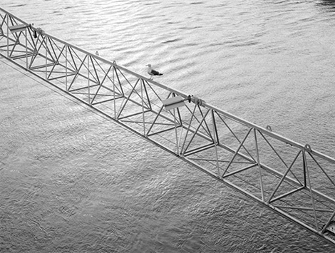
Jim Arthur: "If you were to split this image in half you would have two nicely composed 9x12’s stacked on top of each other. I like it. It gives the picture an expansive look and jiggles the brain. I think the print would have more impact if it were larger. Nice job, Nick.
"FYI—my gecko card was printed on a PRO-100."
Mike replies: Thanks for that last—I made the change.
Here's what Jim is talking about—bottom picture:

Top picture:

It strikes me that this is unusual; not many pictures can be split in half and be two complete compositions. Good observation, Jim.
David Dyer-Bennet: "I like this image, and this print from what I can see (seeing both the snapshot of the actual print, and the photographer's JPEG, is interesting).
"That's probably a crane boom, but whatever it is, it raises the question of where the photo was taken from (alignment is wrong for the photo to be from the crane control cabin). Do you happen to know? Not actually important of course.
"The diagonal of the boom coming in draws the eye in, and it's beautifully parallel to the far river bank. The bird right in the middle is great to stop your eye rather than following the boom on out the other side. And the nearer parts of the city look sharp and immediate, and then aerial perspective kicks in, giving us gradations of distance. This is a really nice photo.
"The 'rule' about full black to full white is like the 'rule' about composition in thirds and all the other 'rules'—a starting point for thinking about things. They're 'rules of thumb,' not real rules. I know, I know, lots of people don't get that. As rules of thumb, I think they're useful—beginners should think about why they are violating them, and not do it for no reason. Experts should pay no attention to rules of thumb; they're for beginners.
"Very often, you want the widest range of tones available, so that you can make details visible in multiple areas of different densities, so if you don't go to the ends of the scale in both directions, you're making a flatter print than you have to and thus making some details less clear than you could. But some images want to be somewhat flat.
"Most of my work, I find, when trying to make 'good' prints, is about suppressing distractions. (Usually, a print that's going to be good has the important stuff fairly good to begin with, not needing huge alteration. Usually.) Mostly by darkening things, but I've resorted to masked blurs and such also. (And cropping comes in, but usually earlier in my head.)"
Charles: "Canson Baryta Photographique—it disappeared about a year ago. Version two emerged a few months ago, and people see differences and argue over whether it is an improvement or a decline."
hugh crawford: "Inkjet doesn’t do a very good impression of silver bromide/gelatin on baryta, but it does a remarkable facsimile of platinum printing. It’s just different. I don’t know what to say about inkjet paper that strives to replicate RC papers other than why? I once pointed out that even the best chef would have trouble making a TV dinner from scratch."
Tom Judd: "Re your comments about packing a print for mailing. You are proposing $50 packing for, in this case, a $5 print. Not practical. The Post Office does have some blame here."
Mike replies: We can disagree here, Tom, and that's okay. But I think it's better and more useful to think of any print as the representative of all the time and all the money you've put into photography over your lifetime—in other words, think of each print as a chunk of what it took you to get to the point of being able to take it and make it. That's why I said it's worthwhile to think about like you just sold it for $2,500. Because, really, what makes a piece of paper with some ink or metalized silver on it worth $2,500 or more? Only that people value it. If you don't value your work, why should you expect others to treat it with respect?
