[Originally published in Black & White Photography magazine c. 2006]
By Mike Johnston
I'm nearing the half-century mark in age, and I've been in love with pictures since early childhood, when my parents, bless their hearts, allowed me to clip out my first "collection" from the pages of old National Geographic magazines. Fortunately my love of pictures continued and my sanguine acceptance of vandalism did not.
My biggest problem with photography these days is one that fits right in with the mission of the magazine you hold in your hands: for the most part, I don't like color photographs as well as black and white ones.
Yes, I know that many human beings are wired to feel the opposite. My little boy startled me at age five when he offered his first critique of Daddy's artwork. He had asked me to take a picture of how small his watermelon hard candy had gotten in his mouth, opening his mouth wide and presenting the remarkably diminished candy on his tongue. Never one to refuse a proffered photo opportunity, I took the picture. Later, though, when I showed the print to him, he launched into a tirade that I still think is wonderful: "Daddy, you need a new camera. Your camera is a grays camera. You need a colors camera. When you buy another camera next time you should make sure it has colors in it." And so forth. It was a pure critique, succinct and pointed—art criticism direct from a five-year-old heart.
I have an old friend, Kim Kirkpatrick, a (color) photographer who teaches at the Smithsonian Institution in Washington, who I know has a visceral attraction to colors for their own sake. He's a gardener, and he'll plant particular flowers just because of their colors. He and his wife used to drive around to look at Christmas lights just for the pure visual pleasure all those colors offered. Once in a while, the point of one of his photographs might be summed up with a comment such as, "just look at that orange!" Kim doesn't just see colors. He feels them. Others can't even really "see" his gardens, I suspect, even if they are sensitive to the arrangements of colors, because I'm sure he plans for the colors to shift and change as various plants go into and out of bloom. It's an artwork in time that itself unfolds like a blossom, with a pace across the season and a life that progresses in phases and stages. Seeing it once is like seeing two minutes of a movie: you can't get the whole picture, the whole effect.
Whenever in my life I have mimicked a successful photographer, it has been with color photographs. My "best seller" is a color 5x4 photograph of a distant sunlit yellow canoe on a lake at dusk under a cloudy blue-gray sky. It would have served as the "cool with warm accent" shot we were required to do in my basic color theory class in school. People love it, and no doubt they would love it much less in black and white.
Oddly enough, too, I have a well-developed color sense and I’m fastidious about color. My brother, now a Ph.D. psychologist in Rhode Island, once worked for Dr. Norman Rosenthal, who developed the diagnosis and treatment for seasonal affective disorder or SAD. They had for one reason or another developed a series of color perception tests where test subjects were presented with mixed-up colored disks representing a scale of slight variations in hue, value, or chroma and asked to arrange them in order. I aced the tests. I find I’m quite sensitive to the polluted colors common in tri-layer films and papers, what Dr. Bertram Miller called “arrastres” in his color photographic theory. Given an adequately calibrated monitor and printer, I'm very good at color corrections, and I often dislike what passes for "adequate" color correction in other photographers’ work: it sometimes seems obvious that they can't see what their own pictures need.
Old analog techniques
I've never really liked color photography from a technical standpoint. Digital color is better than the color of most analog techniques. The history of color analog techniques is a history of make-do, of never-quite-good-enough. I was repelled by Cibachrome, unless it was masked; John Szarkowski, the great curator, was so disturbed by carbro prints that he seldom showed the work of Paul Outerbridge, who worked in carbro. The only traditional color methods I really cared much for at all were the very rare Kodak Azochrome process (a sort of midway point between color and black and white), dye transfer, and, sometimes, Kodachrome 25 (not 64), provided that the subject luminances matched the film's scale adequately. Digital color is getting better, but it's "simple" in that there are just not enough colors represented in the average DSLR color palette, to my eye at least—digital prints miss the subtle variations seen in large format color. But they are more often much more pure, which is an improvement.
But still, there is just something about color that robs photography of what photography offers me at its best. I think most people have an emotional response to color, which can then be educated and refined by practice, delectation, and connoisseurship. But to me there is just something so pat about color snaps—so quotidian. There is no mystery to them. Or something. I really have no idea, you see, what it is. Tones of gray move me, and colors don't.
This is often lumped into the common criticism, "color is too decorative," a tidbit of dismissive wisdom I think began to circulate in the 1970s. "Color is distracting" is another once-common cavil.
I'm not sure either of those things ever really meant anything to me. Neither accusation has any power any more; where black and white was once the standard and color had to prove itself, the situation is now fast reversing. But it's not a political position in my view. It's a matter of personal response. What seems to be the bottom line for me is that black and white grabs me, satisfies some gut need; it speaks to me. I have an appetite for it, a love for it that is emotional, somehow, native, and wordless at its root. I drink it in. Color doesn't slake that thirst or nourish me as much. Somehow the way that black and white transforms the world makes the subject of the picture more real to me, even though it's less literal—richer, even though there's less information there. It's as if it shows the bones of reality beneath the surface flesh of colors, the truth behind the world's mask. Maybe that's just me.
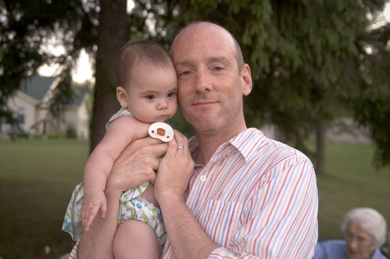
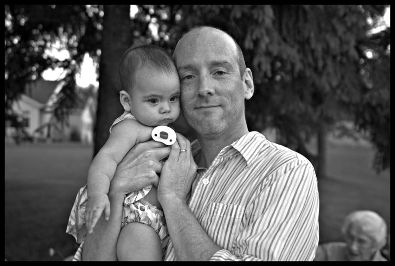
 Proud New Papa Richard, with Keller: A pleasant enough
family snapshot in color...
 ...Achieves much more richness, resonance, balance, and emotional depth in black and white. I simply find it more satisfying. Other
peoples' mileage, of course, varies.
Tones move me, colors don't
I've been shooting more in color recently, because I'm shooting more digital and color is digital's natural mode, at least in the technology that's available to me. My friend Carl Weese once said that digital is the coming of age of color photography, and I think he's right. Yes, you can convert color digital pictures to black and white, and I often do. But how silly is that? You take a Bayer array, that devotes four photosites of three colors to every "parcel" of light rays, and then arrives at intermediate colors by very complicated extrapolation algorithms. How much simpler it would be to simply record value only—that is, illuminance—at every single photosite! Black and white sensors would have more resolution as the same number of megapixels in color, and the processing would be considerably simpler. Perhaps the dynamic range could be better, too. I hope we'll have dedicated black and white sensors someday soon, even though most people can't see why we should want them. I do. I like "grays cameras."
In the meantime, I shall continue to photograph in color, convert it when I can, and miss the days when the colors of photography, as Robert Frank once famously quipped, were black and white.
Mike
Copyright 2006, 2014 by Michael C. Johnston
[Note: This post is a "rerun." I've been recuperating from a health event and trying to minimize workload, so the Comments Section has been closed for most of these rerun posts. However, I'm feeling better, so I'll keep the Comments open for this one. It might be a good way to ease back into work. —Ed.]


