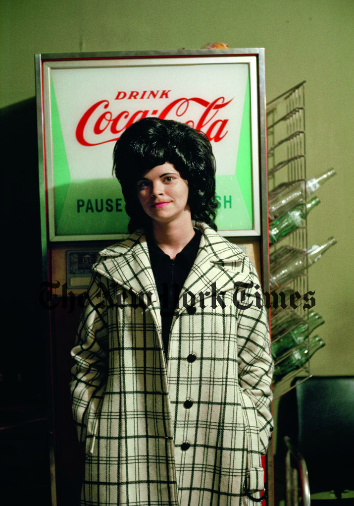
 New Haven, Vt., 1973. Photo by Nathan Benn.
"Color is good; therefore, more color must be better" might as well be the mantra of the digital age. But still, this is really pretty funny: The New York Times' Lens Blog today features a number of pictures from Nathan Benn's upcoming book Kodachrome Memory: American Pictures 1972–1990 that have had their color jacked up digitally...so they look a lot like digital and unlike Kodachrome. Even though Kodachrome colors are obviously part of the book's concept—I mean, it's right there in the title.
Kodachrome never rendered anything like the paint-set blues and greens in #2, the man's electric blue jacket in #4, or the office worker's magenta sunburn in #9. (The numbers refer to the pictures in the Lens Blog's Nathan Benn portfolio.)
The color in the picture above, titled "New Haven, Vt., 1973," is gorgeous—and yes, on a good monitor, a reasonable approximation of characteristic Kodachrome colors. (The photographer himself says, "I much prefer pictures with a limited color palette.") Lovely photograph.
I liked Matt McCann's essay.
Can't wait for this book. I'm a bit of a sucker for Kodachrome books and websites, I admit. Hope they got the colors right.
Mike
(Thanks to Kent Phelan)
Original contents copyright 2013 by Michael C. Johnston and/or the bylined author. All Rights Reserved. Links in this post may be to our affiliates; sales through affiliate links may benefit this site.
(To see all the comments, click on the "Comments" link below.)
Featured Comments from:
Kevin Purcell: "Note that Nathan Benn (the photographer) pops up in the comments and says:
NYTimes did a nice selection from the images in the book. I should note though that the color on the LENS blog is not accurate to the book images. I 'm guessing that it has to do with compression, and some of the blog pictures read as overly saturated, contrasty, and not true color. But I remain grateful for the exposure to the LENS community. A few more of my images, closer to their appearance in the book, are on the book's website at www.kodachromememory.com. I trust you will see some difference.
"See his versions here."
Mike adds: An example:
Screen shot from the book website
 Screen shot from the Times' Lens Blog website
George Barr: "New Haven, Vt., 1973—What an absolutely wonderful photograph. Have not seen it before and what a pleasure to discover it.
"The photograph tells part of a story, but leaves us to make up the rest. Sure I could talk composition, colour palette, etc., but the real strength in the image is in her posture—even the toes.
"Is she talking with a neighbour about a problem, scolding the kids or pissed off because hubby's off to play ball, again!—we don't know and of course it could be any of those or something else entirely.
"This is the kind of image you could place on a wall and every time you come upon it, make up a new story for the image. Each time you could find another reason it works. For example, notice that both arms line up with the railings on the step as does the raised thigh, while the upper left arm matches the folded leg, the whole thing making a zed (OK, zee) pattern. So many levels, so little time. Thank you Mike and Kent, thank you so very much."
[George is the author of the book Why Photographs Work. —Ed.]
Colin: "That 'New Haven, Vt.' image just captures perfectly the reason why photography is endlessly fascinating, infuriating, elusive and unclassifiable. No clever perspective tricks, the subject is centre frame, colours are muted, nothing is actually happening and it was probably taken on a camera that's worth about $25 today. And yet I could look at it all day and still find new things to discover. This is the antithesis of pixel peeping, gear oriented photography. Just gorgeous."


