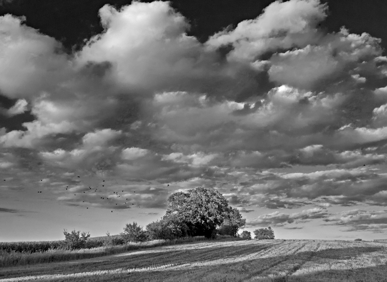
(Graflex Speed Graphic, 127mm Ektar, Kodak Verichrome Safety Film, D-23 [scratch mixed], Wratten K-2.)
-
(Pentax Spotmatic, 55mm Takumar ƒ/1.8 lens, stop-down averaging metering, Ilford HP3 ASA 400 film.)
-
(Hasselblad 500 C/M with Acute-Matte, 80mm ƒ/2.8 Zeiss Planar, Tri-X 320, HC-110 dilution B, orange filter. Shadows placed on Zone II. Oriental Seagull, lightly selenium toned.)
-
(3.1 megapixel Minolta DiMAGE 5, converted in Photoshop 5.5. Unsharp mask. Uploaded to PhotoSIG.)
-
(Panasonic mirrorless, OIS zoom, RAW, Lightroom 3, SilverEfex Pro. "Original in color.")
-
Mike
Illustrations are simulations.
Send this post to a friend
Please help support TOP by patronizing our sponsors B&H Photo and Amazon
Note: Links in this post may be to our affiliates; sales through affiliate links may benefit this site. More...
Original contents copyright 2012 by Michael C. Johnston and/or the bylined author. All Rights Reserved.
Featured [partial] Comment by Andrew Molitor: "I think it would be fascinating to correlate birth date with preferred image. Born: 1965 Prefer: 1987."
Featured Comment by Patrick: "Probably going to regret this but...I like the last one most. In my defence, I am looking at these on my phone."
Mike replies: Okay, made me laugh.
Featured [partial] Comment by SteveB: "...Seriously, if we're going to compare the look of different equipment and processes, wouldn't actual pictures be a better comparison?"
Mike replies: I would have, but my HP3 and Verichrome sheet film are both out of date.
(I'm kidding, I would never have, even if the old materials still existed...way too much work!)
Featured Comment by Ed Hawco: "Actually, this would be a better representation of the 2012 version. Instagram, with 'Lo-fi' filter. ;-) "
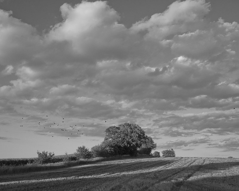
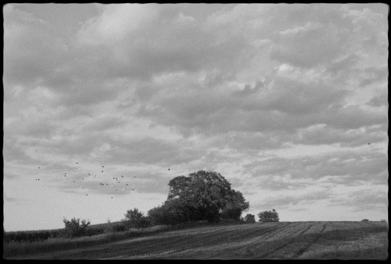
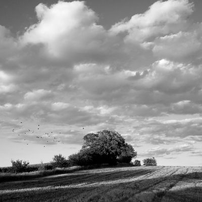
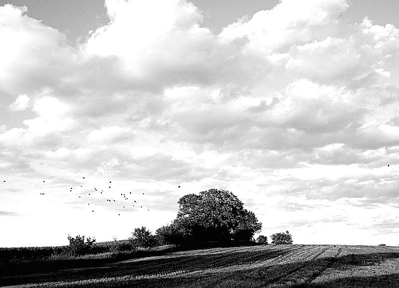



So, would those be considered photoshopped (as in cheating)titles or photoshopped pictures?
Posted by: Eddie | Thursday, 16 February 2012 at 09:48 AM
Shouldn't the title be `Ways to convert a digital image to B&W'?
Posted by: Bernard Scharp | Thursday, 16 February 2012 at 09:50 AM
1940 wins with '87 a close second.....will 36mp bring it back????
Posted by: dale | Thursday, 16 February 2012 at 09:59 AM
That's very dispiriting.
Posted by: George LeChat | Thursday, 16 February 2012 at 10:04 AM
"So, would those be considered photoshopped (as in cheating)titles or photoshopped pictures?"
(Sigh) I was really hoping I wouldn't have to explain the concept here, at least not immediately. Yes, those illustrations (not demonstrations) are SIMULATED (as it says) digitally, from a digital original (the same one, obviously), to illustrate the point that styles in B&W have changed over the years. As a fun way to make the point visually instead of saying it verbally.
You *really* don't get that? I'm disappointed.
Mike
Posted by: Mike Johnston | Thursday, 16 February 2012 at 10:05 AM
Interesting - I like the '1940' and '1987' versions best, but I can't articulate why...
Posted by: Paul Van | Thursday, 16 February 2012 at 10:06 AM
Looks, like we've come full circle (except for the darker blues in the last photo).
Posted by: Micha Drögemüller | Thursday, 16 February 2012 at 10:09 AM
I'll take that first shot every time.
Posted by: Scott Symes | Thursday, 16 February 2012 at 10:15 AM
"I'll take that first shot every time."
I wish my Photoshop skills were a little better. I didn't quite nail the look. Should have added a little simulated cosine 4 falloff, for one thing...those nice old Ektars did hotspot a bit.
Mike
Posted by: Mike Johnston | Thursday, 16 February 2012 at 10:17 AM
I love the "Hasselblad/Tri-X" shot. So balanced.
Posted by: Mjmetts | Thursday, 16 February 2012 at 10:20 AM
Wait, I'm confused, either those trees haven't grown an inch in 72 years or am I really looking at pictures of a picture?
Posted by: icexe | Thursday, 16 February 2012 at 10:27 AM
Yup! I think your examples sum it up pretty well. What I do find interesting is the fact that all of them [even if they were 'real'] operate in their own reality, and NONE of them look the way the scene actually appeared to the average human eye. So, in my opinion all the 'I like this one best...' comments are purely subjective, and don't really 'prove' anything.
Posted by: christian harkness | Thursday, 16 February 2012 at 10:36 AM
I'm impressed that you have the perseverance to go to the same location year after year and take the same photo. What's most amazing is that you are able to coax the birds to fly in the exact same flight patterns - following the wings, as it were, of their now long gone predecessors.
Posted by: JohnMFlores | Thursday, 16 February 2012 at 10:41 AM
The 2001 shot reminds me why I held off on digital until 2005. I like the 1987 Hasselblad shot best. I'm impressed with the 2012 shot from a technical perspective, but it is not to my liking (I'm not keen on HDR either) - too much effect I think.
Thanks for the comparisons Mike, very interesting.
Posted by: James B | Thursday, 16 February 2012 at 10:47 AM
I love the 1940 and 1987 versions. That 2001 Dimage version is nasty...but it does show what I've seen a lot of from that time. The "most recent" image is one of the reasons B&W is suffering right now. We have people who are afraid to have shadows with no detail...so the pull them up so much we get that horrible pseudo-HDR look.
Posted by: David Luttmann | Thursday, 16 February 2012 at 10:47 AM
Before I read it was simulated, I was going to comment how slow growing those trees are. :-)
Posted by: David Anderson | Thursday, 16 February 2012 at 10:49 AM
Wow, so Photoshop has a filter that simulates what an image looks like using an Acute-matte screen..... and boy does it make a difference
Posted by: Richard | Thursday, 16 February 2012 at 10:50 AM
The first one "breathes" more delicately, to my eyes. If the whole idea is to say we didn't lose anything with progress, I agree.
Posted by: Max | Thursday, 16 February 2012 at 10:57 AM
Is it the look of bw that has changed over the years or the methods by which we get there that has changed over the years? You might be illustrating that too. A chicken and egg thing, which comes first, the tools or the look?
I'd argue that the tools still drive the look and we only think that the look is just a style to be applied. In the actual taking of the picture, all of those cameras would produce different results, and not just in tonal aspects. Different cameras produce different pictures which is obvious, but the ability to mimic as you have done I think tends to mask that.
I'm currently shooting a project with a 5D and a Mamiya 7- I can make all the prints converge on an average so that it is hard to tell which comes from which, however, they are different and I shoot differently with each.
So I'm not so sure that the title of the post is accurate- is it paths to bw over the years? But it raises a good point.
Posted by: robert | Thursday, 16 February 2012 at 11:05 AM
Lets see if I get it:
Picture one: Old film but large negative, so still high resolution. Panchromatic film gives `different' tonality, especially in greens. Yellow filter offsets this a bit, and gives better contrast in clouds and shadows. No meter, so photog had to do the work (and did it right). Speed graphic gives a 4x5 aspect ratio.
Picture two: One of the earlier fast films, so very grainy/low resolution. No filter means very low contrast in sky and shadows, made worse by averaging meter which has overexposed due to large amount of shadow in the picture.
35mm gives 2x3 aspect ratio
Picture three: Larger neg and newer film give better resolution, but this is offset by low-acutance developer choice, which also loses some shadow detail. Photog new this and moved exposure up, so grass very bright. Orange filter gives good contrast in green foliage. Square neg.
Picture four: Low dynamic range, low resolution, and hopelessly oversharpened by early USM algoritm? PhotoSIG -> User had uncalibrated monitor? 4x3 aspect ratio of digicam sensor.
Picture five: Modern digital photog has found the `Ansel Adams' preset in lightroom. 4x3 aspect ratio of M4/3 camera.
Posted by: Bernard Scharp | Thursday, 16 February 2012 at 11:06 AM
This is awesome. It took me a while to get it, since you cleverly moved the crops around a bit so it wasn't instantly obvious that the clouds were the same. I'm reading Errol Morris' book now, so I have recently been soaking in the various older styles dictated by emulsions and tastes.
Well done, placing them all together like that.
I think it would be FASCINATING to correlate birth date with preferred image:
Born: 1965
Prefer: 1987
Posted by: Andrew Molitor | Thursday, 16 February 2012 at 11:13 AM
What made you choose a flat image for the 1940's style? I get most of the others. I wasn't around in 1940, but I've seen enough Weston, Adams, and others to know that even then prints were frequently made with more contrast.
Of all the shots shown the 1987 is closest to my current style.
Posted by: Larry Gebhardt | Thursday, 16 February 2012 at 11:17 AM
1940 for me.
Posted by: Paul M | Thursday, 16 February 2012 at 11:19 AM
I assume the point is to illustrate current bad taste rather than technology changes, in which case it looks like a lot of commenters missed it.
Posted by: Björn Lindström | Thursday, 16 February 2012 at 11:22 AM
Presumably the 20 year gaps between the pictures is down to how long it takes to train a flock of birds to exactly recreate the scene :-)
But seriously, if we're going to compare the look of different equipment and processes, wouldn't actual pictures be a better comparison?
Otherwise we're just comparing the way that 5 different photoshop filters look.
FWIW, I prefer the first one.
Posted by: SteveB | Thursday, 16 February 2012 at 11:23 AM
Bernard,
Very good! You got it mostly very right, stumbling only a little in that HC110-B is a high-acutance developer. Note that 1987 post-dates Ansel's last technical series...the underexposure could have come from the orange filter or it could have come from the fact that open shade shadow detail really needed to be placed on Zone III [g]....
But kudos for your deconstruction of #2. The fake "grain" is not quite visible enough. I only have 800 pixels to work with because of the blog software....
Mike
Posted by: Mike Johnston | Thursday, 16 February 2012 at 11:27 AM
Can I just get a Lightroom preset for the 1940 and 1987 one? :)
Posted by: Kalli | Thursday, 16 February 2012 at 11:29 AM
I like them all! Except the one taken by the Minolta DiMAGE 5; that's just...wrong, somehow
Posted by: Miserere | Thursday, 16 February 2012 at 11:30 AM
"I'm impressed that you have the perseverance to go to the same location year after year and take the same photo. What's most amazing is that you are able to coax the birds to fly in the exact same flight patterns"
John,
That's impressive, true (birds are damned hard to train), but what's *most* impressive is that I took that first shot seventeen years before I was born!
Few people have that skill.
Mike
Posted by: Mike Johnston | Thursday, 16 February 2012 at 11:43 AM
1940, hands down, the best
Posted by: steve | Thursday, 16 February 2012 at 11:43 AM
David:
" We have people who are afraid to have shadows with no detail...so the pull them up so much we get that horrible pseudo-HDR look."
Part of that is that printing on paper crushes the shadows. < a bunch of pointlessly confusing stuff about monitor calibration and paper profiles goes here >
Part of that is bad taste.
Similarly what looks sharp in a large print looks like mush on screen and vice versa.
Posted by: hugh crawford | Thursday, 16 February 2012 at 11:45 AM
Thank you. I just noticed I wrote panchromatic regarding picture one, which obviously must be orthochromatic.
I've read differing things about HC-110b regarding acutance, and most places say that Kodak claimed lower acutance/more solvent action than D76. But I've never used it, so can't speak from experience
And if digicams were really that bad 10 years ago, why did we ever stop using film? :-)
Posted by: Bernard Scharp | Thursday, 16 February 2012 at 12:09 PM
Wow, the 2012 version is so strikingly the most interesting.
I guess that's why I'm so fond of digital, eh?
I was looking closely, and noticing the different bird patterns. I briefly thought (before you made it clear at the end of your article) that you might have actually done a series of new pictures, using retro tech for much of it (which would have been a huge amount of work).
The question I now have is, how accurate do you feel the simulations are?
(Hasselblad is second-best, then 4x5 Verichrome, for me.)
Posted by: David Dyer-Bennet | Thursday, 16 February 2012 at 12:14 PM
What this shows to me is that there's a lot more to getting convincing B&W in Photoshop than fiddling with the 'Black&White' adjustment sliders or simply using SilverEfex.
I particularly like the haloes in the last one - always a tell-tale feature of bad HDR and lazy processing generally. A nice touch, that.
Posted by: Julian | Thursday, 16 February 2012 at 12:14 PM
Hasselblad..... Sigh.
Posted by: Chris Y. | Thursday, 16 February 2012 at 12:21 PM
All this does is illustrate your attempts to simulate how you think tastes in B&W have changed over the years. As another poster suggests, the point might be been better made by posting images of real photos taken of the same scene over the years. The fact that many posters (all of whom probably live in the here and now) appear to prefer the '1940's' version would appear to refute the central premise that tastes have changed. But then again, what they prefer is your simulation of the 1940's look, created using a digital camera and photoshop. I guess I don't get it.
Posted by: Martin | Thursday, 16 February 2012 at 12:31 PM
Despite growing up in the film twilight/digital dawn (born 1990), I find myself drawn to the 1940 one most. Such delicate tonality...
Perhaps this post should be called "glass half full/glass half empty". As in, an optimist could say that we didn't lose anything with progress; a pessimist could reply that there doesn't seem to be, ahem, much progress either.
But I am really glad not to be back in 2001!
Posted by: Zeeman | Thursday, 16 February 2012 at 12:33 PM
Now somebody's gonna say the SQUARE one is "better".
Posted by: Luke | Thursday, 16 February 2012 at 12:44 PM
People, people, people,
Of course they're all original photos-- that's the famous Wisconsin Petrified Larch! It's been photographed more often than Yosemite's Half Dome. It was easy for Mike to find dozens of nearly identical photos over the decades.
As for the apparent sameness of the sky and birds, well, that's all just a backdrop. The place has been a tourist attraction since the 1920's and the owners built a pretty background so folks could get nice snaps without showing the gift shop, concession stand and parking areas.
Trust me, would I lie?
pax / Ctein
Posted by: ctein | Thursday, 16 February 2012 at 12:58 PM
Ha, it appears that I (via LR3 and Silver Efex Pro) tend to fall somewhere between 1965 and 1987. I'll accept 1977-79, I do love the Ramones and the Clash.
Posted by: Matt P | Thursday, 16 February 2012 at 01:32 PM
I am very intrigued by the different look of the clouds. Also, you should try an IR look, just for fun. Very interesting.
Posted by: Jim Green | Thursday, 16 February 2012 at 01:34 PM
Actually, I have a DiMage Z1, 3.1 Mpixels, from 2004. It does a MUCH better job at fake B&W (See what three years can do?), but as your simulation makes clear, ya gotta watch the clouds or they blow out to hell. The spot meter helps.
And ... *sigh* I miss Verichrome. And sunny days. (Dreary Canadian winters do that to me)
Posted by: John Holland | Thursday, 16 February 2012 at 01:54 PM
I'd like to see prints before reserving judgement on what is 'best' for me, but I take the point that you were illustrating the effect of changing tastes oover time.
The book Ansel Adams at 100 makes the point by showing AA's work reinterpreted over time with some signature pictures. In another medium, a fascinating CD set (2 discs) is Glenn Gould's take on the Goldberg Variations (A State OF Wonder: The Complete Goldberg Variations), recorded decades apart (1955 and 1981).
Patrick
Posted by: Patrick Perez | Thursday, 16 February 2012 at 02:15 PM
@Ctein - Are you sure that is a Larch?
http://www.youtube.com/watch?v=ug8nHaelWtc
Posted by: Michael | Thursday, 16 February 2012 at 02:22 PM
The 2001 version compared to everything else is very reminiscent of my recent re-discovery of a photo I took a few days after I bought my first digital camera (a 1.2MP Casio ca. 1999). Blown highlights, blocked shadows, poor definition, an ugly nasty mess. Lately I've been using the 35mm P&S that it replaced, scanning the negs and realizing that, in hindsight, that old digicam was a good example of how a fool and his money are easily parted. Oh well.
I'll still take the 2001 version over that god-awful abomination of an HDR though ;-)
Posted by: Paul Glover | Thursday, 16 February 2012 at 02:26 PM
"the point might be been better made by posting images of real photos taken of the same scene over the years."
....There being only one slight impediment, which is that what you suggest is completely impossible. Other than that, you're right.
Mike
Posted by: Mike Johnston | Thursday, 16 February 2012 at 02:30 PM
I'm partial to the 400 ASA because in expensive days I shot that to be sure I'd get the most usable prints - the print grain is actually better than pixel-peeper blowups would suggest. Generally agree with others that the 1940 and 1987 are best - would go on to say the others are just not very good in any year.
Posted by: Albin | Thursday, 16 February 2012 at 02:41 PM
"Trust me, would I lie?"
Only about megapixels.
Posted by: KeithB | Thursday, 16 February 2012 at 02:57 PM
Ctein, Made me laugh out loud and almost spill my coffee with the 'the gift shop, concession stand and parking areas'
Like the 1940s best but its all preference.
Craig
Posted by: Craig | Thursday, 16 February 2012 at 02:58 PM
While many of us bemoan the loss of film, wet darkroom, and paper choices that achieved a certain "look" or the fact that photography is now on the consumer electronics product cycle, one of the more exciting things about the current digital photographic period we live in is that as artists we have the ability to render our images in practically any style we desire (a small subset aptly demonstrated by Mr. Johnston).
We also have the choice of a hybrid workflow: e.g. film capture / digital processing and printing or digital capture / digital negative / "antique" printing process (e.g. gravure). In fact I would venture to bet that there are more "alternative" processes being practiced today then ever before. This has only been made possible through digital technologies.
Posted by: Michael T. | Thursday, 16 February 2012 at 03:02 PM
Born 1948. Prefer 1987.
Posted by: Darrell Marquette | Thursday, 16 February 2012 at 03:19 PM
For people who want to correlate birth with preference: Born 1954, preference 2012.
Posted by: David Dyer-Bennet | Thursday, 16 February 2012 at 03:23 PM
Is it weird that my preference greatly change when I click the pictures and look at the larger versions, versus just looking at the small versions in the blog post?
Either way, I'm a little dumbfounded that people (well, commenters anyway) seem to prefer the 1940's one so much. The whole thing is like looking through gray tinted, slightly fogged glasses.
Maybe the sun was weaker back then?
Posted by: David Bostedo | Thursday, 16 February 2012 at 03:33 PM
born: 1975
prefer: 2012 (well, aside from the halos as were mentioned. I like the contrastiness but there are some flaws that are ultimately unnecessary) with 1940 a medium-close second, and 1987 right behind that one.
The more I look at '12 the more the flaws bother me. Does the photographer not know how to use layer-masks properly? There's no reason for blown out shadows and highlights in the same picture.
A fun post, Mike!
Posted by: Christian | Thursday, 16 February 2012 at 03:44 PM
It's truly breathtaking to see how much more details and resolution that Hassy shot has. You really CAN tell the difference even on a web sized pic. If I squint hard enough, you can even see the chromatic aberration differences too. It has so much more MORE comparing to the dinky 4/3 sensor. Truly an excellent test.
Now excuse me while I unstuck my tongue.
Posted by: Richard Man | Thursday, 16 February 2012 at 03:52 PM
And upon even further examination, I am willing to bet my house these are the same capture! C'mon, is this serious!?
So I'm thinking, yes, you would lie!:)
But I do prefer 1987 and 2012.
Posted by: John Gillooly | Thursday, 16 February 2012 at 03:53 PM
At first the top one seems overly gray, but there is just enough black to keep it interesting. So I vote for that one, at least at 800 pixels, and even though you weren't asking for a vote. If you save the preset, just call it "Mike's Old Fashioned" and sell it for $5.
Posted by: John Krumm | Thursday, 16 February 2012 at 03:57 PM
Is that badly-done HDR haloing I see in the 2012 photo? :P
Posted by: YS | Thursday, 16 February 2012 at 04:04 PM
Another vote here for 1940 closely followed by 1987.
And, if I may be so bold, the 2012 rendering doesn't do a thing for me - in fact I actually dislike it.
W
Posted by: Walter Glover | Thursday, 16 February 2012 at 04:13 PM
Interesting! I'm eagerly and patiently waiting until you get time to do a similar one in colour.
Posted by: Erik P | Thursday, 16 February 2012 at 04:22 PM
Oh! Verichrome. I swear, they whispered Verichrome Pan in D-23 and then Kodalk as they handed us our diplomas in Rochester. Shoot Verichrome Pan with a Hasselblad, mount a Y2 filter up front. Process in D-23 and Kodalk. Negatives so long even I could make great prints. Those were the days when men were men and the sheep were nervous.
Posted by: sandy rothberg | Thursday, 16 February 2012 at 04:25 PM
The birds bother me. I think it's the influence from my Errol Morris book review. It seems to me that the photos were taken in late afternoon, because the shadows in the foreground are so dark, long and sharp-edged - which means they aren't cloud shadows. So, they're trees behind the photographer. Probably lombardy poplars. This late in the afternoon, and with that much depth of field (i.e. small aperture in all the shots except possibly the first one -- did the Graflex have tilts?) it seems to me that the exposure time on the older films would eliminate the birds. Wouldn't it?
Posted by: John Camp | Thursday, 16 February 2012 at 04:25 PM
So technology always wins over art? The images represent what was possible at that time. 2012 sharpness, high ISO and HDR is what every photo needs!? - And how any camera is measured.
But when we see the tonality and a more gentle rendering from the 50's we go nostalgic. The quality then was what we could get.
The 1987 image is liked by many, me included, as it resembles todays ideals, yet has a more natural presence.
Posted by: Kylberg | Thursday, 16 February 2012 at 04:33 PM
I wonder if some viewers would have made different selections if you'd changed the labels.
Posted by: Dave Kosiur | Thursday, 16 February 2012 at 04:49 PM
You left something out.
1940
Illustrators special
1965
DuPont Velour Black #3 (diffusion enlarger don't you know).
Nice idea
Posted by: Mike Plews | Thursday, 16 February 2012 at 04:54 PM
Like the first one best. Actually feel the last one is overdone - too much pp.
Posted by: John Brewton | Thursday, 16 February 2012 at 05:25 PM
Wow, the 2012 shot comes complete with halo around the trees so that must be sort of holy and therefore the best. A little disappointed that the clouds did not look quite sooty enough, and a token piece of radioactive glow could've been left.
How about a waterfall scene, with the final 2012 shot inevitably looking as if a milk tanker has had an unfortunate accident upstream?
And where's that place with the empty jetty extending out into the lake? 2012 has the water with a smooth homogenous luminescent glow and ne'er a sign of a ripple. Always.
Finally, that famous rock strewn beach at twighlight, continually plagued by a misty fog for 30 seconds every evening from 2008-2012. Someone will know the location, it's on every camera magazine cover.
Posted by: Dohmnuill | Thursday, 16 February 2012 at 05:51 PM
Mmmm, born 1959, used to print like 1940, currently print (wet) like 1987, alergic to mono like 2012.
Interesting exercise and one I've done with my own negs, never can get the digital version to have all the tones of my wet prints, but then I've been printing on silver for a lot longer.
Thanks for the brain food.
Posted by: mark lacey | Thursday, 16 February 2012 at 05:57 PM
Mike, so you reached your peak, at least in terms of craft, 17 years before you were born? Say it ain't so!
It makes me glad that I have a freezer full of Verichrome (as well as Tri-X and Panatomic) I should spend some time shooting digital vs. the B&W classics and see what it takes to match the results.
I do that quite often with Portra and digital, and it's quite interesting.
Posted by: Doug C | Thursday, 16 February 2012 at 06:01 PM
John Camp -- think Sunny 16.
Is "Verichrome Safety Film" already ASA 125 like the later Verichrome Pan? Hmmm, maybe not; random hits suggest it was Ortho, and ASA 50, maybe.
The cloud cover might require another stop of exposure (it's gonna depend on exactly where the sun is relative to the clouds). So maybe 1/50 at f/11; that's not going to make the birds go away. (It looks like it was faster than 1/50 to me, but 1/100 at f/8 looks entirely possible).
So -- provisionally, I guess that the birds aren't especially hard to believe in actual period photos as advertised.
Posted by: David Dyer-Bennet | Thursday, 16 February 2012 at 06:10 PM
Dear Michael,
Well, that's what the billboard says.
I imagine a petrified larch looks somewhat different from a live one. Extremities gets shmooshed and distorted during the process of petrification (a constant problem for paleontologists) and when the surrounding sediments got eroded away no doubt some bits of the harder fossilized tree broke off.
I know all this stuff 'cuz I live with a geologist.
pax / hyper-educated Ctein
Posted by: ctein | Thursday, 16 February 2012 at 06:17 PM
ha-- It's funny how everyone "picks one", and sad because pretty much every landscape photography taken today looks like the last one.
Thank you for this.
Posted by: Aldo | Thursday, 16 February 2012 at 06:19 PM
Born 1964.
Prefer 1987.
Posted by: Trevor Small | Thursday, 16 February 2012 at 06:38 PM
I like the first one which is really my last one because I viewed them backwards.
Born 1938. Getting to the end of anything is an achievement.
bd
Posted by: Bob Dales | Thursday, 16 February 2012 at 06:56 PM
I can hear the birds in the first photo. Not so for the others, especially the last—they're more like confetti.
Posted by: Bill Stormont | Thursday, 16 February 2012 at 06:57 PM
My favorite overall is the '87, but I'm torn. I love the '87 for the square and and the clouds, but I'm uneasy with the handling of the deep shadows (maybe this is just an issue with my laptop display). After, that, I'm torn between '12 (nice but overcooked) and the '40 (like the shadows, like that it doesn't feel overcooked, would adore it if it were square and if the clouds had just a little bit more ‘pop’ (or maybe ‘snap’? I can never remember which is which.)). Born '81.
Posted by: Benjamin R. George | Thursday, 16 February 2012 at 07:05 PM
"I'm impressed that you have the perseverance to go to the same location year after year and take the same photo. What's most amazing is that you are able to coax the birds to fly in the exact same flight patterns - following the wings, as it were, of their now long gone predecessors."
That's what I thought ;-)
Posted by: Matt Stevens | Thursday, 16 February 2012 at 07:17 PM
I like the 1987 photo. I can feel the light rays bursting through the clouds and the shadows moving across the landscape: it's just makes my heart beat more than the others.
Posted by: Artur | Thursday, 16 February 2012 at 07:31 PM
Mike, maybe you should have posted these randomly numbered without the info under each, but then have all the specs at the bottom of the page, randomly. Then we could have played "match the photo to the year."
How many would have picked number 1 as 1940? Does nostalgia skew preferences?
Can you do the experiment over again, or have we all cottoned on?
Posted by: Michael G. | Thursday, 16 February 2012 at 07:56 PM
1951, like the 1940
Posted by: Tim McGowan | Thursday, 16 February 2012 at 08:58 PM
and again, all the commenters are missing the point for me: is STYLE just the way something looks, or is it the result of process? And is a fake STYLE equal to a real PROCESS?
don't working methods come as the result of some restrictions? If you can do anything with anything doesn't that result in nothing?
I think this post illustrates exactly what is wrong with imaging v photography.
any takers?
Posted by: robert | Thursday, 16 February 2012 at 09:18 PM
Clever and fun post!
Begs the question: if HDR software hadn't been invented, would anyone edit an image to give the [dreaded] "HDR look" ;-)
Posted by: Sven W | Thursday, 16 February 2012 at 10:02 PM
Its a little hard to tell but surely an outdoors picture like that airy 1940 farm scene didn't necessarily call for the dual emulsion, contrast taming Verichrome, notwithstanding the sunlit patches?
Anyway, between Verichrome and Tri-x and careful choice of format and paper I think we had B&W photography covered, circa 1965. No progress since then, I think.
I vote for the 4x5.
Posted by: Mani Sitaraman | Thursday, 16 February 2012 at 10:35 PM
Born '62
Prefer '40.
Posted by: Michael Bearman | Thursday, 16 February 2012 at 11:09 PM
Also, having seen actual wet prints from a Hassy (shared darkroom with a photographer who used one), I have to say your 1987 simulation is pretty close!
(In the wet darkroom) I have always preferred to print like the 1940 picture. But such prints were never popular-- most everyone thought they were "too gray." Split grade printing made everyone happy- I got to keep my beloved midtones, the masses got the shadows they wanted. I ended up printing halfway between 1940 and 1987.
And I learned one thing from this exercise: people today, they're contrast junkies.
Posted by: Zeeman | Friday, 17 February 2012 at 12:19 AM
I prefer the 1940 image to the others. The 2012 image has a hint of the same but with "creepy" overemphasis of contrast - particularly in the tree and a very artificial looking sky - what I might unintentionally achieve with too much polarising filter. Thanks for an interesting topic!
Posted by: Ian Douglas | Friday, 17 February 2012 at 01:25 AM
As soon as I saw the first photo I thought" "if this were made today, every edge would probably be glowing because someone couldn't keep away from the 'clarity' slider." Scrolled down to 2012, and yep, there it is.
I've noticed that I sometimes actually grimace when I see overtly manipulated photos, and I almost always find local adjustments far more offensive than global adjustments.
Global contrast increase: "Sure, bright stuff is bright, and shadows are dark, no conflict with how the world looks."
Local contrast increase: "Why is that tree glowing?, and why is the sky menacingly dark around that guy's white pants?"
Maybe, it's my curmudgeonly tendencies, but I like photographs that at least look like they could believably represent reality on first glance, without distracting gimmickry meant to "highlight" specific elements.
Born: 1985, Favorites: 1940, 1987
Posted by: Andrew E. | Friday, 17 February 2012 at 05:01 AM
Born in '59, and really loving digital, so I tried my best to be happy with 2012. No way, 1940 is by far what I prefer.
Posted by: Roberto C. | Friday, 17 February 2012 at 05:41 AM
I got most of these camera or lens or similar even now ... It seems the 1988 Hessy is winner for me. Have to go for this next round then. Do not have the seagull paper though.
Posted by: Dennis Ng | Friday, 17 February 2012 at 06:03 AM
It's interesting that I've been looking at expired Verichrome on eBay. Can you do a series showing the effect of different periods of expiration? I'd like to be informed before I pull the trigger. ;)
Posted by: Earl Dunbar | Friday, 17 February 2012 at 07:10 AM
Your 2012 image is so 2010. 2012 in my mind would be something like: "iPhone 4S, Instagram, Inkwell filter, selective focus and nasty Facebook jpeg compression"
Posted by: Xavier HC | Friday, 17 February 2012 at 07:24 AM
born 1941
prefer 1987, except that I could go with the more open foreground tonality of the 1940.
scott
Posted by: scott kirkpatrick | Friday, 17 February 2012 at 08:21 AM
Untrained eye: All, except the 2001, appear to me as though they could be unaltered photographs of a natural scene.
I drive past a whitewashed barn on my my into work each morning. Lately I have been taken notice of how different the barn looks every morning. I can't say why, but the realization of this has added quite a bit of enjoyment to my morning drive. Something to look forward to.
Posted by: Wayne | Friday, 17 February 2012 at 09:15 AM
I'll take the speed graphic and the hasselblad as well: they look the most "photographic" to me. I guess that's why I picked up an old graphic a couple of years ago.
Posted by: the other ian | Friday, 17 February 2012 at 09:51 AM
I like the 2016 one the best. The Photoshop CS8 shot where the "content aware reconstruction tool" has incorporated the attractive cows, changed the time of day to midnight and the season to mid winter, and included those fabulous star trails. Now that's a great photo...except we don't call them photos anymore.
Posted by: Gary | Friday, 17 February 2012 at 09:52 AM
the thing I love about this post is that it proves the opposite to what one may think at first, and that's: you can do anything with anything, if you know how to use the "anything" you're using.
All these styles are made with one original, they are nothing more than styles.
Yes, some tools make things simpler and others are hard, but you can still make anything with anything ;)
Posted by: Account Deleted | Friday, 17 February 2012 at 10:02 AM
This was a great little experiment. I'm actually very encouraged by what I think is one of the lessons to be gleened from it. While digital photography and its associated post-processing makes it possible to create what we see in the 2012, it also makes it possible to create the 1940 and the 1987 (which I think is very impressive, including the crop to square).
The decionmaking behind how and WHY you made the adjustments to make 1940 and the 1987 should be required reading for every photographer, especially beginners who are sure to see all those HDR tutorial sitres as well.
Posted by: pepeye | Friday, 17 February 2012 at 10:27 AM
Wish you had shot one with 35 mm Tri-X processed in 1/25 Rodinal and printed using a Focomat on Agfa Portriga.
And it is way cool that you got the birds to return for every photo.
All-in-all though, I most like 1940 - born in 1945 - precocious looker at photographs.
-Jim
Posted by: Jim Dobbins | Friday, 17 February 2012 at 11:31 AM
Am I the only one seeing the direct connection to this post:
http://the_online_photographer/2012/02/context.html
THAT is the brilliance of what you have done I think.
BTW: born 1960 pref. 1940 and I KNOW that has something to do with it's "title"
Posted by: Paul Pickard | Friday, 17 February 2012 at 11:51 AM
It took me a while to get it too (I'll blame the RSS reader for messing up the photos a bit). I'm late to the party and I won't reiterate what's been said, but: Brilliant! And fun.
Posted by: robert e | Friday, 17 February 2012 at 05:00 PM