By Jim Hughes
Introduction: This is a "Long View" column that I wrote for the April/May 1998 edition of Camera Arts. It was brought to mind when I read Mike's recent comments about black and white in movies.
Just keep in mind it was written 13 years ago—in photographic terms, a different era! —JH
Recently [1998, remember!], for the first time in nearly 30 years, "To Kill a Mockingbird" played on network television. The movie, based on Harper Lee’s true-to-life novel, starred Gregory Peck as a principled small-town southern lawyer who was chosen—conscripted, actually—to defend an innocent black man accused of raping a white woman. Watching this film, I found myself completely absorbed in the heartrending and ultimately tragic story. It felt almost as if I had entered the lives depicted, people whom I’d come to regard as more real than the usual Hollywood cast of on-screen fictional characters. In retrospect I realized that the film’s transformative power had as much to do with the medium as the message: this tale of blacks forced to live by white rules had been told in painfully revealing shades of gray—as seen through the lens of childhood innocence.
In 1962, color was already dominant in motion pictures. Even then, to shoot a film in black and white represented a conscious creative choice—and in this instance, clearly the correct one. It brought to mind such 1940s classics as "Citizen Kane" and "The Maltese Falcon." Now, these many years later, there can be little question that color is king in the world of photography: black and white has virtually disappeared from cinema screens, as indeed it has from television and, in still photography, from the pages of most popular magazines.
True, black and white still thrives in the darkrooms of many so-called fine-art photographers, and of course among the cognoscenti who read such journals as Camera Arts, but by and large black-and-white photography seems to be going the way of the magnificent Bengal tiger: an endangered species, admired for its beauty, respected for its power, prized as a trophy—and condemned to an increasingly circumscribed life (in zoos and preserves) to ensure its survival, not to mention humankind’s continued viewing pleasure.
Please understand that I, too, photograph almost exclusively in color—Kodachrome [in 1998, again!] to be exact, at least when conditions permit. And this from someone who is so "color impaired" that he has a hard time telling green from blue socks, and frequently finds he's left the house in the morning wearing one of each! (Last night my wife and I engaged in a lively discussion about a sweater she was wearing. I said it was dark brown, she said it was charcoal gray. Today, in bright morning light, I had to admit she was right, of course.)
For me, color is sufficiently elusive and mysterious that it has become one of my primary photographic subjects: its form, its shape, its hue, its texture, its interaction with light and, most especially, the illusions it creates on film. Garry Winogrand, a celebrated black-and-white practitioner, said he photographed to see what something looked like photographed. I suppose I share essentially the same philosophy, except that I often photograph to see how the color I think is there translates into the color the camera insists is there, as rendered on a particular roll of film. Of course, in no case is the final result reality.
And now, with the ease that digital manipulation offers in today’s increasingly computerized environment, color has become even more dominant. For example, where my predilection for using transparency film once mandated making internegatives in order to produce color prints—a difficult and never quite satisfactory compromise—I now simply pop my slides into my trusty Minolta scanner and, using Photoshop on my Mac, "print" to the screen and, if the spirit so moves me, ultimately to paper. No darkroom, no chemicals, no enlarger, no filter packs. Applying basic techniques I learned when doing midnight press okays for magazines, I find I have all the tools I need to change color, contrast, saturation and brightness to my heart's content. Again, the objective is not reality, but simply a good picture—verisimilitude, the appearance of truth.
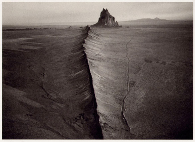 William Clift, Volcanic Dike Shiprock, New Mexico, 1998
When it comes to describing the world in more objective terms, however—particularly when documenting the human condition—the editor in me still believes that black and white done the old fashioned way, wet-processed negatives expertly printed out by hand and eye, is by far the more appropriate medium. It can be no accident, for example, that of the 20 photographers—14 men, six women—who [again, up to 1998] have received the annual W. Eugene Smith Grant in Humanistic Photography, one of photojournalism’s highest honors, only two proposed photographing their projects in color (and only one of those, in my opinion, deserved serious consideration).
Being less literal, black and white, in my experience, actually offers the possibility of greater accuracy. Years ago, I remember being given the opportunity to examine an early mockup of Philip Jones Griffiths’ condemnation of war, Vietnam Inc., now regarded to be a classic of its genre. The photographs I saw, some in all their gory detail, were in color, as originally shot. When the book was finally published, however, the photographs were reproduced in black and white. The photographer had evidently decided that his horrific story would be best told symbolically. History has shown him to be right.
Photography is no less a language than its written and/or spoken verbal counterpart. Surely, photography is more universal, transcending countries, continents and cultures. Images, the individual components of a photographic essay, for instance, combine in somewhat the same way that letters of the alphabet do, forming, not words and sentences, but sequences that come together in meaningful ways to spell out visual stories of sometimes awesome power.
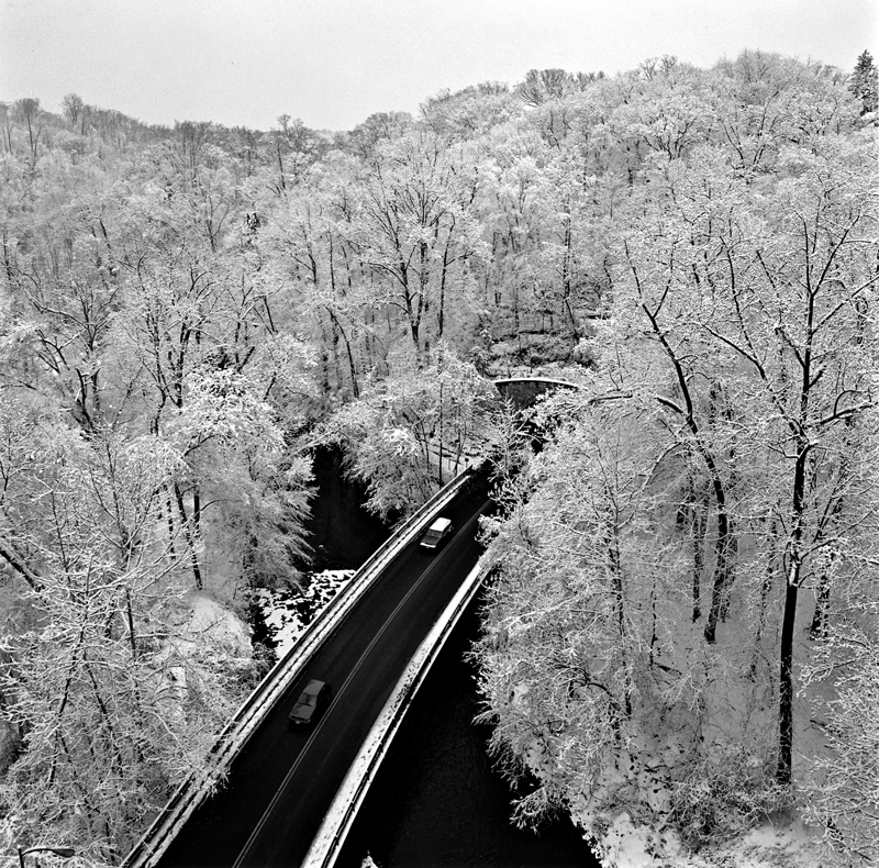
Black-and-white photography has a grammar of its own. Indeed, there is a certain poetry in black and white that color seems to lack. Consider the landscapes of Ansel Adams, Bruce Barnbaum, William Clift, Michael Smith or John Sexton. Now try to visualize any of their beautifully expressive black-and-white prints in the colors of nature. They didn’t see their pictures that way, and neither should we. For these photographers, I submit, color would be a distraction. Yet when seasoned viewers read those same pictures, their minds do the translation for them, filling in the blanks with a kind of subliminal color. Call it audience participation. Or simply imagination. For me, at least, it is this thought process, this reading between the lines, this need to reexamine and interpret the essential elements of an image, that sets black-and-white photography apart from color.
All language is abstraction, the representation of what we see, know and feel in a form that may be understood by others. Photography, too, is abstraction, a visual distillation that manifests itself in a complex tapestry of signs and symbols. My two eyes see in three dimensions; a camera’s lens records what it "sees" in two dimensions. It is up to me, the viewer of the final photograph, to make whatever conversions are necessary to combine the photographer’s intentions with my sensibilities: to reinterpret, if you will, the original interpretation.
Do your eyes a favor tonight. Rather than continuing to subject them to the ubiquitous and mindless bombardment of electronic rainbows, tune your television to your favorite dramatic series and turn off the color for at least the next hour. Slowly but surely, I submit, that rectangle of light will again become a transparent window on the world. Content will replace cacophony. Cross over if you can, and rediscover the subtle strength of black and white. Then apply any lessons learned to your own photography.
Jim
Jim Hughes, founding editor of the original Camera Arts and former editor of Camera 35 and the Photography Annual, is the author of W. Eugene Smith: Shadow & Substance, Ernst Haas in Black and White, and The Birth of a Century.
Copyright © 1998 by Jim Hughes
Send this post to a friend
Please help support TOP by patronizing our sponsors B&H Photo and Amazon
Note: Links in this post may be to our affiliates; sales through affiliate links may benefit this site. More...
Original contents copyright 2011 by Michael C. Johnston and/or the bylined author. All Rights Reserved.
Featured Comment by Wayne: "Earlier in my career, I was frequently required to visit various buildings and businesses for the purpose of gathering information for insurance underwriting purposes. As part of the evaluation process I was required to submit photos of every side of a building or property. In instances where properties were in a poor state of repair or a housekeeping problem existed, color photos always made the conditions look less severe than they were. In extreme cases, I would include notes to let the underwriter know that the live view was considerably worse than that conveyed by the photos. One day, by virtue of the fact I accidentally purchased a roll of B&W film rather than color, I noted that B&W photos conveyed a much better representation of the subject than did color photos. That was the day I became a devout B&W fan. To this day, I do not fully comprehend the reason for such a significant difference. Maybe B&W forces us to concentrate on substance in the absence of distraction."
Featured Comment by Dennis: "The funny thing for me about reading this post today is that it immediately brings to mind Mike's recent post entitled "Do You Ever Feel This Way?" I love B&W photographs. My admittedly small bookshelf includes David Plowden, John Sexton, Robert Frank, Ansel Adams, and Cartier-Bresson among others. I fondly recall some favorite photographs among the relatively few rolls of B&W film I shot, and occasionally try a monochrome conversion in LR that just clicks. But bye and large, my enjoyment of other peoples' B&W photographs makes me feel like I should do B&W in the same guilty sort of way Mike describes.
"It was easier with film, for some reason I can't explain, to find subject matter suited to black and white with black and white film in the camera. I can't seem to force myself to do the same with a digital camera. Maybe if it were a dedicated monochrome camera. Beyond that, I have the sense that there are so many people out there so much better at it than I'll ever be. The same is true of everything, but not to the same degree; I think I actually have an eye for color. And that's where I rationalize away the desire to do B&W.
"I think (I'm not sure) that I am pretty good at color; that I instinctively see compositions in which color contributes versus those in which it distracts (much more easily than I see tones that would show up differently in black and white). While those books of B&W photographs mentioned above are favorites, I recently bought Cape Light after reading about it here on TOP and found it very inspirational. While the B&W photos in the other books are thoroughly enjoyable to view, the color photos of Meyerowitz are photos that I can more reasonably aspire to. I'll leave B&W (somewhat guiltily) as an art form to be practiced by others and appreciated by me, much as Mike will leave winter photos to others."
Featured Comment by John Brewton: "Man, do I miss Camera Arts!"
Mike adds: I even still miss the first incarnation of Camera Arts, c. 1980–1983.
