Time from olden and current times
I mentioned in the comments the other day that I first read an issue of Time magazine cover-to-cover when I was eleven years old, and that I felt very grown up and proud of the accomplishment for having done it. That happened in the summer of 1968. I even remember where I was—in an upstairs bedroom at my Uncle Cam's cottage on a wooded bluff high above Lake Michigan.
The reason I was proud of myself was because it was written for adults, and reading it was an adult thing to do. I took it seriously because it took me seriously—that is, its editors and writers took the magazine's readers to be serious-minded and intelligent grownups.
In later years I stopped reading Time because my impression was that it had gotten slighter and less serious. But of course I've changed over the years too—I'm older and more experienced and even slightly more educated now than I was when I was eleven. So had the magazine really changed, or had I? Or both?
To find out, I went on Ebay and bought an issue of Time from 1968—the January 19th, 1968 issue (the year after founder Henry Luce died)—and then I bought the current (February 8, 2010) issue from the newsstand. I didn't read either one cover to cover this time, but I read enough to get a handle on them. The differences are fascinating.
The biggest difference is that the older issue has far more words in it. I'm not going to do a strict count, but old Time has about 100 pages (not all are paginated) and new Time has 56. Old Time is denser, too—although both have three-column layouts, new Time has far more "white space," larger heads, more decorations and box-outs and such, and many much larger photographs. (See the "Problem With Football" spread at the bottom of this post for an example.) I would estimate that the older issue has at least three times and possibly as many as five times as many words in it.

A typical page spread from old Time is meaty and no-nonsense, if a bit boring visually. Oh, and the paper they used in those days was yellower. Just kidding.
Old Time also offers a far more comprehensive coverage of the news. The sections, listed alphabetically, are: Art, Books, Business, Cinema, Education, Law, Letters, Medicine, Milestones, Modern Living, Music, Nation, People, Press, Religion, Science, Sport, Television, Theater, and World. Each of those categories has multiple articles within it, and even the shortest ones are brisk, informative, and to the point. In "Nation," for example, both political parties get more than 1,000 words each, alongside much else.
This week's issue seems surprisingly light on trifling pop-culture content compared to some recent issues I've seen, but the 1968 issue is undeniably a much more serious magazine, with a friendly but sober and distinctly adult tone. It's easy to picture men in suits and ties and women in dresses reading it. The new issue in contrast opens with "10 Questions" put to "rocker" Ozzy Osbourne, wherein he speaks to such burning issues of the day as "Where do you get your awesome glasses?" and "What's your favorite tatoo?" And near the end we get "Randy Jackson's Short List," in which the American Idol judge best known for calling people "dawg" holds forth on some of his favorite things, including his favorite movie and the architecture he likes. In between we get very good editorial content—just far less of it, in both breadth and depth, than there used to be. The tone in the new issue compared to the old seems slightly dumbed-down in the serious articles, and, in the frothier sections already mentioned, anxiously ditzy, like a youngish mother who thinks she's hip trying to communicate with a surly teenager. Again in fairly stark contrast, old Time's "People" section (which later spawned People magazine) only includes one individual who would qualify as a celebrity by contemporary definitions (Hollywood actress Faye Dunaway). The other people mentioned in 1968's "People" include three politicians, two relatives of politicians, one estranged wife of a famous spy (those were still the Cold War years, remember) and one book author (Vladimir Nabokov).
It would be unfair to make too much of any one feature, but I need to report two distinct personal reactions, one historical, one contemporary: first, I recall when I was younger that I always wanted there to be more of the "People" section. I relished it; I just wanted there to be more items in it, more people featured. And yet I never subscribed to People magazine. I didn't want a whole gossip rag, I just wanted there to be three pages of the "People" section in Time instead of one.
The other reaction is that the Ozzy Osbourne piece that opens the new issue sends me a personal message right from the outset that is crystal clear: this magazine is not for you. (And that's despite the fact that its more serious features actually are for me.) I don't read piffle like this because I'm not the kind of person who reads piffle like this. I love music and I read a lot about it, but I don't need Time's fawning take on whomever the hipster Mom thinks the kids adore. I don't give a crap about where Mr. Osbourne gets his glasses.
I'm even offended by the diction of the header. It runs like this:
10 Questions. In his new autobiography,
I Am Ozzy, the rocker tells his side of the story.
Ozzy Osbourne will now take your questions
Is it really necessary to point out to the brain-dead that when a feature is called "10 Questions," the premise is that the subject of the piece is going to answer questions? Again, that clarion message is effectively transmitted: this magazine is not for me; instead of encouraging children to be adults, Time now telegraphs effectively its intention to treat adults like children.
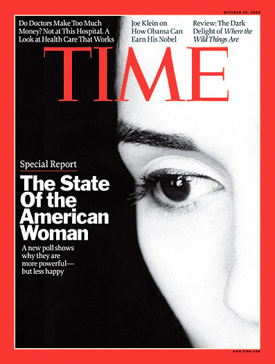
Moving on. The cover of the 1968 sample is classic Time: an original portrait painting (it looks like chalk or pastels, I can't tell) by one Boris Chaliapin, whose signature appears on the cover but who isn't credited inside the book, or at least not that I could find. The Henry Luce formula was to put a portrait of a person on the cover of Time, and it was a signature element, in the same way that the cover of The New Yorker is always an artwork, never a photograph, and after all these years I still want that. It was an indivisible facet of editorial identity. The Feb. 8 cover is a portrait of a squashed and dirty football, by photographer Stephen Lewis. He's credited on the Contents page. (So is "prop stylist" Michele Faro, who apparently was charged with the responsibility of squashing and dirtying the football.) I personally have a genial loathing for "concept" covers like this one—I think they're just weak—and I happen to know that current research suggests that covers with white backgrounds sell best, which makes all magazines with white backgrounds behind their cover art seem cynical to me. But that's just me. Old Time's cover subject is a then-young Zubin Mehta, making the old cover simultaneously "diverse" (although that term wasn't in common usage then) and also solidly middlebrow; neither hip mothers nor recalcitrant teens give a rat's patootie for classical music now, alas.
Perhaps the best illustration of the difference between old and new is the "Essay." The essay from 1968 is a serious, intent piece about charitable foundations and their role in society. It runs to about 2,000 words and is not bylined. The essay in the most recent Time is an idle little footle about how neat birthdays can be*. It runs 600 words or so, and the author's last name is by far the biggest type on the page. Wherefore art Lance Morrow?

The essay from the 1968 issue is to this week's essay what a New York strip steak is to a rice cake lightly glazed with cinnamon. Today's Time suggests that modern readers cannot cope with a single page of text, never mind two pages, unless it is enlivened with some sort of graphic—even if the informational content of the graphic is nearly zilch. Then again, in 1968, advertisements were never...well, pages of text.

The one area where new Time scores decisively over the old is photography. The older issue has only two color editorial features (although many of the ads are in color). One is a portfolio of paintings and the other is a picture story on deep-sea exploration in "Science." For the most part, the older magazine's photographs are almost all portraits, almost all in black-and-white, and almost all small (one column wide). The portraits vary in quality, but at least a few are pretty poor. The new issue is visually much stronger, with much better photographs generally and a higher standard even in the small stuff; there is also much more inventive use of visual accents and the graphic presentation of information.
As I mentioned, though, much of this visual dynamism comes at the expense of verbal content. White space, bold heads, graphs, inset pictures and the like all take up space—which the newer issue has far less of to start with.
And even with photography, the older issue scores one distinct hit. The big photo essay in the current issue features photographs by James Nachtwey on the aftermath of the Haitian earthquake. But there are only four pictures. Two of them are run far too large, as two-page spreads, and both of the spreads are pretty weak photographs, especially the first one—it actually makes less of an impact than it might have done if it were run smaller. To see what I mean, if you have the issue yourself, hold the spread on page 22–24 out flat at arm's length in good light—see how it seems more cohesive that way than it did when you first encountered it turning the pages? The color feature on "Oceanology" in the "Science" section of the older issue has sixteen photographs, with a much more sensible, if less flashy, layout.
 The photo feature in the old Time has sixteen pictures; the new, four.

In fact, in my opinion the weakest visual aspect of the new Time is the knee-jerk overuse of double-truck photos. There's just no need to make them that big—in no case, in this issue at least, do they look better that way than they would smaller. The informational content just doesn't justify the space. Big double-trucks are a standard and in my opinion uncreative way of going for "impact" and a "now" look. That's the common wisdom, anyway. In reality it's just trite and pro forma, a waste of space that could be better spent increasing the nearly critically shallow word count.
(And, if all goes well, we will offer far better original coverage of Haiti next week right here on TOP.)
The editorial content of new Time is quite good as far as it goes, though. Joe Klein's essay on failing schools is excellent, just too short—it ends just as he's getting going on the topic. And the cover story—about the recent research on brain injuries in former football players—is of a good length and very well written, albeit with a spongy ending. ("Perhaps the football fixing has begun." Squish.) (The New Yorker's article on the same subject, "Offensive Play" by Malcolm Gladwell, was better, although that's not a mark against the Time piece.)

A lot of the photographs in the new Time are portraits too, just like in the old—only they're bigger, and better. And here's your cover photograph, right here—imagine this Peter Hapak portrait of Harry Carson with the tagline "Football is dangerous." There's impact for you.
It's very tempting to ascribe causes to some of the changes in Time magazine between 1968 and now. The advent of cable and the internet, the dumbing down of the population, greater competition, truncated attention spans (although you're still reading this, and it's already longer than the average Time magazine piece). In retrospect I think I was right to be proud of myself that summer day when I was eleven—it marked a rite of passage to a more adult way of learning about the world, and that wasn't an illusion. I wonder what I would have thought if the issue I read that summer had started out with "10 Questions: Ozzie Nelson will now take your questions"? I think I might have at least sensed I was being pandered to, even at that tender age.
Mike
*It occurs to me belatedly that there is an outside chance Ms. Gibbs will one day see this, so I hasten to add that I'm sure she knows what she is doing. Just not my cup of tea, or slice of cake, if ye ken.
Send this post to a friend
Note: Links in this post may be to our affiliates; sales through affiliate links may benefit this site. More...
Featured Comment by
Herman: "The old
Time magazine didn't need many photos, they had
Life magazine for that."
Featured Comment by John Camp: "On New Year's Day, one of my closest friends was killed in an auto accident in New Zealand. She was a longtime newswoman, just retired as the omsbudswoman at the Washington Post, after having broken a lot of glass ceilings in a lot of other news businesses in the U.S. A bunch of us who worked for her got together at a couple of memorial parties. Many of us hadn't been together for 20 years, and we talked about news and newspapers. One woman, who is very smart, said she thought the real decline in American news came with the O.J. case, when straight news organizations, who before might have disdained such a tawdry story, avidly followed and promoted it...and sold extra copies. They found what they thought was an almost inexhaustible hunger for entertainment news, and soon, entertainment—and entertainment values—had taken over. And yet, the audiences declined. This wasn't the net doing its damage yet: O.J.'s car ride was in 1994. I suspect that a big chunk of the newsmagazines' audiences, those people who didn't put entertainment at the center of their lives, simply decided that they didn't need the magazines any more, and stopped subscribing. Not all at once, but over the course of a decade or so. As the subscriptions dropped, so did ad revenue, and pages.
"Today I went out to Charter.net because I was having trouble with my internet service, and saw, on their home page, an interview with the wife of Mark Sanford, the South Carolina governor, about her husband's career-wrecking infidelities. An interesting piece...posted under the "Entertainment" section head. It's all entertainment now.
"The O.J. case may have been a notable turning point, but I actually place the turn earlier than that—I take it back to when Woodward and Bernstein were breaking the Watergate stories, and suddenly news people (who JFK called "the last of the talented poor") woke up to the fact that they could be rich and famous if they could only get somebody. That had all kinds of fallout, but mostly in the hunt for more and more sensational stories, and who really cared how superficial they might be? Can you say Geraldo Rivera? So we read about O.J., and then about Clinton's infidelities (as if they were the first by a president) and eventually we've rolled all the way down the hill to Paris Hilton and her ilk, taking up space in the papers and magazines.
"Who could really care about any of it? And that's why your newsmagazines are so skinny—because nobody really does."
-
 A Fortune cover from 1935 by Antonio Petruccelli
Featured Comment by Eric: "Yes, I too enjoyed your piece very much, Mike. Now just imagine doing a similar piece comparing the pre-WWII and present-day Fortune magazines! The former are works of art inside and out. See, for instance, the covers by Petruccelli.
Featured Comment by Ian Loveday: "You really nailed it—it's an uneasy feeling I have had for many years but never did a direct head to head comparison (maybe it's worth doing for other publications).
"I am a magazine designer—so in part there is a mea culpa feeling when you lambast the use of pictures larger than they need to be. I think you're right about the influence of image-driven media on people's expectations and attention span. Layouts are dismissed as boring ("can't you liven it up a bit, make it dynamic?") so text loses out to headlines, graphics, and creative use of white space.
"But also, instead of the old 'paste-up' method you are today designing on a computer—on a monitor where you reduce the size of the pages to show a spread or look at several thumbnail spreads together—it tempts a designer to think more in graphic/dynamic layout terms than in information content terms. It's just blocks of abstract material to move around on a grid to create a pleasing effect. And changing things around, enlarging and reducing them—is so easy. A picture gets blown up too big because at the screen resolution and viewing size of your layout program it looks great.
"A good guideline for design is that good typography (or indeed layout) should be invisible, transparent, not assert itself all the time. It is a window onto the information content. That is true of the old Time pages—though as a designer of course I can't help seeing them as quaint and old fashioned, for many people they are 'transparent' in a way the new design-conscious ones are not."
Mike replies: Thanks for your perspective, Ian. I do think there are a couple of problems with computer layout—one is that it minimizes the gutter and makes the designer ignore the gutter. I always thought that a really good page design program would automatically distort any content within an inch of the gutter, and automatically cause images run across it to not line up precisely!
The other thing is that it encourages the designer not to pay attention to the physical immediacy of pages as they are being read, with the magazine held in the hands or on a table or a lap—the computer gives the designer a more distant, more remote perspective on the spread, which encourages him or her both to see the elements more abstractly and to believe that the main elements always need to be bigger when in fact they don't. I'm certain good designers know this in their heads, but the knowledge needs to be always there for the eyes.
Featured Comment by Joe Glaser: "'One Boris Chaliapin' indeed! Chaliapin was the son of the famous Russian operatic bass, Fedor Chaliapin. He painted hundreds of Time covers over nearly thirty years. His brother Fedor played the memorable Italian grandfather in Moonstruck. If people like those are so quickly forgotten, what chance do the rest of us have?"
Mike replies: Thanks, Joe. I knew nothing about him, I admit, but I'm glad to learn.
Featured Comment by
Brooks Jensen: "I am reminded of the last issue I purchased of a certain photography magazine (which shall remain nameless) some 20 years ago. The feature story, touted heavily on the cover, was one in which celebrities (Madonna and the like) selected their favorite photographs—of
themselves. I realized at that moment that pop culture was the magic elixir in selling magazines. I have not looked at said magazine since and been happy to walk a different path. Unfortunately, I see more and more of this celebrity gossip approach with every passing year. You are so right, Mike, that piffle has taken over the publishing trade—a trend that promotes the 'shallowing' of culture. In my scarce relaxation time, I'd much rather read your blog than read the flotsam that floats around in Ozzy's remaining brain cells!"