Yesterday was a great day in Los Angeles, eighty degrees under hazy blue skies, and a happy throng of Angelenos turned out for the last day of the three-day Photo L.A. exposition (The eighteenth annual Los Angeles Photographic Print Exposition), held this year at the Barker Hangar at Santa Monica Airport.
Though the crowd was good, it seemed to me that actual photo sales were thin—in a two-hour visit, I never saw anybody actually buying a photo, and the red-dotted "sold" stickers were scarce. However, it’s possible and maybe even likely that the biggest photography enthusiasts showed up on the first two days of the show, and sales were better then, and they took the photos with them.
A few notes at random:
Several photographers were showing Gregory Crewdson-style night scenes—selectively lit lonely houses and still, vaguely foreboding neighborhoods. With the high ISO cameras now available, this fashion may be with us for a while.
Lots of female nudity. I don’t know exactly how these would be displayed by a collector, since so many of them—especially the life-size Jock Sturges nudes—were so in-your-face. Maybe it’s just me, but I’d have a hard time eating a Subway BMT with extra cheese while staring at the high-res pudenda of a fourteen-year-old.
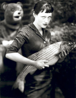 I’d never heard of Michael Garlington, who apparently is well-known in northern California, but he showed a very nice, near life-size (non-nude) black-and-white print called "The Fishmonger’s Daughter" (left). I liked it; it seemed almost 19th Century, with an amused smile behind it. While I was looking at it, I noticed that the wall label quoted him as saying that one of the interesting things about photography is that "you can look into someone’s eyes for as long as you want, without having to look away." That stuck with me because I saw a guy with his nose about two inches from one of the very largest Sturgis nudes, and I wondered, "What in the hell is he looking at? The grain?"
Hendrik Kerstens, who did the "Bag" photograph displayed on this blog a few days ago (the Vermeer-like portrait of the girl with the white plastic bag on her head), had several more large portraits of Paula, who is his daughter, in somewhat the same vein. In one shot, her hair is elaborately done up with paper towels still on the cardboard rolls; in another, she had a black plastic wastebasket on her head, the kind you might buy at a Target store; in another, a black plastic garbage bag in a kind of throw-back veil; another, with a second white plastic bag; and then a couple of fairly straight photos. They were all individually quite interesting, but as a group, began to come off as a kind of trick. (On the second reading of this, "trick" seems a little unfair, because the quality was so good, the girl’s face so striking, and the ideas so clever; but I leave it because that really was my most immediate impression.) The photo that Mike put up here a few days ago was easily the best, in my humble opinion. In the others, the actual nature of the headdress is more obviously apparent, and that takes away a bit of the sudden, amused realization of what you’re seeing. The girl has an amazingly sixteenth-century face; it has a fine blue quality that absolutely would have rung Vermeer’s bell.
One gallery was showing three very nice Ansel Adams silver prints, all "printed later." The asking price for "Moonrise" was $150,000, which I think is absurd for a non-vintage (printed 1977) print, especially in the essentially unlimited edition that Moonrise is. The print was beautiful, though.
Lots of C prints, beautifully done, at least to my eye—Ctein might feel otherwise. I considered buying one, a huge 78-inch wide photo of a super-cell storm apparently taken somewhere on the high plains. The problem was, the gloss on the photo was so high that you could not stand in any one place in the display and see the entire photograph, because there was always a reflected hot-spot on it somewhere. It occurred to me that with the lights in my house (an old house with center ceiling lights in each big room) that you would never be able to see the whole print at night, because of the reflections. Hmm. I don’t know what that means, but the photo was nice.
Lots of manipulated photos—photo montages, cutouts, pastiches, etc. On the whole, I thought, not very interesting.
 The eye-catching photos often were black-and white, despite acres of color stuff, and very often done by older, modernist photographers. On about my third lap around the place, I decided it was because the modernists were schooled in structure, design, composition; a lot of newer photographers seem to simply look for interesting stuff to shoot. But even if the stuff is inherently interesting, if the design and composition isn’t there, it doesn’t really reach out and grab you across a room. I saw Andre Kertesz’s "Satiric Dancer" ($28,000) from fifty feet away, and knew it in an instant, because of the design of the thing.
A Robert Mapplethorpe silver portrait of Isabella Rossellini absolutely leapt off the walls, even surrounded by other portraits. Say what you want about R.M., the guy could shoot a portrait.
There were a lot of interesting landscapes in the Adams mode—high res, well-printed wilderness scenes with clearing clouds, but those of Californian Mitch Dobrowner seemed to stand out. He does digital prints and as fine as the C prints are, I would have to say that digital, to my eye, now holds its own, even with the C’s.
At the same time Photo L.A. was going on, there was a sale of vernacular photos across the street in another hangar. I don’t have anything to say about that, because everything I know about the vernacular enthusiasm you could write on the back of a postage stamp.
A final observation: there was a large collection of really good-looking women, of all ages, at the show. Most of the guys, on the other hand, looked like they’d just fallen off a turnip truck. I don’t know why this should be. Anyway, if I were 26, male, and looking, I’d go to photos shows. I thought you’d like to know that.
John
Featured Comment by Stephen Gillette: "John, I don't think that sales were robust in the two days preceding your visit to photola. I was even surprised by the thin crowds on Friday, when I went, wondering if Saturday and Sunday would be better.
"Obviously, I don't have much insight into actual sales, but by 2 p.m. on Friday (just two hours into the show) I could see small pods of dealers talking with one another in the aisles. Usually that doesn't happen until near closing time.
"Last year's photola seemed to have much more energy, both in terms of images being shown, and floor buzz. This year seemed predictably flat, given the economic storm swirling. Even the portable bathrooms outside the hanger were less swank than last year. (You had to have seen last year's to know what I'm talking about.)
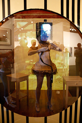
"One highlight for me was the ongoing performance by artist Tiffany Trenda. She reproduced a classic old box camera at a very large scale. In fact, she did her performance inside the camera. The viewers looked in through the lens to watch her. And, it turned out, to watch themselves: she 'wore' a video-monitor headdress that displayed the viewer in real time, captured by a hidden camera. As viewer/participants moved, she mimicked their motions, much like an animatronic robot. The performance was funny, light and thought-provoking.

"Across the street in another hanger (and yes, the sound of small jets and prop planes is the constant background noise at Barker Hanger, located at the Santa Monica Airport), the work of Barbara Grover was in its final weekend at Sherry Frumkin Gallery. Barbara spent nearly two months visiting a Darfuri refuge camp, and the resulting collection of images is powerfully beautiful, despite the tragic back story. The images were masterfully captured (in a very difficult environment—Barbara told me that she never removed the lenses on her two digital camera bodies, and taped over every seam she could see to keep out the blowing dust and sand) and wonderfully printed. The heart, purpose and presentation of the exhibition, which was not formerly a part of photola, stood in stark contrast to the 'big show' just across the street. Hopefully, photola visitors managed to discover Grover's fine work."

Barbara Grover


Thank you for such a good on-the-ground report of Photo LA, John! The art world in general is seeing the same slump that the rest of the economy's sectors are experiencing. Although photography is a poor stepchild of the art world it may be suffering somewhat less acutely due to its "bargain" pricing, although this is also not a good time to speculate. There is no shortage of "good" photography by time-tested names for sale these days. So newcomers will have a harder time to make an impression. (Speaking personally, I'm also not very jazzed by what I see from most "newcomers".)
BTW, the explanation for the profusion of good looking females at big photo shows is very simple; models looking for lenses. I've never been to Photo LA but that tends to be the story. (The explanation for the seedy-looking guys probably has more to do with today's razor-less/un-laundered look.)
Posted by: Ken Tanaka | Monday, 12 January 2009 at 04:07 PM
26? Why so low? Older men often can have an edge in these things...
Posted by: Paul Kierstead | Monday, 12 January 2009 at 04:07 PM
Two things.
1. If it hasn't been mentioned one can get a Mitch Dobrowner Folio over at lens work. http://www.lenswork.com/specialeditions/lwfolios.htm FYI.
2. "The Fishmonger’s Daughter" looks remarkably lurid to me. I don't know why. Maybe because I pay women to smack me in the groin with mackerel while wearing a bear costume.
Tom
Posted by: Tom | Monday, 12 January 2009 at 04:07 PM
Re the final observation: The guys, as usual, were at home watching football on the couch. Go figure.
Posted by: Robert Roaldi | Monday, 12 January 2009 at 04:07 PM
girl? what girls? what about the books? that was the best part! :)
Posted by: aizan | Monday, 12 January 2009 at 04:07 PM
John - thanks for providing an amusing and insightful write up. Living in London, I should note that your observation on the disparity between the young male and female attendees holds true this side of the pond also. Happy hunting.
Posted by: Julian Love | Monday, 12 January 2009 at 04:07 PM
I got my Still Earth folio (Lenswork)last week. Yeah, Mitch Dobrowner's work is something special.
Thanks for the interesting review of the show.
Posted by: jay moynihan | Monday, 12 January 2009 at 04:07 PM
"A final observation: there was a large collection of really good-looking women, of all ages, at the show. Most of the guys, on the other hand, looked like they’d just fallen off a turnip truck. I don’t know why this should be. Anyway, if I were 26, male, and looking, I’d go to photos shows. I thought you’d like to know that."
Hmmm. My impression has always been sort of the reverse; I mean, photography is astonishingly male-dominated, probably because guys tend to have more of a gadget-fetish than gals, all things being equal. Back when my daughter was whining about not meeting any interesting guys, I repeatedly urged her to hang out at camera stores or a photo club. I mean, think about it: lots of reasonably smart, reasonably employed guys with enough discretionary income to buy photo gear, and enough geek-factor to need help finding female companionship.
Just sayin.
Somehow neither my wife nor my daughter found this amusing or helpful.
Posted by: Geoff Wittig | Monday, 12 January 2009 at 04:18 PM
"A final observation: there was a large collection of really good-looking women, of all ages, at the show. Most of the guys, on the other hand, looked like they’d just fallen off a turnip truck. I don’t know why this should be. Anyway, if I were 26, male, and looking, I’d go to photos shows. I thought you’d like to know that."
What's interesting about your observation, is that I see the same thing on the East coast. At the workshops, studio parties and exhibits here the women - including those who are togs - look good. The men usually look like they just got back from Afganistan.
Posted by: misha | Monday, 12 January 2009 at 04:18 PM
Great writeup, best thing I've read all day. :)
Posted by: Mark | Monday, 12 January 2009 at 04:18 PM
Thanks for the review of the show. If I had the $$, I'd pay the 28k for the Kertesz before I'd pay the whatever for the Adams, any day.
About the Garlington photo–I like it, too... the quality is unmistakeable. And though the bear-fish-girl connection works in some way, it just seems sad that a photograph requires that forced, pseudo-surrealist gimmick. It's like your reaction to the Kerstens photos. After I saw the one posted here, I let my imagination fly as to all the different configurations he could have thrown together–a needle and thread, a globe, a piano or lute, and whatsoever other props one finds in your run-of-the-mill Vermeer... Yet to focus solely on the hair, when you have so many other options? I'm sure there was no play with the composition either. So sad to take what could be a really cool idea and make such a one-trick pony out of it.
Posted by: ben | Monday, 12 January 2009 at 04:18 PM
I felt that the show was dominated by vintage photography, and that a lot of the contemporary work was fairly conservative, maybe chosen to fit in with the vintage prints.
Posted by: Quang-Tuan Luong | Monday, 12 January 2009 at 04:21 PM
This was an amusing read :)
At every print show I go to I can only ever find "who would put that on their wall??" type images or extremely boring landscapes... I guess it's not limited to my city!
Posted by: Tanya | Monday, 12 January 2009 at 04:21 PM
Mike,
The text on this post is a little on the small side. One of the many things I like about your blog is that the text is not (has not been) as tiny as it is on too many sites.
Posted by: Eolake Stobblehouse | Monday, 12 January 2009 at 04:21 PM
Thanks, I enjoyed reading about images (not equipment), for once. It was certainly a very well-done report, informative and whetting my apetite to hear more.
Bill
Posted by: Wilhelm | Monday, 12 January 2009 at 04:21 PM
It's interesting that the Mapplethorpe silver print jumped out. Mapplethorpe did no printing and had the same full time darkroom tech for the last 10 years of his life.
Mapplethorpe: A Biography by Patricia Morrisroe give a great insight into Mapplethorpe's people skills in his portraits rather than his technical skills with the camera and darkroom.
Posted by: John A. Stovall | Monday, 12 January 2009 at 07:05 PM
"Mapplethorpe did no printing and had the same full time darkroom tech for the last 10 years of his life."
John,
Tom Baril, I believe.
Mike J.
Posted by: Michael Johnston | Monday, 12 January 2009 at 07:06 PM
"Mapplethorpe did no printing and had the same full time darkroom tech for the last 10 years of his life."
This particular portrait brought Mapplethorpe's whole skill-set together: the lighting was perfect, Rossellini's skin is so fine and delicate that it has to be seen to be believed, and the printing was flawless. Mapplethorpe actually shot a number of portraits with Rossellini, just because of her great skin qualities, I think. She glows in the dark.
Mike should sponsor a "great printers" week on the blog -- I was fascinated to watch James Nachtwey working with his printer in the War Photographer film. It's two artists with one art work, but only the shooter gets the credit (at least with the general public.)
I saw the woman-in-the-camera performance, but to tell the truth, had forgotten about it by the time I went out the door. Yes, I'm a philistine, but, thank god, at least I'm not a philatelist.
Hmm. It's interesting that so many people were interested in the good-looking women observation, and have provided similar testimony from the East Coast and London. It's odd...though, it may be man-fashion, as somebody suggested. Maybe the "back-from-Afghanistan look is in. I've noticed that artists tend to dress the part -- if anybody ever showed up for a college art class in a golf shirt, he'd be laughed out of the place, talent or no talent.
I'm embarrassed not to have reported on the book stalls: there was one with multiple first editions of Robert Frank's "Americans" with the French edition signed. I was interested in the plainness of the covers. Larry Clark was also hot, with several copies of "Tulsa" in evidence and at least one "Teenage Lust," on which I overheard some negotiations. There were several early Cartier-Bressons, also signed, and a near-pristine "Family of Man." Essentially, most of the photo books you ever heard of were there in first editions, but I don't have the first-edition book-collecting bug, so I really didn't pay too much attention to it. I'll do better next time.
JC
Posted by: John Camp | Monday, 12 January 2009 at 11:03 PM
In terms of the Hendrik Kerstens images that I saw at Photo LA.
I would comfortably say they are more than influenced by a dutch
photographer Desiree Dolron. Kerstens images pale in comparison.
I saw some of her prints in Amsterdam. outstanding! Link below.
http://www.egodesign.ca/en/article.php?article_id=48
Posted by: melvin Sokolsky | Monday, 12 January 2009 at 11:03 PM
"I would comfortably say they are more than influenced by a dutch photographer Desiree Dolron. Kerstens images pale in comparison."
I followed the link. You're right - they are superior.
Another observation: it's a web only journal. It's interesting how many are ditching an ink on paper edition. The list grows every month.
Posted by: misha | Tuesday, 13 January 2009 at 05:32 AM
Nice review. My favorite quote is, "Maybe it’s just me, but I’d have a hard time eating a Subway BMT with extra cheese while staring at the high-res pudenda of a fourteen-year-old."
That says so much to me about the "shock" value of contemporary photography/photographers that just have to be noticed.
Posted by: Joe Lipka | Tuesday, 13 January 2009 at 08:11 AM
In relation to the comments about Dolron, I am fortunate enough to share a dealer with her and have seen her prints in real life. They are beautiful, beautiful images.
And I agree with ben above, give me the Andre Kertesz over the Ansell Adams.
Posted by: David Boyce | Tuesday, 13 January 2009 at 08:11 AM
"The Fishmonger’s Daughter"
Very arresting. would love to see a real print.
Posted by: Jay Moynihan | Tuesday, 13 January 2009 at 08:11 AM
Mike Garlington has also flickr gallery :
http://www.flickr.com/photos/milkgarlictoast
Posted by: Igor | Tuesday, 13 January 2009 at 08:11 AM
There is no intention to shock in Sturges's work, which is in fact fairly classical. In contemporary photography, female nudity is only slightly more popular than nature landscapes.
Posted by: Quang-Tuan Luong | Tuesday, 13 January 2009 at 01:43 PM
Extremely delightful article. Thanks for the update.
Posted by: Account Deleted | Tuesday, 13 January 2009 at 03:36 PM
John,
High ISO has nothing to do with it. These are shot on tripods, likely at ISO 100, especially if one is ever concerned with printing.
Posted by: J. Wesley Brown | Thursday, 15 January 2009 at 05:33 PM