To begin with, I need to apologize...the other day, in this post, I talked about "a mimicking error" as if it were a common term. Obviously, that should have been error mimicking...and neither one is a common term after all, although I could swear I read about it somewhere. The idea is that something that is not an error seems like an error (i.e., mimics it), creating ambiguity; and, more specifically, now that we have Photoshop, there are cases arising in which things look just like they've been put together in Photoshop when in fact they haven't been.
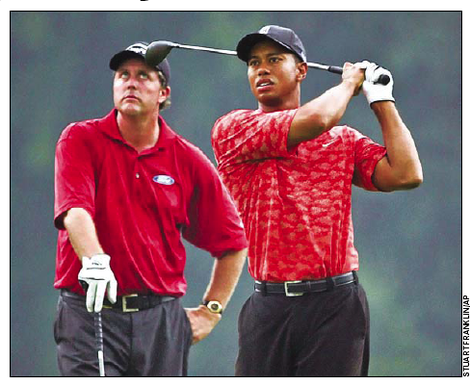
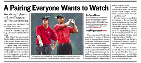
Case in point is this recent Getty Images shot by Stuart Franklin (not the Magnum photographer) which was published on page 15 of the June 12th, 2008 Express, a free ancillary publication of the Washington Post (wrongly credited to the AP in the byline). Here's the whole item:
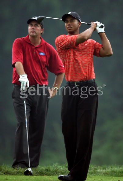
The picture looks so much like a bad Photoshop kludge that it was featured on the popular website "Photoshop Disasters." However, it's not a botched Photoshop collage at all—it's a perfectly straight photograph, if perhaps ill chosen and awkwardly cropped. Take a look at the whole frame (from the Getty Images website):
Including the men's feet makes their relative positions more clear. Here's another frame near the one above from the Getty Images catalog:
In the original Express presentation it amounts to a fascinating optical illusion. First of all there's the accident that Phil Mickelson (the golfer on the left) appears to be looking up at the head of Tiger Woods' club. But the real illusion is that the hard in-focus edge of the right side of Tiger's torso (viewer's left) appears to be the top edge of the shirt sleeve on Mickelson's upper left arm (viewer's right). This makes it look like Mickelson's arm is in front of Tiger's body, a clear impossibility. In the original image, put your finger over the offending edge and see if the picture doesn't resolve itself more sensibly.
You might call this "edge swapping," where the edge of one thing looks like the edge of another. It reminds me of the problem of "tonal mergers" in black-and-white photography. For anyone not aware of that phenomenon, a tonal merger is when two objects or areas in a scene have the same tone of gray (even if they're different colors in real life) such that the form of one or the other is difficult to discern in the B&W picture.
The picture was hotly debated on the Photoshop Disasters site, with some readers insisting that it had to be (that is, it is "obviously") a Photoshop job. They're wrong, if understandably so. For us, it's good to be reminded from time to time that photographs are not always easy to read (despite the fact that most pictures we see are chosen in part because they are easy to read). As photographers, we now need to be on the lookout for aspects of our pictures that might look as if they were done in Photoshop when they actually weren't. Like other forms of error mimicking (a term I appear to have coined—sorry again!), "apparent Photoshop" is in essence a type of ambiguity—one of many—and photographers and editors alike need to be aware that it can happen.
_______________________
Mike (Thanks to Chris Combs, a picture editor at the Express)


I must be simple minded!
I looked at Mickelson's eyes and aside from that, thought nothing more of the image. However now that you have noted the differences realize that perhaps I should review some other photos.
Suspect what really gets me is Photoshop as a program has been used to manipulate what we would normally view, to something that may well scream "fake!"
Which is unfair to the program which does all it proclaims to be able to accomplish.
However the world is never as it seems, sadly.
Posted by: Bryce Lee | Thursday, 18 September 2008 at 09:29 AM
It actually happened to me.
I entered a competition, and the picture was disqualified because they thought it was a Photoshop composition. The thing is that now, with some time passed by, I can realize how the photoshop effect is altering somehow photography perception: everything that might be "irregular" is considered to be a photoshop job instead of a lucky exposure or the result of other events.
The picture:
http://www.concursopentaxquesabesde.com/Photos/IMG3090.jpg
The aftermath of all this "imaginary vs. photography" war is that, nowadays, the boundaries between them are there no longer. A photography is not successful for general comprehension if it is not a good image [therefore, admitting that post processing is a form of altering the photograph], and a good--or striking--image is often considered the result of digital manipulation.
Posted by: Iñaki | Thursday, 18 September 2008 at 09:55 AM
Mike
How can this be "straight" when Mickelson's arm lies over Tiger's body but Tiger's club falls over Mickelson's head? It would seem they would have to be standing virtually on top of one another for that to happen.
Woody Spedden
Posted by: Elwood Spedden | Thursday, 18 September 2008 at 10:08 AM
"How can this be "straight" when Mickelson's arm lies over Tiger's body but Tiger's club falls over Mickelson's head?"
Woody,
Because Mickelson's arm does not like over Tiger's body--as I explained, it appears to, but it's an optical illusion.
Mike
Posted by: Mike J. | Thursday, 18 September 2008 at 10:15 AM
“Truth is stranger than fiction, but it is because Fiction is obliged to stick to possibilities; Truth isn't.”
Mark Twain
Posted by: Antoni | Thursday, 18 September 2008 at 10:43 AM
Seems to me error mimicking is more likely when using super telephoto lenses.
Posted by: Other MJ | Thursday, 18 September 2008 at 11:27 AM
I guess this whole "Photoshop Disasters" phenomenon is especially an issue when it comes to the press, advertisement or otherwise where authentic representations are important.
When it comes to "art", those kinds of optical illusions (which one might be tempted, on many occasions, to attribute to luck) might actually be a desirable artefact.
One such example of a "tonal merger" is present in a 1989 image by Nikos Economopoulos. The image in question appears on the cover of his book titled "In the Balkans". The dog just seems to be sticking out of the mountain--in this case, far from being a problem, this optical oddity likely "makes the shot".
Posted by: Charles Lanteigne | Thursday, 18 September 2008 at 11:58 AM
The other issue here is how the use of photoshop to "improve" the image contributed to the illusion. The golfer in the back should be less sharp than Tiger as he's not quite in focus. Yet he appears to have been sharpened and brightened which makes him appear to be in the foreground. That plus cropping have removed the visual cues we need to sort out distances.
Posted by: Roger S | Thursday, 18 September 2008 at 12:51 PM
Part of the illusion here is that the lighting is somewhat unnatural, especially for an outdoor scene, even more so for an event like golf -- there is a light source on both side of the subjects.
You can see a highlight on Mickelson's left sleeve, and you can also see one on Woods' right side. Normally we expect the light to clue us in, but here it can't.
Posted by: Mark Sirota | Thursday, 18 September 2008 at 01:05 PM
This kind of thing in the audio world is known as psycho acoustics. When you percieve a sound that really isn't there. The classic example of this is when a client asks for something to be changed (like eq or compression or reverb) and for the engineer to grab a knob that makes the change but not actually move it. Then the client says "That's it. Much better!"
Or course this can also turn on the engineer when they turn a knob and think they hear the change but don't realize that the piece of gear they just used wasn't actually doing anything (like not plugged in properly).
Posted by: Riddle | Thursday, 18 September 2008 at 03:42 PM
What fascinating illusion. It certainly looks like the use of a telephoto contributes to the effect. Also on my screen the shot looks 'juiced' compared to the full length shot. It's easier to read the line of Tiger's torso in the full length shot.
Posted by: Dennis Allshouse | Thursday, 18 September 2008 at 04:17 PM
I think the fact that Phil is slightly out of focus also contributes, as it makes it appear that he was cut from an image with a different resolution. Anyway, the editor could have picked a better one, how could he not see the mimicked error?
Posted by: Thiago Silva | Thursday, 18 September 2008 at 05:23 PM
Iñaki, yours is a great image, quite a classic imo. It is a pity that it was rejected and it shows very nicely (albeit in a not-so-good-for-you way) how digital has changed the whole photography thing. Weird.
Take care
Andreas
Posted by: Andreas | Thursday, 18 September 2008 at 05:52 PM
Mike: If you say so! Dave
Posted by: Dave Kee | Thursday, 18 September 2008 at 07:36 PM
Phil is a left handed golfer and in this photo his seems to be holding a driver for a right handed hitter. Does that seem right?
Posted by: Sammy Chavanavich | Thursday, 18 September 2008 at 08:34 PM
The lighting is key here. Our visual systems rely a lot of default assumptions to disambiguate what we see (without assumptions it is impossible to do so). One default assumption is that light tends to come from above. Which means that brighter areas should be facing upwards, not downwards - so that ambiguous bright area is judged to belong to the up-facing sleeve of the left golfer, not the down-facing side of the right one. It's the same effect as the inverted-mask illusion.
A related, though different, mimicking error is what I like to call the "Simpsons Cloud" effect. You know the bit of the The Simpson's signature with white clouds parting to reveal "The Simpson's" - it is quite possible to shoot a real sky that looks much like that kind of cartoony or computer-generated "ideal" sky, but the picture simply looks fake. People who see the picture will generally not accept it as genuine; it looks too much like that cartoony ideal sky and they will believe you made it up.
And as the ability to render real-looking but ideal scenery improves, so will we more and more dismiss real photographs as fake or manipulated if the subject is too close to perfection. If you would shoot a portrait of a young woman that happens to have absolutely flawless skin, nobody would accept the picture as unmanipulated today; everyone would assume you've cloned out blemishes and spots from the image.
Posted by: Janne | Thursday, 18 September 2008 at 10:20 PM
I have to be honest, Iñaki--I don't even see why they thought it was photoshopped. That's just a pretty natural example of the kind of shots you get through a subway train as it goes by. I guess I've taken too many in the last couple of months, though.
Nice shot, too.
Posted by: mwg | Thursday, 18 September 2008 at 11:02 PM
Sammy,
Unless he's holding it backwards...that is, he's got the tip of it resting on the ground so that the hozzle is facing toward you. (Search Getty Images for picture #82841402.)
Mike J.
Posted by: Mike J. | Friday, 19 September 2008 at 12:11 AM
I can see why it is very easy to think the image of the photo being manipulated by Photoshop. I think we can reproduce it, with a long telephotob lens and some creative positioning.
Case in point:
http://www.moillusions.com/2006/04/dwarf-and-giant-illusion.html
This kind of camera tricks are pretty old, I guess people forgot about them once digital image manipulation came about.
Posted by: Syam | Friday, 19 September 2008 at 02:58 AM
Sammy/Mike - maybe Mike has it - or maybe he is holding a different one of Tiger's woods. He still has his glove on the right hand though....either way i think its a pretty nasty picture.
Posted by: robert | Friday, 19 September 2008 at 07:53 AM